Neil Richards on uncovering data stories in business dashboards
Reading time
Category
The exploratory nature of a data dashboard can leave little room for a narrative to form. Instead, the key role dashboards play is to close the gap in data fluency and aid users to find the story that supports data-informed decisions. We asked five-time Tableau Visionary Neil Richards to explain more.

We’re probably all familiar with the growing desire of most businesses to be data-driven nowadays: the desire to move the business forward by making decisions, evidenced by data, that save money, identify big wins, or generally grow the business. Perhaps, we as data professionals are embedded in a team, department or corporation that professes to embrace a data culture hoping to help make that happen. We may be fortunate enough to play a part in that ultimate goal.
But how does that manifest itself? If we’re fortunate enough to work in an environment that has moved on from Excel and printed reports, it’s likely that we’ll be in an environment where our business intelligence tools (such as Tableau or Power BI) enable us to visualise our data. Our key metrics and KPIs are typically visualised in the form of dashboards. We make these available as “self-service” dashboards, perhaps both to our internal end-users and external clients, enabling them to discover the important insights within.
So far, so good. However, to make decisions from these outputs, data visualisations are not usually enough. For the insight to be uncovered, we need to find the narrative to tell the story that our data is showing us. Brent Dykes is one of many who emphasise the importance of data storytelling in driving change, and it’s his image (below) that I and many others will always reference when making that emphasis.

Essential Elements of Data Storytelling: Image by permission of Brent Dykes: https://effectivedatastorytelling.com
Data visualisations can help enlighten data, but change is not truly enabled without finding the narrative, through data storytelling – it’s this narrative that explains the data and engages with the visuals, thus really enabling us to drive change.
And so, many businesses will curate dashboards, making them available to their internal stakeholders and external clients. A thriving internal data culture may lead to skilful designs and a wide range of reporting options, available to all who need them, supported by a genuine desire to present data accurately and appropriately. But is this enough – do our business dashboards do enough to draw out the narrative behind the data and tell the crucial story?
The nature of business dashboards makes it difficult to narrate stories
Business dashboards are rarely explanatory; they are much more likely to be exploratory in nature. Most aim to show data in or near real-time and hence refresh regularly, perhaps monthly, daily, or even hourly. For example, an explanatory title or headline for a dashboard is a key storytelling technique that can act as a call to action to the dashboard consumers. But a business dashboard is most unlikely to have such a headline with a clear call to action if the data is constantly refreshed. It’s usually up to our users to decide the timescales, filters and parameters they need.
Although data dashboards should be designed to show the minimum amount of information required to address the business questions most relevant to their end users and make the user experience as simple as possible, even within those constraints they are usually designed with filters, drill-downs or tooltips (or, in many cases, all three). These constraints mean it’s unlikely that our dashboards in their current guise are great tools for telling data stories.
As data storytelling expert Kat Greenbook explains, a dashboard can help inform, but it only goes part of the way along the spectrum from “explore” to “explain”. To continue the storytelling analogy, perhaps a dashboard will introduce the characters of the story. But without a back-story, context or plot points, that story is meaningless.
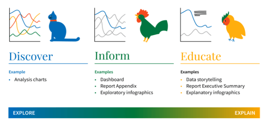
Spectrum from Explore to Explain: Image by permission of Kat Greenbrook – https://roguepenguin.nz
Data fluency is critical for users to make the most of business dashboards
A problem can then arise when these dashboards leave a gap between our dashboard designers (and their end products) and the end users. Here are some examples of possible gaps:
- Confidence: where the final designed dashboard may be the designer’s pride and joy, but the end user does not understand it
- Enablement: where the end user does not explore the dashboard to its full potential; a gap of usability or functionality ensues from inferior design on the part of the dashboard creator
- Storytelling: where the end user does not have the experience or skill to draw out the narrative to tell the all-important data story
Regardless of the type of gaps that exist, they need to be addressed to draw out data-informed decisions.
A data fluency initiative acknowledges the existence of such a gap, aiming to target and close it by acting as the connective tissue between BI team, data, and dashboard end users. Crucially, data fluency aims to address the gap-closing from both sides:
- Closing the gap from the design side
If dashboard designers are unable to incorporate data storytelling elements due to the need to provide exploratory elements on changing datasets, they must instead design dashboards to be as familiar, understandable and easy to use as possible. Adhering to best practices and strict design guidelines helps remove clutter and unfamiliarity and ensure that the data elements come with no distractions, so that your end user will know exactly what to expect. Focusing on the UX and accessibility experience will minimise opportunities for your end users to shun the dashboard (and all the hard work put into its creation and design).
- Closing the gap from the user side
Finding and delivering insight and story within data, specifically within business dashboards, takes a level of familiarity and confidence that is certainly not a given, and this can come not just from training sessions, but a gradual increase of acceptance in data usage and immersion in data culture. For the end user, we can close the gap through workshopping and education. Data literacy initiatives such as training sessions and dashboard walkthroughs are some first go-to options. However, it can sometimes be important to emphasise to reluctant adopters (or their managers) that introducing a data fluency programme is more than just training. Other initiatives, such as newsletters that feature data trivia and data moments (nugget-sized examples of thought-provoking data in action), help improve familiarity and confidence with data in general.
Within data fluency initiatives, we can explain the importance of data storytelling too, so that our users understand the need to tell a story with their data in order to gain value and drive data-informed decisions.
Many resources recommend incorporating storytelling techniques, such as the narrative arc or the three-act story featuring introduction, rising tension and resolution. These are key elements in understanding how to formulate such a data story.
Data storyfinding is just as important as data storytelling
However, few resources focus on the art of finding the story. This comes with confidence, from the encouragement to explore, and from the experience that ultimately leads to the former two elements. It’s important for data professionals to work with users across their internal data communities to build their data fluency and help with the development of these skills.

One example might be looking for trends and patterns within dashboards, since almost all stories take place over time, and data stories are no exception. These may be shown clearly within the dashboards if charts and lines are shown over time, or they may need uncovering from a number of different views. In looking for trends and patterns, we may find the typical three-act story, featuring an initial scene-setting, a rising tension and climax, and a falling action leading to resolution.
Another technique is to identify outliers. Many outlying data points may tell their own story. In finding these outliers, we can use our knowledge of underlying circumstances to tell the stories behind individual data points, and then make a (data-informed) decision on how to address the data point. This may also contextualise the rest of the data differently: maybe on average our profits weren’t falling after all, it was just the inclusion of an outlier that on further investigation was mis-reported?
The well-known example of Anscombe’s quartet teaches us that to find trends and outliers, we need to explore our charts. Averages and other summary statistics by themselves can hide key narratives. Imagining our business scenario showing sales as y versus time as x, all four of the charts below have the same mean for both x and y, as well as identical sample variances, correlations and best-fit lines. It is only a visual exploration that will tell the story of how our own sales figures (y) have changed over time (x).
Perhaps there’s a curved relationship, or an outlier is hiding a constant relationship, or perhaps there’s a genuine approximation to an increase of y over x. Or the real story may be that none of these things are happening, and there is no story to be told! Improving confidence with data, and in our own data skills, can encourage us to spend time looking visually at the data, which in turn leads to a story that could be unfound (or mis-told) by simple summary numbers alone.

Anscombe’s Quartet: Source: Wikipedia
Additionally, we can look for stories through filtering and disaggregation of data if our dashboards are designed to allow this. Variations might not be showing at a higher level, but they can be seen when looking at a subsection of data. Having the ability and confidence to filter dashboard data can uncover trends and stories at a regional level, or a departmental level, which start to tell their own specific data stories.
In all cases, data stories are much more likely to emerge if we ask questions. Let’s continue to ask, and explore, until we find a potential root cause behind what our data is showing us.
Making business decisions based on data narratives
Returning to that ultimate goal to be data-driven, we gain from softening that tone and striving for data-informed decisions instead. Decisions that are made from finding the narrative of the data, but with the extra subject matter expertise forming part of the storyteller’s narrative.
In this way, striving for a culture of data-informed decisions empowers the users to be less blinkered and more rounded in their decision-making, while still focusing on the importance of stories derived from the data as the underlying factor.
Uncovering the story is every bit as crucial as delivering the story. You can’t have one without the other. But building these skills takes time and practice. Once your users have familiarity with data dashboards, enough confidence to explore them properly, and sufficient data fluency skills to correctly interpret and present the analytical findings, in combination with skilful and intuitive dashboard design, we start to see fruitful results in the form of uncovering key data stories.
We’re grateful to Neil for sharing his perspectives on data storytelling in business dashboards. With over 10 years of experience partnering with the likes of Lightcast, the City of London Corporation and the Association for Financial Professionals, we’ve created highly engaging interactive data dashboards for organisations making a meaningful impact. If you’re interested in how we could help your organisation do more with your data, connect with us to learn more.
About Neil Richards

Neil is a UK-based five-time Tableau Visionary, working as Global Data Fluency Lead at JLL. He regularly speaks and presents about his creative visualisation design ideas and inspirations, and he has documented his creative journey in his blog Questions in Dataviz, culminating in the publication of his first book, of the same name. Neil has served on the board of the Data Visualization Society and Viz for Social Good, and he writes regularly for both Nightingale and Data Leadership Collaborative.