Regular infogr8 collaborator Loris Mattioni shares his thoughts on how crafting your own data can bring new dimensions to dataviz.
As a data visualisation designer, I notice that I always ask myself the same questions, but they never come in the same order. What message do I want to convey? Do I want to explore or explain? How can I visualise it? How does it support my client view? How will it affect my audience? But there is one that almost always comes at the end: Which data can support it?
There are many open datasets, APIs and client data that we all use for our visualisations. But I always end up collecting and analysing my own data on top of them. This often leads to approaching the original message differently and helps tell a unique story that reveals even more information.
In addition to the message itself, I try to get my audience’s attention with different sources and processes. While ‘data is everywhere’ is one way to approach data collection, I prefer to think that ‘everything is data’. In that sense, taking the time to curate your own data can result in more original, engaging and impactful visualisations. Furthermore, it often uncovers hidden information and helps reveal new insights that we haven’t considered before.
Data is everywhere vs. Everything is data
For us information designers, the data is our raw material and, no matter the tool we’re using, we need our ink to write the story. In the ‘data is everywhere’ scenario, the idea goes along with a specific dataset: “Here is the data I want to explore. Let’s find the best way to visualise it”. With ‘everything is data’, the idea and the message come prior to the data source, and finding the data becomes part of the process.
‘Data is everywhere’ is a commonly accepted trope nowadays. From open APIs to our own WhatsApp conversations and running apps, getting the raw material is often easily achievable. However, I think that limiting ourselves to our pre-existing data sources restricts our exploration of new ideas. It’s like having three colours to paint with, without realising that mixing them could create endless possibilities.
During infogr8’s discovery phase, for example, we often blend various types of data that can come from unlikely sources. Yes, the starting point may be numerical, but we then layer the data with further insights on the audience, their needs/wants, the wider context and open discussion with a range of stakeholders. Continuing the colour analogy, blending these insights is where the interesting greens and purples lie.
In this sense, my approach is to think that ‘everything is data’, and turning something into data is part of the creative process.
Some working examples, this time from music and film. Fetching data from artists on Spotify, along with their genre, popularity and style, is only a tiny part of what could be explored. What if the frequencies of each song could convey a new layer of information? Likewise, the pacing of a movie can be conveyed through dialogue and soundtrack, but what if the whole atmosphere could be conveyed via the main colour chosen for each of its frames?
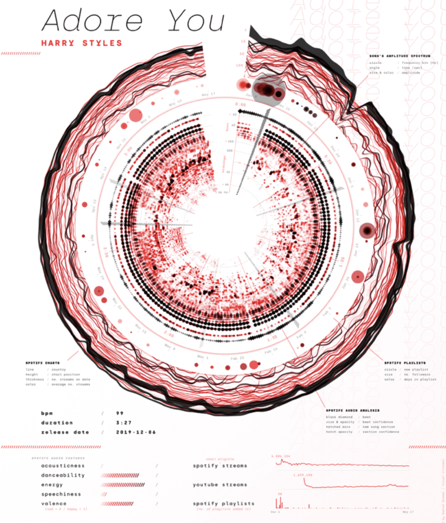
A song is a set of frequencies. A video is a set of pictures. A photograph is a set of pixels. A Twitter account is one node of a whole network, and an Instagram account is full of colours.
Most of the time, this means that the raw material has to be transformed, and this part of the process can be more or less difficult, requiring different tools. Still, the process itself can be incorporated into our story and add an extra dimension.

Create original visualisations with your own data to reveal new insights
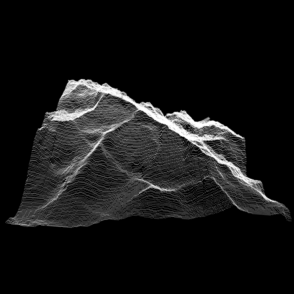
The creative process begins when we reshape our new sources of data. Given that a pixel is a 3D array, an image could be rendered as a bar chart of colours or a 3D model. Likewise, music can become an animated timeline, and a movie can become a combination of sound, text and images with colours. Our new dataset can take shape by destructuring every piece of material and converting it into data.
By deconstructing the traditional dataset, we are encouraged to push the limit of creativity to visualise it. Our colours can be sorted by hue or ranked by saturation of pixels, and our sound signals can isolate certain frequencies. Not only is the visualisation kept away from the classical decision tree that forces classical patterns (which is a powerful tool in many contexts), but the material itself can also be reshaped for different scenarios.
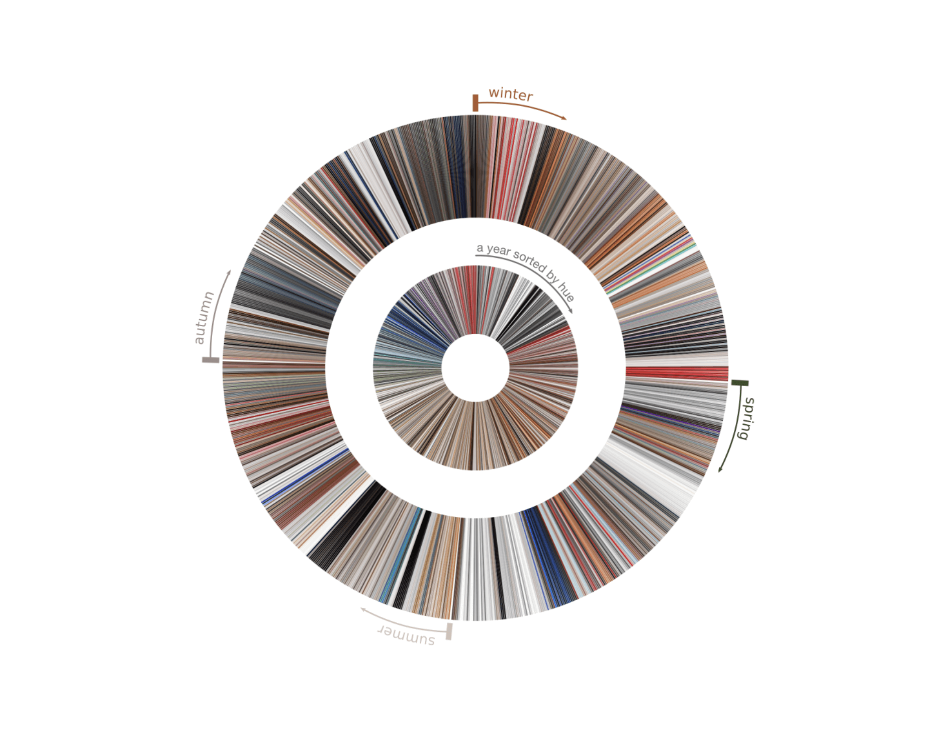
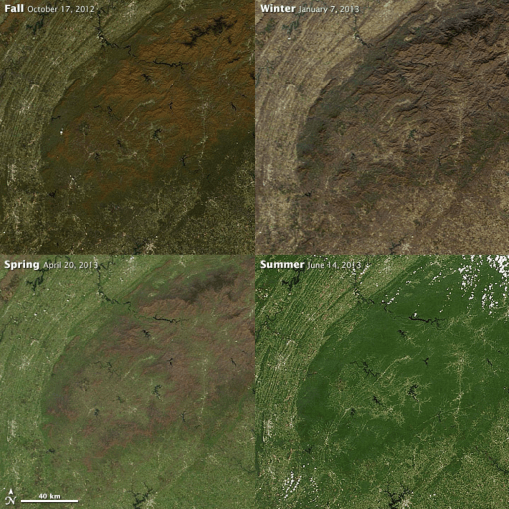
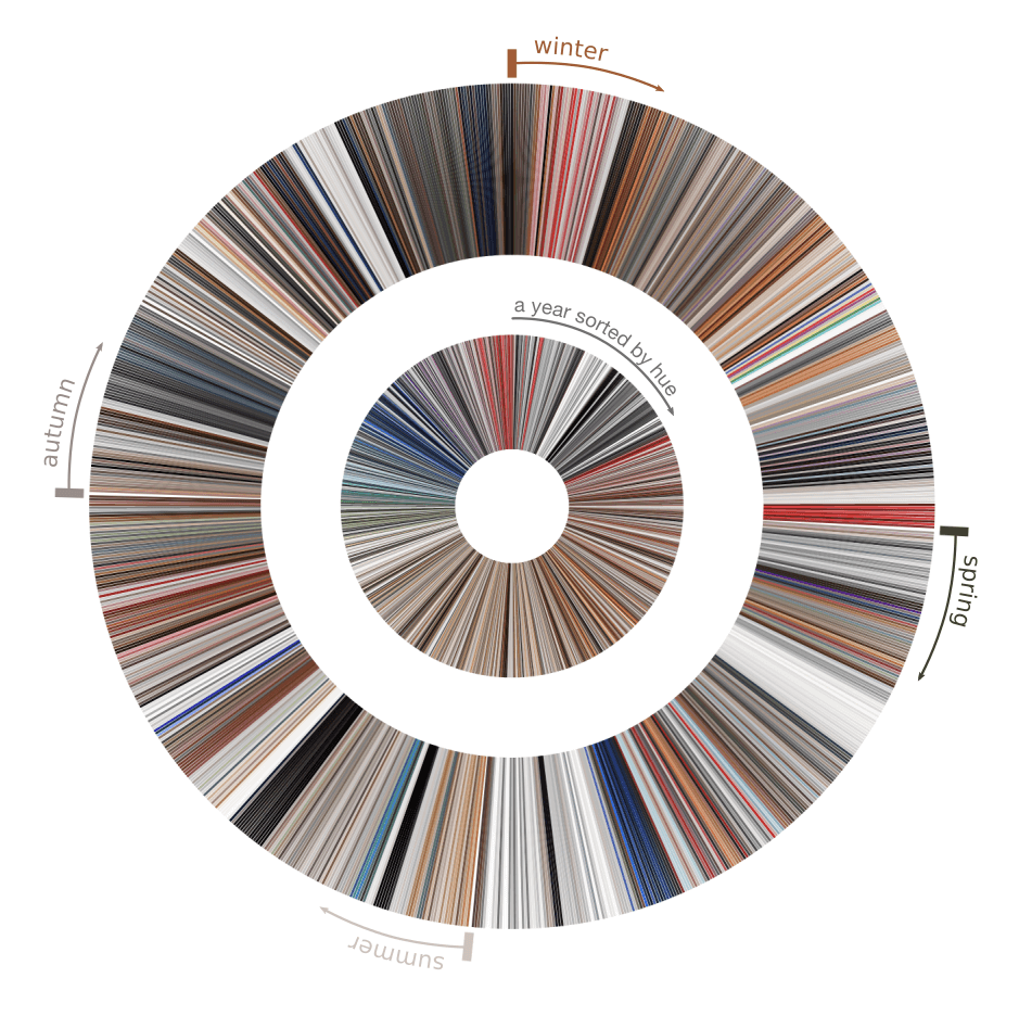
Finally, opening up the data sources pushes the limits of our understanding. New sources can be blended with existing ones. They can be aggregated into the process, in a story with different visuals or combined. On top of that, new information can be revealed. Is the colour palette of a brand changing in line with the seasons? What is the colour spectrum of our luxury brand in comparison to our competitors? We can sort our colours by hue to see the dominant colours, stick with an original timeline and combine the information altogether:
Of course, there is a trade-off here. Depending on the data you’re crafting, the process can be tedious, and the techniques and tools need to be built. The balance between originality and clarity should also be kept in mind during the whole process, from data collection to design. We already have some common patterns to read specific information, and we should think outside of the box only when we want to innovate new types of data visualisations.
We hope Loris has broadened your perspective on what constitutes data and how you can get creative when sourcing it. If you’re looking to create engaging and interactive stories through data, reach out to us at [email protected].
About Loris

Loris Mat is a freelance data visualization designer who has worked with clients such as infogr8, Atlantic Council, 360Learning, and the University of Innsbruck. He uses a range of techniques, from generative art to creative design, to reveal insights and communicate complex information.