As a data analyst, Kenneth quickly found himself stuck in a routine creating the same charts. With a desire to express his work creatively, he shares how he draws inspiration from nature, as well as ways to optimise your dataviz workflow.
In my personal journey as a data analyst, I’ve come to appreciate the remarkable opportunity to embrace creativity alongside analytical skills. Similar to other creative fields, nurturing and stimulating creativity plays a crucial role, particularly when conveying findings to stakeholders. However, during the initial stages of my career, I found myself constrained to using basic chart types like bar charts, pie charts, and line charts to present my insights. This repetitive approach gradually dampened my enthusiasm, and I started to feel trapped in a monotonous cycle. Here’s how I managed to break free to incorporate creativity and inspiration into my routines as a data analyst and visualisation professional.
Nature’s muse: Translating concepts into captivating visualisations
One of my sources of inspiration lies in the wonders of nature – I’m constantly captivated by the beauty and curiosity that nature offers. Taking the time to explore and appreciate the majestic mountains, gazing at the night sky, and marvelling at the celestial bodies allows me to tap into a deep well of inspiration. Nature truly showcases the boundless beauty that surrounds us.

A captivating visualisation of the night sky, showcasing realistic planetary bodies. A source of awe and inspiration for star gazers. Credit: Stellarium-web
One aspect I’ve been gradually working on is the art of incorporating these natural aesthetics into data visualisations. Imagine stepping out into the open on a dark night, gazing at the celestial wonders above. Observing the planetary bodies, the moon, the stars, you notice a few things. The intensity of light emitted by each planetary body is not equal, and they vary in size, some appearing closer to Earth than others. These celestial giants create a sense of awe and wonder.
Now, let’s translate this concept into a captivating visual. Consider this dataset I’ve been working on, which consists of study permit approval per country, provided by the Canada Immigration Authorities (IRCC). While exploring this data, I discovered that out of over 200 countries’ records, approximately 15 countries account for a significant percentage of the applications, with India alone representing a substantial proportion. This dataset exhibits an imbalance, and using a traditional bar chart or pie chart to represent it would not effectively convey the insights. This is due to the large number of categories that need to be represented, as well as the significant variations between the values of different countries.
Drawing inspiration from the concept of planetary bodies, I can choose to represent this data as a bubble chart or a network graph. In this visual, each circle represents a country, with the diameter of the circle corresponding to the number of approved applications. Each cluster would represent a continent and its countries.

Visualizing Global Study Permit Approvals by Canadian Immigration Authorities. Drawing inspiration from the night skies, I have depicted the number of approved applications for each country using marker diameter. Clusters symbolize groups of countries, with their continents displayed in blue at the center. This analogy resembles satellites encircling their planet, with Canada standing tall as the prominent giant of the sky, akin to the sun in the solar system.
By adopting this approach, I want to capture the attention of the audience and provide a unique perspective on the data. The visual itself draws on the beauty and patterns observed in nature, enabling viewers to quickly grasp the relative importance of each country’s study permit approvals. And the use of unconventional visuals adds an element of intrigue and engages the audience in a visually compelling way.
Nature’s palette: Crafting captivating colour schemes inspired by nature
Colours are indeed a crucial element in every design, and nature provides us with endless inspiration for captivating colour schemes. One source of inspiration is the vibrant and varied colours found in flowers. We can also find these in other natural objects like bird feathers, gemstones, etc.
Let’s explore an example using a beautiful rose flower I found on a stock image site. Say I want to create a sequential colour palette for a data visualisation project. To extract shades of colours from the image, I use tools like Coolors to extract different shades of colour from the flower.
Here’s a screenshot of the extracted colours:
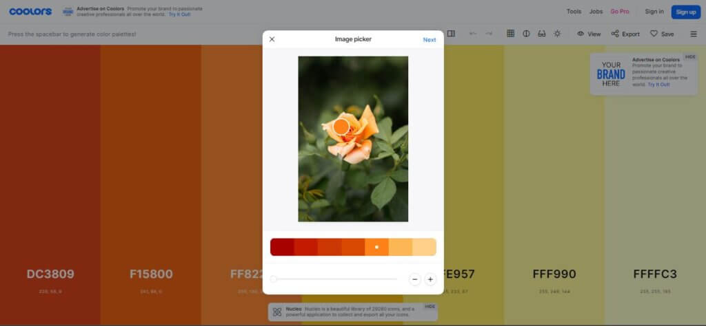
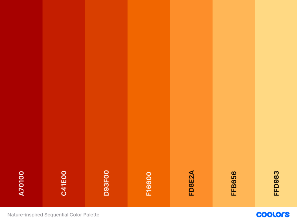
A sequential palette formed by extracting shades of colour from a rose flower using the Coolors.co online tool. Flower image credit: Wolfart via pexels.com
Although the colours are stunning, they may not be evenly spaced. To achieve a well-balanced sequential colour palette from low to high values, I can use various tools or techniques. To keep things simple, I take the HEX codes of the colours and ask ChatGPT to adjust them, ensuring equal spacing and sorting them in a sequential pattern. With this modified colour palette, I can proceed to design my visuals.
Learning from dataviz luminaries
Drawing inspiration from the works of others is a powerful way to enhance our creativity and improve our data visualisation skills. Here are some ways I’ve found inspiration from others in the dataviz community:
1. Curating inspiration through Pinterest
I’ve started curating a repository of captivating visuals on Pinterest. Whenever I come across fascinating data visualisations, whether through accidental discoveries or intentional searches on popular platforms, I pin them to my Pinterest dashboard. This collection serves as a source of inspiration, allowing me to explore how other data visualisation professionals have tackled similar visualisation problems. It also helps me stay updated with the latest trends and creative approaches in the field.
2. Joining vibrant communities
I connect with like-minded data visualisation enthusiasts by joining different dataviz and data analysis communities. I volunteer for community-focused dataviz organisations like Viz for Social Good, and I even help co-moderate some of these groups. Engaging with communities provides me with opportunities to seek advice, get feedback on my work-in-progress, and discover new tools and techniques from others. It’s a great way to stay motivated and continuously learn from the collective wisdom of the community.
Check out these data visualization communities for impactful insights:
- Viz for Social Good (VFSG): A global community of data enthusiasts creating informative visualizations for mission-driven organizations.
- Data Professionals Africa: Join this Whatsapp community to collaborate and share knowledge with data scientists and analysts.
- Data Visualization Society (DVS): Connect with data visualizers across different tech stacks through this community.
3. Guided by industry leaders
I follow influential figures in the data visualisation field, including top dataviz, analysis, and storytelling professionals. By learning from their expertise and experiences, I gain valuable insights and grow in my own practice. They serve as role-models and inspire me to push the boundaries of my creativity and skills.
Here are some examples of who you might consider checking out on Twitter:
- Obinna Iheanachor (@DataSenseiObi)
- Lindsay Betzendahl (@ZenDollData)
- Emily Kund (@emilykund)
- Cole Knaflic (@storywithdata)
- Chisom Nnamani (@Ada_Nkanu_)
- Tina Okonkwo (@Rita_tyna)
Check out Viz Heads that showcases some of the “heads” in the data visualisation industry. It’s based on the latest survey by the Data Visualization Society, so you know it’s reliable. Have a great time exploring and getting to know the amazing people in the data visualisation world!
4. Seeking wisdom from books and courses
I believe in the power of continuous learning and staying updated with industry best practices. Books and online courses have been valuable resources for expanding my knowledge and improving my data visualisation techniques. Good ones offer in-depth insights and practical tips that I can apply to my own work. My latest read is Storytelling with Data: A Data Visualization Guide for Business Professionals by Cole Nussbaumer Knaflic.
5. Switching tools or trying out custom visuals
Sometimes, I experiment with new tools or custom visuals to create unique and engaging data visualisations. Trying out different tools and visual elements opens up new possibilities and allows me to discover innovative ways to communicate insights effectively.
Incorporating these strategies into my data visualisation journey has not only enriched my creativity but also provided me with a diverse range of techniques and approaches to tackle different visualisation challenges. By learning from others, I’m constantly evolving and honing my skills to create more impactful and captivating data visualisations.
Mastering the craft: Optimising workflow with personalised processes
We’ve discussed some ways to maintain creativity and inspiration in the journey as a data visualisation professional. However, mastering the craft of data analysis and visualisation requires taking additional steps, and it can also be time-consuming. With this in mind, I’ve developed personalised workflows that assist me in navigating these challenges more smoothly. Here are a few of the strategies I employ:
1. Applying the “Divide and Conquer” rule for efficient problem-solving
When faced with the complex process of analysing and visualising data, I apply the divide and conquer approach. This problem-solving technique suggests that breaking down a big problem into smaller sub-problems can lead to more efficient solutions. By dividing the entire process into manageable sub-tasks, I can focus my energy on working through one chunk of the problem at a time. This approach has helped me enhance efficiency, particularly when dealing with large datasets.
2. Streamlined organisation: Harnessing the power of customised templates to stay organised
Those deeply entrenched in data analysis will understand how easy it is to get buried and lost in the data while trying to extract every bit of insight. When I started out, the desire to maximise the potential of my data and the fear of missing useful information often left me feeling overwhelmed. To combat this analysis paralysis and information anxiety, while maintaining organised thought processes, I often rely on customised templates. These templates consist of sections with relevant question prompts or activity lists that guide my analysis. By following a structured template, I can stay focused and ensure that all essential aspects of the analysis are addressed, reducing the risk of getting overwhelmed or distracted.
3. Starting strong: Prioritising important questions for impactful insights
Prior to diving into analysing the data, I prioritise the important questions that will drive impactful insights. I break down these questions into smaller sub-questions and follow-ups, which serve as guiding points for my analysis efforts. This approach minimises the chances of being sidetracked by unnecessary or tangential inquiries, allowing me to maintain a clear direction throughout the analysis process.
4. Leveraging the right tools: Utilising each one where they best fit
In the vast landscape of data analysis tools, I recognize that each tool has its strengths and weaknesses. To optimise my workflow, I leverage different tools based on their specific advantages. For example, except when the project requirements demand otherwise, I primarily use Python for data gathering and cleaning, as well as for performing statistical analyses and initial visualisations. However, when it comes to creating polished charts or interactive dashboards, I find tools like Power BI or Tableau more efficient and effective. Also, tools still exist for customised charts that can help speed up the visual creation process.
What I usually do is keep a bookmark of these interesting tools that could help me create visuals that I want, whether I need them at the time or not. By leveraging the strengths of each tool, I can achieve greater productivity and enhance the overall quality of my visualisations.
By implementing these personalised processes, I’ve been able to streamline my workflow, overcome challenges, and maximise the value derived from data analysis and visualisation. These strategies help me maintain focus, stay organised, and leverage the right tools to effectively communicate insights and drive informed decision-making.
Reflections on the adventure so far
My journey through the realms of data visualisation has been nothing short of an adventure. From the initial challenges of data gathering and cleaning to the intricacies of analysis and the artistry of visual design, every step has been a learning experience. I’ve witnessed first-hand the power of data visualisation in transforming complex information into meaningful insights. It has allowed me to communicate with clarity and impact, bridging the gap between raw data and genuine understanding.
Data visualisation is not just a technical process but a creative endeavour. It’s a place where data analysts and designers can unleash their creative potential, infusing beauty and artistry into their work. By embracing creativity, we can transcend the boundaries of traditional charts and graphs, exploring new ways to captivate audiences and convey complex information intuitively. Creativity allows us to push the boundaries of what is possible and create visualisations that inspire, engage, and drive action.
To all the data enthusiasts out there, I encourage you to embark on your own creative path in data visualisation. Embrace the power of data and the beauty of design. Explore new techniques, tools, and visual elements. Learn from the works of others and seek inspiration from the world around you. Break free from the constraints of conventional visuals and dare to be different. Infuse creativity and enthusiasm into your data visualisations, and witness the transformative power it can have on your audience and the decisions they make.
Data visualisation has the potential to shape how we perceive and understand the world. It’s a field where analytical rigour meets artistic expression, and the possibilities are endless. So, let’s embark on this journey together, armed with data, creativity, and a passion to make a difference. Together, we can unlock the true potential of data visualisation and create visuals that inform, inspire, and empower.
We hope Kenneth’s ideas inspired you to keep your skills sharp and look to unexpected places for creative ideas. At infogr8, we join the dots so you can do more with data. Send us a message to find out more.
About Kenneth Odoh

Kenneth Odoh is a data storyteller and visualisation professional from Nigeria. He enjoys using data to drive action through elegant visuals that convey powerful messages. He is a regular volunteer at Viz for Social Good, where he helps purpose-driven organisations to communicate their impact through data.