National Geographic
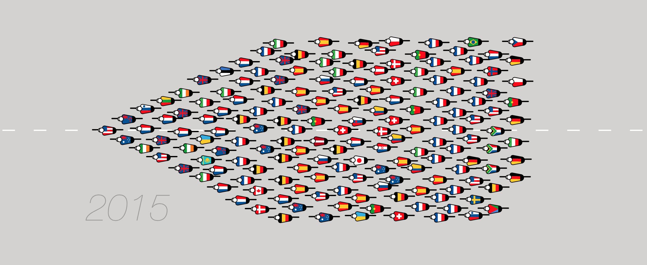
This week saw the 102nd edition of the Tour de France get underway. With riders flocking from 34 countries, the peloton is more culturally diverse than ever before, and quite a departure from the 1905 event when all but two riders were racing on home soil. To highlight the mixture of nationalities, National Geographic have created a parallax that allows us to view every rider from every race. Magnifique!
Norsecorp
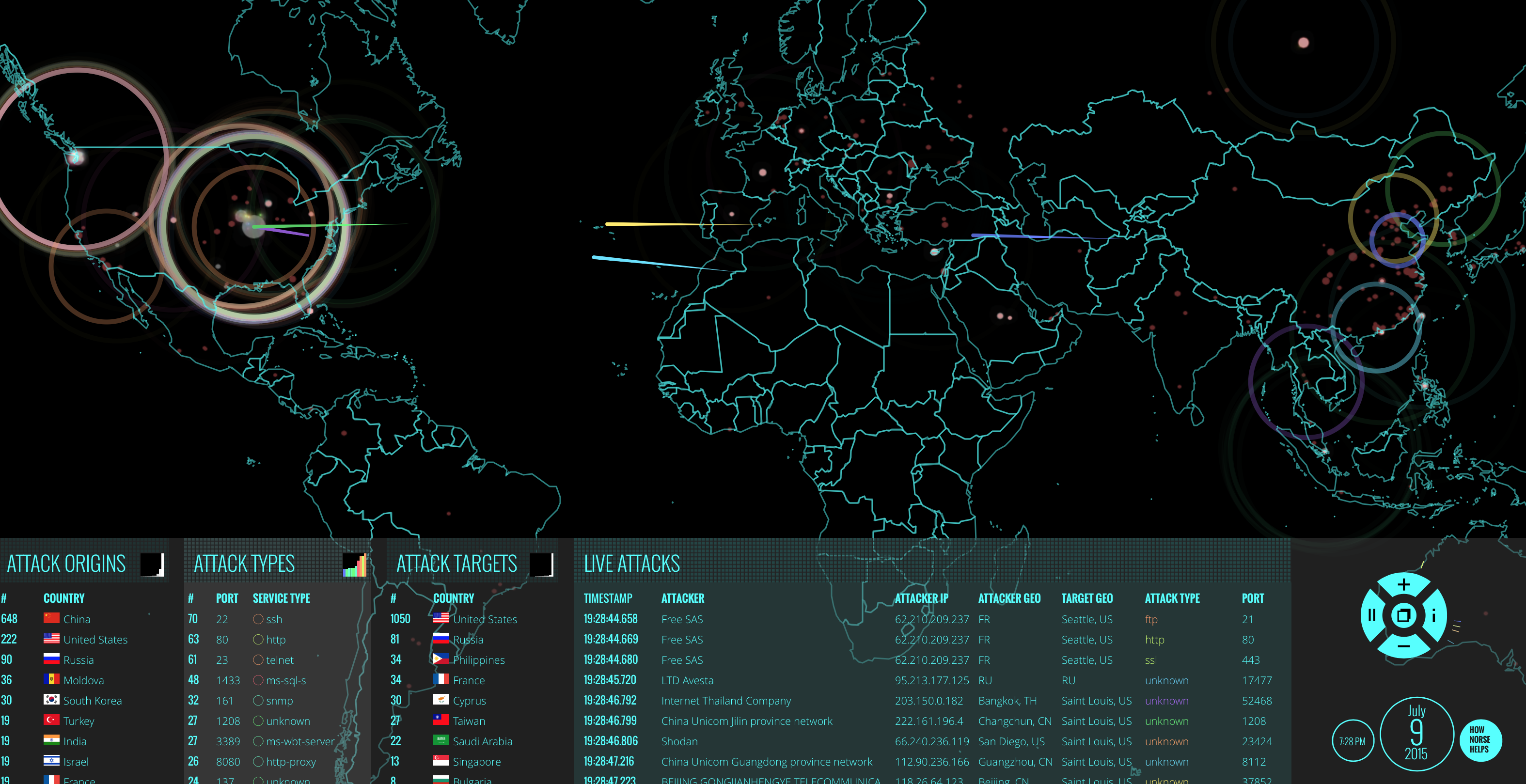
Cyber attacks on large organisations have become so ubiquitous that many of us barely raise an eyebrow when reported in the media. Earlier this week it was revealed that 13,000 email addresses had been stolen from Edinburgh city council’s database, and other stories of data theft, fraud and blackmail have become all too common. To help visualise the scale of the problem, Norse, a US online security company, created a dazzling animated map of where attacks originated, and who they were targeting. Even at a glance, it’s clear that the majority of hackers are based in Asia and are targeting the US. It’s war, but not as we know it.
Changing price of food items and horizon graphs
Flowing data
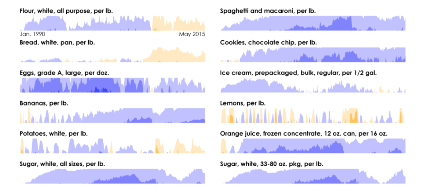
Information designers like ourselves can take comfort in the fact certain visualisation techniques such as bar and pie charts are universally understood. These examples have been in use for more than a century, and it feels like our brains have been hardwired to decipher their meaning. It is however extremely encouraging that new methods of visualisation are constantly being devised. Horizon charts have been around for less than a decade but have so far failed to go mainstream as nobody seems to understand them. Thankfully Nathan Yau from FlowingData has put together a rather nice explanation by displaying changing food prices over time. We admit it wasn’t love at first sight, but with a little practice we started to fall for their charm, leaving us excited at what other visualisation techniques lie just beyond the horizon.
Over time: Ashes history in charts
The Guardian
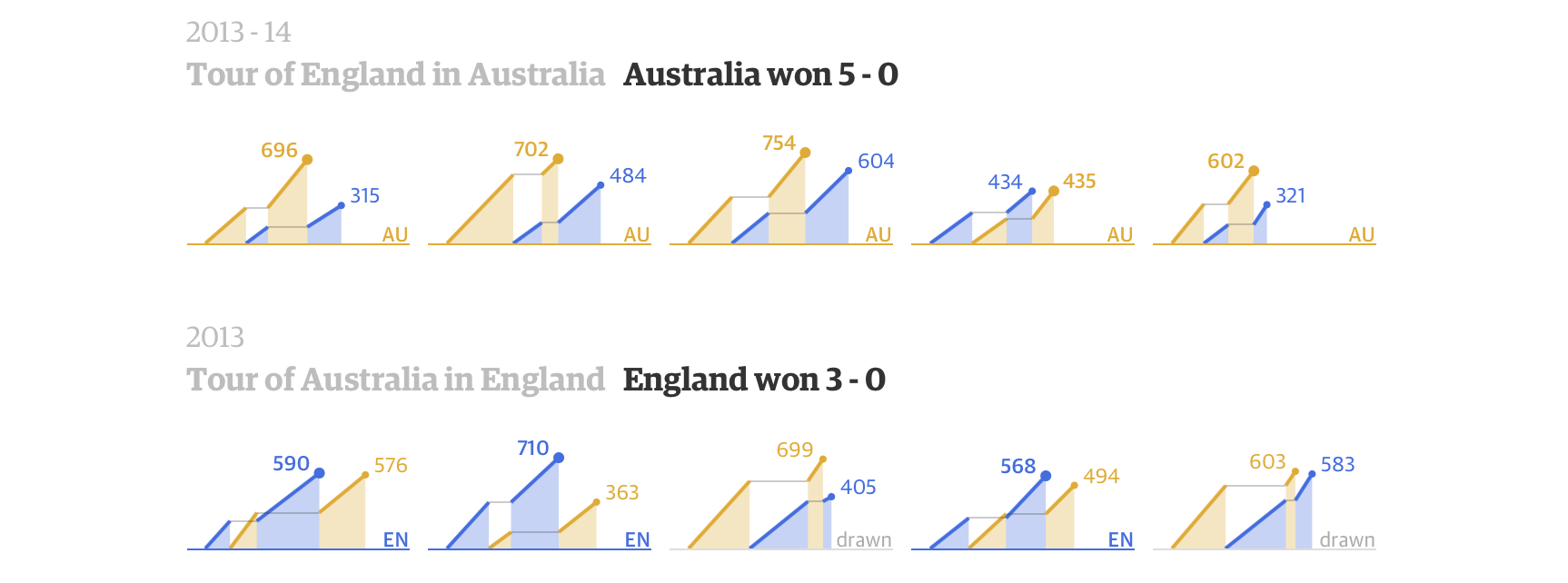
This summer, England will once again have an opportunity to draw level with the Aussies in the long-running battle for the Ashes. A win in 2005 was their first in 18 years, putting them on the road to recovery, but another thrashing in 2013-14 saw Australia once again begin to pull ahead. The history of the series is almost as long and complicated as a game of cricket itself, and so the Guardian has put together a belter of an article that knocked us for six. A spate of small multiples allows us to compare matches across the ages to help relive some of the greatest moments in the history of the series.
The Science Behind Why Native Ads Work
Sharethrough / Column Five
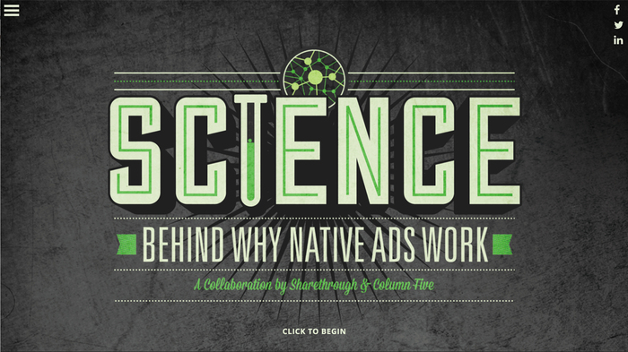
The ad world has changed, over the last decade online advertising has been growing and growing and now in 2015 it’s estimated that around 30% of brand marketing spend is going on digital. There is a constant stream of different products, techniques and strategies being developed for this relatively young industry, but what’s the best for your brand? Well, we all know that question relies on a huge amount of variables, but if you have ever been interested in native advertising look no further than this great interactive guide by Sharethrough and Column five. They make a compelling argument using the science behind the native ad, which is an ad that’s designed to ‘fit in’ with the native infrastructure of the site it’s embedded within. However, saying that it engages both the left and right side of your brain as it usually contains both imagery and text leading to greater interaction and recall from the viewer. Have a click through the beautiful site and learn how you better greater engage with your consumers.
Ogilvy / IBM

Do you think you have fast reactions? Well this might be the job for you, every year when Wimbledon comes round and we tune in to see the titans of tennis duke it out, we are also being feed mounds of data through statistics and over a 1000 graphics and diagrams. You’d think that all this data would be collected and assessed by the famous supercomputer system ‘Hawkeye’ , but it only deals with visually tracking the ball and player. The truth is, people are ones who help record, log and assess the 3.2 million data point captured at every tournament. It takes lighting fast reactions and great accuracy, and thanks to OgilvyOne and IBM you can test yourself with maketheteam.co.uk site. Here you take part in a series of games, played using a very nifty method of syncing your smartphone to the website, that will test wether you have the accuracy and reactions needed to be one of IBM’s data capturers, by making quick fire decisions based on what you see in-front of you.

Oh and anyone lucky enough to catch the remaining matches at Wimbledon, keep your eyes open for a selection of visualisations by designer Maggie Ruddy and pupils and Wimbledon High School.
A taxonomy of hipster coffeeshop names – LDN edition
Information Is Beautiful
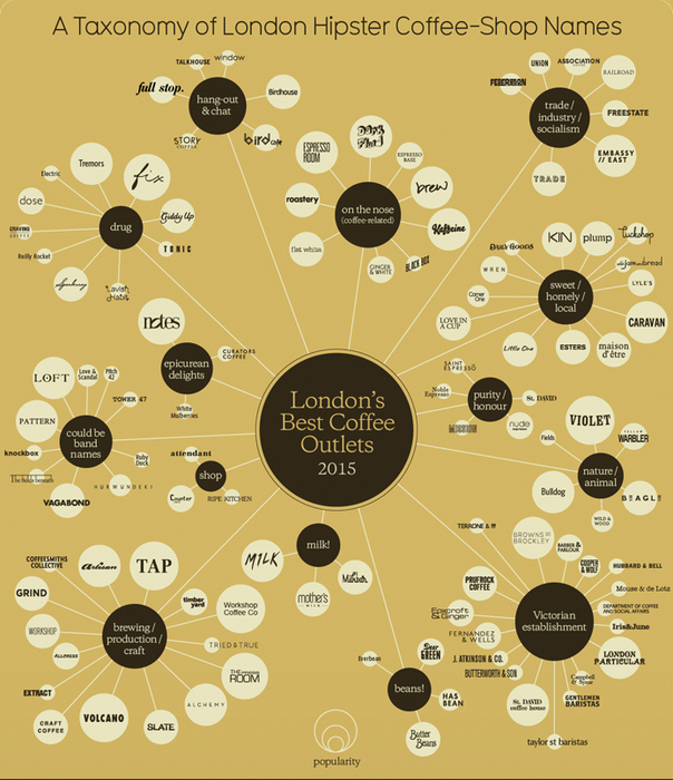
We all know what keeps a city like London moving, no not the tube (especially after the last week…) but the humble cup of coffee. Whether you prefer to enjoy your mocha-latte in a nice chilled environment or dashing to the office with a triple expresso in hand, finding the best place to get and enjoy your cup of jo can be hard in a city as big as London. Well, Information is Beautiful is back with ‘A taxonomy of hipster coffeeshop names LDN edition’ designed by David McCandless with additional design by Fabio Bergamaschi. Showing you all of the best coffee shops by popularity, type of environment and also to which point on the compass they are located around the big smoke. So you should never go without your caffeine fix again.
The price is wrong: survey exposes lack of personal finance knowledge in UK
The Guardian

Looks like when it comes to personal finance knowledge, we here in the UK are way off the money. In a recent survey by Ipsos Mori, you may be shocked to discover that Britons believe it costs four times less to raise a child than it does. Also that only 1% of us guessed that the average deposit for buying a house was between £70-£79K, the majority of us going with a mere £20K. Looks like we all need to have a closer look at the cost of living around us, but at least according to this survey most of us know how much a pint of milk is…