Pop Chart Lab
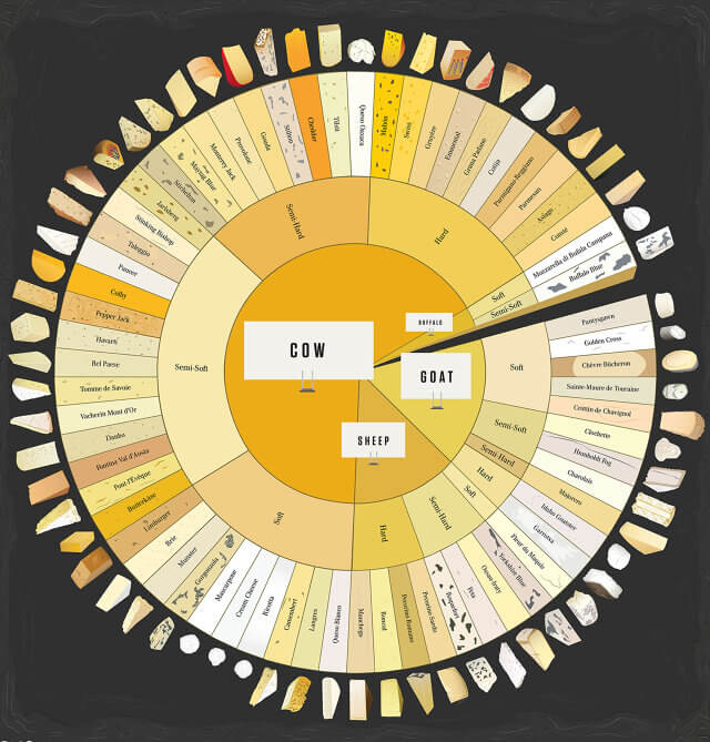
Fun fact from our lead designer, Ben Willers – did you know in France they call pie charts “le camembert”, or “un diagramme en fromage” (cheese diagram)? Well, here is “un diagram en fromage, de fromage“. (A cheese diagram of cheese).
Confused?
With 66 different varieties, you should be. This chart helps you decipher which animal produced your favourite fromage and why you might question the ‘soft’ parmesan you thought was such as great deal the other week.
Stephen LaPorte and Mahmour Hashemi

BBC

As if politics was not already complicated enough, the interactive ’Can You Build A Majority’ asks you to build a parliament-ready coalition following a random election result where either the conservatives or labour do not receive the required 326 votes to form government.
An easy task? It’s not as easy as it first appears – for instance I learned UKIP have ruled out entering a full coalition with any party, so I had to say goodbye to a Labour + UKIP coalition.
Helpful Q&A’s below the visualisation answer some of the queries you may have thought up following your time in government – the result of which makes you more informed and the UK political system only slightly less confusing.


Finally, if you’re into a more adult-orientated literary emoji experience – here is the game of emojis (You know nothing, Scott Fahlman).


Maybe after all of that politics and emoji business you need to grab a strong drink, turn down the lights and put some jazz on?
The final piece is by Fathom, who have created a static and interactive visualisation that tries to makes sense of Miles Davis’ 405 recording sessions and the 577 artists he collaborated with in the process.
The static is more art than a functional representation of the facts but still achieves it’s purpose by creating a great looking timeline, while also giving the impression of what a complicated information query provided by a hologram interface may bring up in a couple of years. The interactive contains an information cloud that lets you click on the artists and the sessions, see how they link up, while listening to a snippet of music from each collaboration.
“Don’t play what’s there, play what’s not there.” – Miles Davis