by: ferdio
Infographic
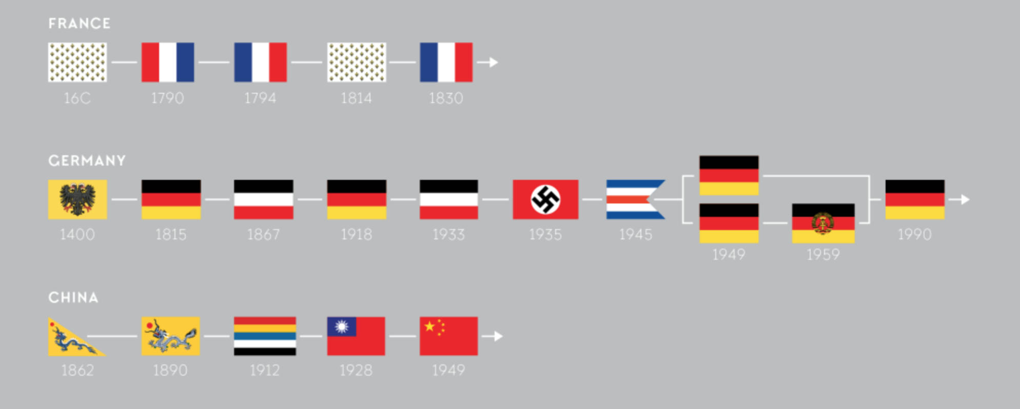
Did you know that the scientific study of the history, symbolism and usage of flags is called Vexillology? Fans of Sheldon Cooper Presents: Fun With Flags will do doubt already know this, but the rest of you can learn all about the most popular colours, designs and other interesting tidbits from this new collection of infographics from ferdio. It comes hot off the heels of the news that after months of whittling down the long list, and countless debates and referendums, New Zealanders have now voted to keep their existing flag. It certainly gets our wave of approval.
by: DANIELE QUERCIA, ROSSANO SCHIFANELLA, LUCA MARIA AIELLO
Interactive module
Back in issue 22 of our ICYMI, we looked at how odors were being measured and mapped across major cities. Now, we can combine this with a new map to see what noises are our city of choice is generating. From transport sounds, to nature, human and music, we can see exactly what audible tones characterise each area. Except, we are not entirely convinced by the findings. A quick search for our own streets threw up some unexpected results. After two years of living in Walthamstow, this writer would never have guessed the prominent sound would be “nature”. Sure, there are a few pigeons, the traffic does a pretty good job of drowning out any cooing that may be going on.
by: Stylist.co.uk
Gif
Aside from her catalogue of chart-topping hits in the last decade, Lady Gaga has shocked the world with her outrageous appearances on the red carpet, in her Music videos and even just in her regular day-to-day life! Stylist have taken it upon themselves to collate 30 of her most memorable looks into one brilliantly executed infographic/gif.

15 Data Visualizations That Explain Trump, the White Oscars and Other Crazy Current Events
by: Visme
Data Blog
From hot topics such as how Trump might win the GOP nomination (shudders), to the economic go slow in China; an informative summary of some of the Worlds top news from this month is very well put together in this post by Visme’s Visual Learning Centre. Data visualisation helps put some of these technical topics into a straight forward, eye pleasing format in which anyone can start to understand complexities such as the American Electoral system and how the weather has affected the US population this week. Any confusion is very quickly thwarted by the use of cold hard data in visually stimulating, easy to understand and Interactive visualisations and infographics.
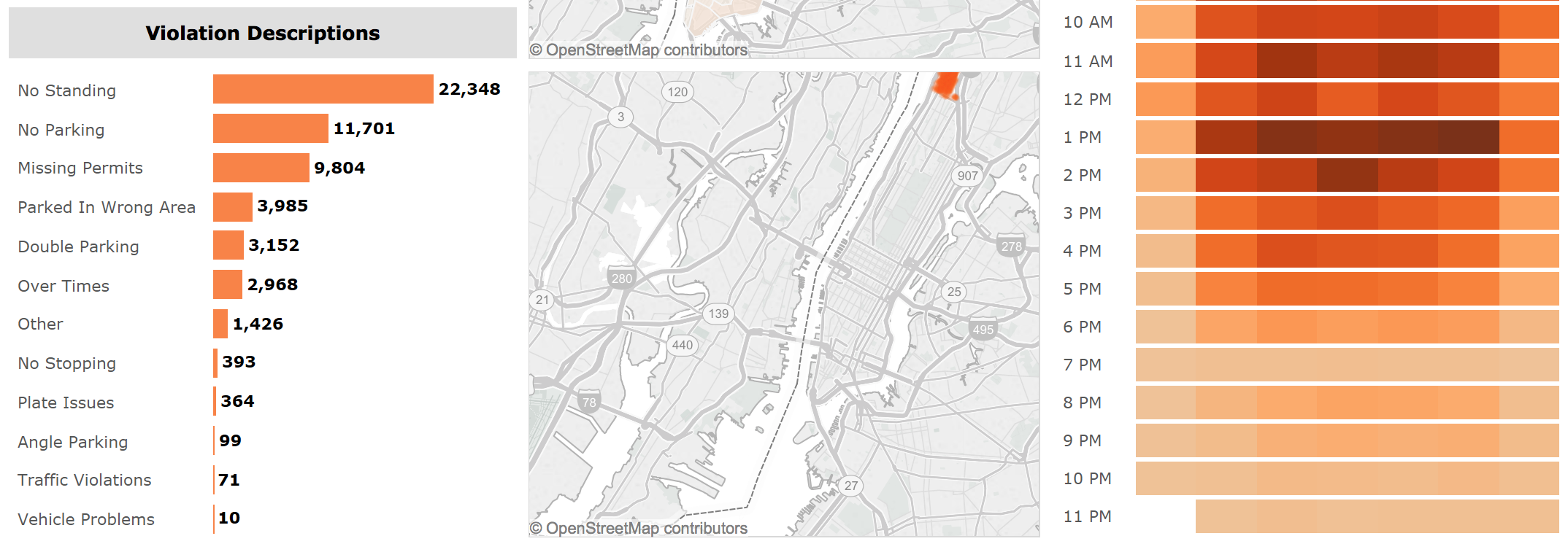
Don’t Get Ticketed in NYC: A Parking Violations Data Viz
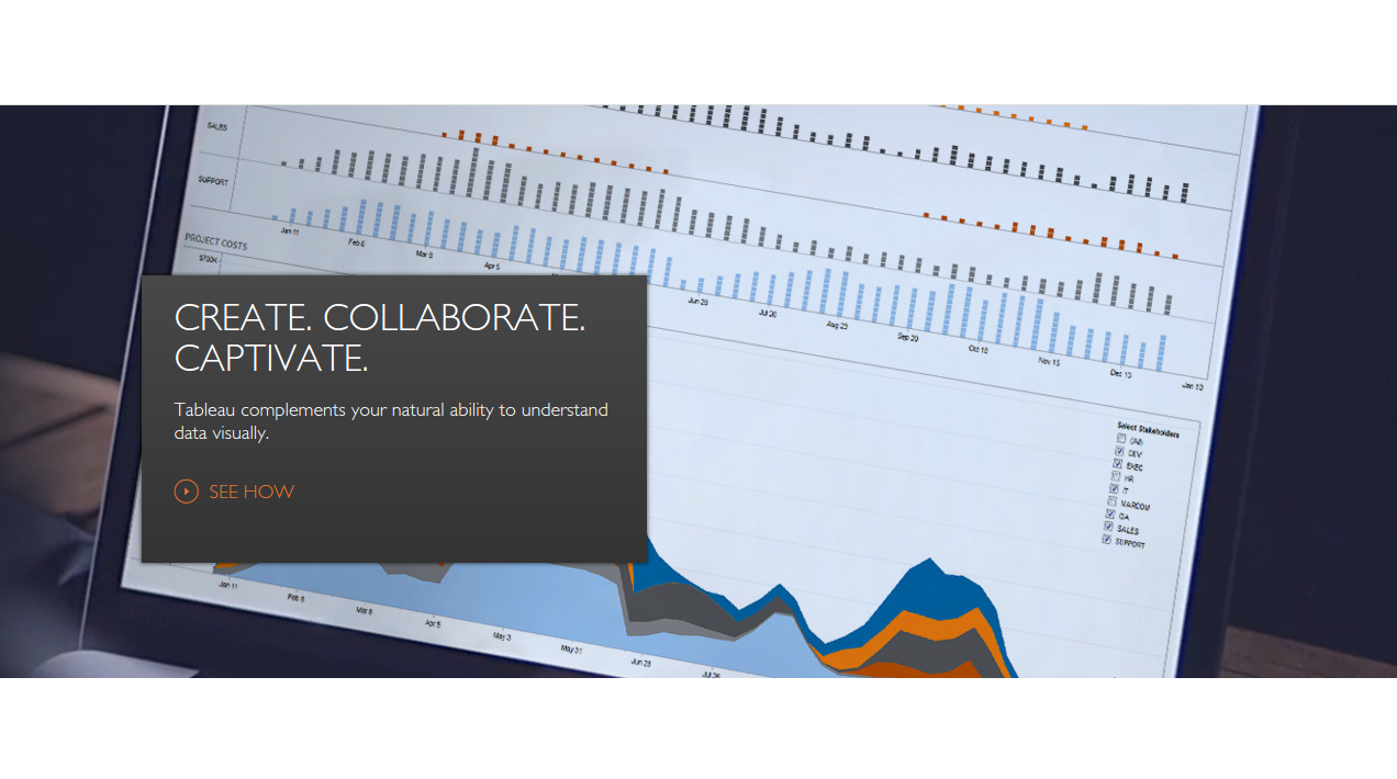
by: InterWorks
Interactive module
As we would have suspected, parking violations often occur on weekday mornings in New York City, but we were surprised to see over 9,000 tractors have been caught out by the wardens, according to data from the NYPD. This interactive module powered by Tableau allows us to explore where and when violations occur by vehicle type, and who the main offenders were. Just make sure to get caught out yourself.
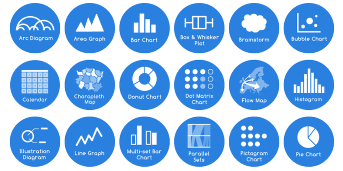
Big Data Visualization: Review of the 20 Best Tools
by: Blu Frame
Data Blog
With so many amazing free tools out there to help visualise data, it is sometimes difficult to know where to start looking for what you need. Luckily, Blu Frame have put together a comprehensive list in their review of the 20 Best Tools. From Tableau to Infogram, and Highcharts to Polymaps, plus everything in between, there is bound to be something in here that will allow you to make your visualisations really pop.
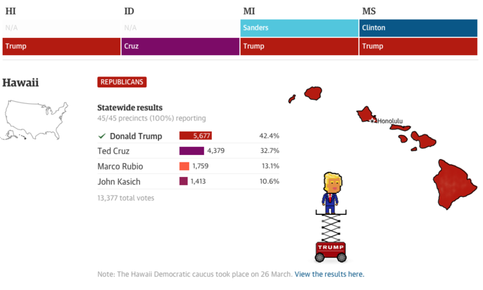
Live election results: track the votes in Michigan, Mississippi, Idaho and Hawaii
by: The Guardian
Interactive
Whilst social continues to talk daily about Mr Trump, as he makes his way towards to winning the GOP nominations. The Guardian have created a lovely little interactive, visualising the votes as they come in from the different states. It’s humorous and nails exactly how the US election’s in the US are headed.
Interview/Q&A InfoVis Expert Severino Ribecca
by: Zingers!
Data Blog
In a great Q&A with Award-winning University of the Art London graduate and infogr8 collaborator, Severino Ribecca – Zingers goes on discussing everything from big data visualisation design, how best to design for both mobile and Desktop viewing and even getting into how Ribecca manages co-location and remote working – An interesting read for aspiring and experienced Data led Visual designers alike.