ICYMI – Weekly round up of inspiring visual content Vol. 52
Reading time
Category
Missing your data-led visual content fix? Fear not, we got you. The team at infogr8 have curated the most inspiring and interesting visual content we have stumbled on this week.
A Top 30 Skills Chart
Nesta
Interactive Module
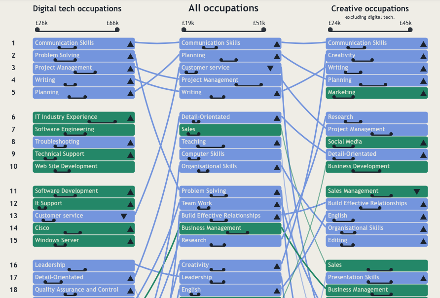
With e-learning becoming more popular, it’s handy to have data on what skills are most in demand or highest paying. Nest have put together an interactive module using data provided by Burning Glass where you get an overview of what skills certain industries are looking for and if particular skills are rising or falling in demand. It’s interesting to see that communication skills is top of the ‘All occupations’ category.
This data visualization of the ex-boyfriends in one woman’s inbox wrecked my whole day
The Verge
Data Visualisation

The quantified movement is well and truly upon us, and it’s creeping into more things than keeping tabs on how many steps we’ve taken during the day. If you’ve ever wondered what your email interactions with your ex-partners looks likes then this post by The Verge may give you an idea. It’s certainly a remarkable use of data visualisation.
Explore data for over 3,500 train stations on the Indian Railways
Socialcops
Interactive Module

This excellent interactive module by Sociocops is simple, clear, and compelling. You can easily find the fastest train route in India or the longest non-stop travel from one destination to another. All of the stations are plotted on the map and the ones which have more outgoing trains are a more solid green than the others, giving a clear indication of the busier stations.
Mapping Zika: From A Monkey In Uganda To A Growing Global Concern
NPR
Data Blog

The Zika virus has been a big talking point of late with 500,000 to 1.5 million estimated cases in Brazil alone. But it’s not a new virus, in fact it was first identified in a rhesus monkey in the tropical Zika Forest in Uganda. This data blog by NPR goes through the timeline of when the Zika virus was first identified, to its emergence through the years in different parts of the world, to the current outbreak which is taking place mainly in the Americas.
The Refugee Project
Hyperakt & Ekene Ijeoma
Interactive Module

The Refugee Project by Hyperkat and Ekene Ijeoma is an interactive map of refugee migrations around the world in each year since 1975. UN data is complemented by original histories of the major refugee crises of the last four decades, situated in their individual contexts.
This Chart Shows Who Marries CEOs, Doctors, Chefs and Janitors
Bloomberg Business
Interactive Module

Have you ever wondered if your profession determines who you marry? This interactive module by Bloomberg Business, using data which covers 3.5 million households, shows how people are pairing up. Some pairings are you would have guessed, but there are some weird ones. See who you’re most likely to end up marrying or whether your marriage follows the trend.
Fans on the Move
Ticketbis
Interactive Module

Thousands of people from across the planet travel each month to attend the world’s biggest events. This interactive module by Ticketbis encompasses the most internationally popular events which took place in last three years depicting the flow of visitors from their countries of origin to their destinations to attend events across several different categories. Enjoy this fascinating and compelling interactive!
You Are What You Ride
Cyclemon
Scrollable Story

This is fun! The type of bicycle you ride says a lot about who you are. I think I’m a vintage guy. See what your bicycle preference says about you — and be honest!