Missing your data-led visual content fix? Fear not, we got you. The team at infogr8 have curated the most inspiring and interesting visual content we have stumbled on this week.
Homan Square: A portrait of Chicago’s detainees
The Guardian
Scrollable Story
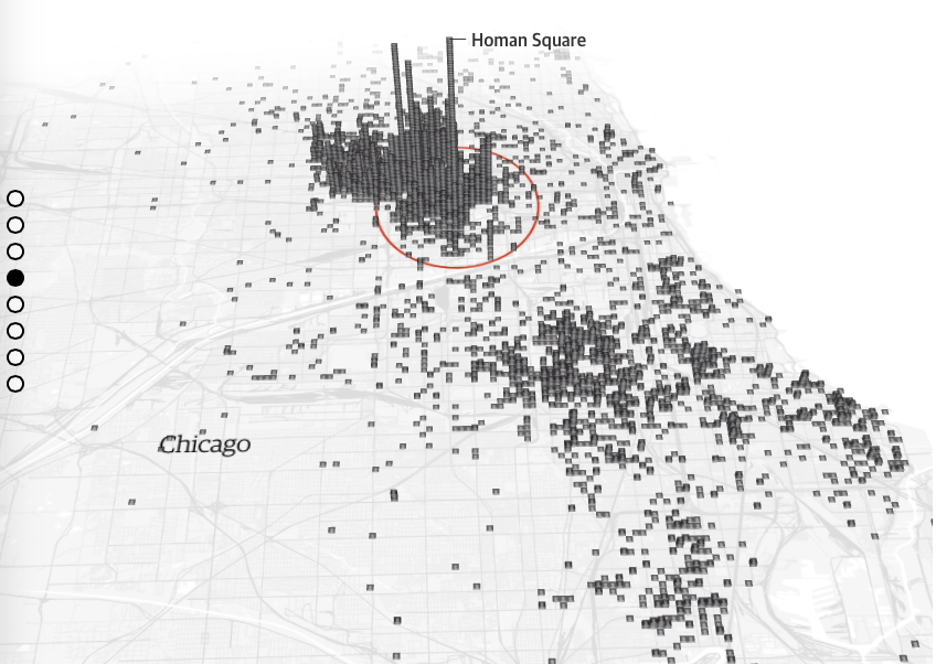
A fascinating scrollable story by The Guardian on Homan Square, a secretive Chicago police warehouse. After launching a transparency lawsuit, the Guardian has forced the Chicago police department to disclose internal records. They help to tell the stories of thousands of detainees. The data visualisations in this post are excellent.
Top 18 houseplants for purifying the air you breathe, according to NASA
Love the Garden
Infographic

Having plants around the house doesn’t only give a more natural look to your home, but it purifies the air. But not all plants are equally effective according to NASA’s Clean Air Study, some are better at air-filtering than others. Love The Garden created an infographic that lists 18 NASA-recommended plants for improving air quality as well as the common toxins that each plant can treat.
How China’s economic slowdown could weigh on the rest of the world
The Guardian
Data Visualisation

The effects of a slowdown in China are felt all over the world and with its imports being down by 14.6% over 2015, there could be trouble ahead for countries around the world. The Guardian have created a compelling data visualisation of the intricate details of this slowdown.
London’s Expected House Price Gain
Freehold Sale
Infographic

London is a great place to live with it’s amazing jobs, open green spaces, and excellent quality of life. But this also means that there’s a high demand for housing which increases house prices. Freehold Sale have put together this infographic to show the dramatic price increases expected in the London’s housing market.
Non-Fiction Books Everyone Should Read
Information is Beautiful
Infographic

There’re always too many books to read and not enough time. Information is Beautiful have pulled data from awards, review sites and the public to find the Non-Fiction tomes everyone agrees are worth reading. A simple and useful infographic for those times when you’re looking for a book to read.
How Trump Happened
WSJ
Scrollable Story

Many of you may think this when you watch Donald Trump speak: “How did Trump happen?” This scrollable story by WSJ sheds some light on how Trump has taken advantage of the economic anxiety to rally up supporters amongst other fear mongering tactics.
Cocktails
Information is Beautiful
Infographic
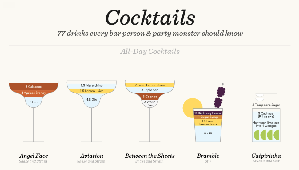
It’s always handy to know some classic cocktails for when you’re out on the town. This infographic by Information is Beautiful has 75+ classic cocktail recipes from the International Bartender’s Association’s list of drinks every bar person & part monster should know. This could come in handy!
Women in the movie industry
Polygraph
Data story

Listeners to the excellent BBC Wittertainment movie review podcast will no doubt be familiar with the the Bechdel Test, a measure of how male-dominated many movies have become. It uses three criteria to judge movies, and to pass they need to satisfy three requirements. It has at least two women in it, who talk to each other, about something besides men. Unfortunately, more movies than you may think fail, and this interactive from Polygraph allows us explore and discover why. Unsurprisingly, teams of male writers, producers and directors are all to blame, and since men outnumber woman buy a considerable margin across he industry, things don’t look set to improve anytime soon.