Missing your data-led visual content fix? Fear not, we got you. The team at infogr8 have curated the most inspiring and interesting visual content we have stumbled on this week.
Uber Brand Experience
Uber
Scrollable Story
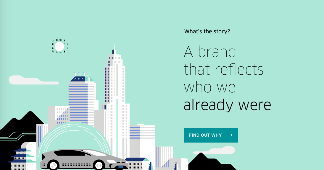
This isn’t your conventional scrollable story, but in telling Uber’s brand story it certainly is compelling. The smooth scrollable page acts as a sort of journey, which is fitting for what Uber does. It’s easy to understand who Uber are and what they stand from the content, especially the videos.
You’ll Be Left Dumbfounded by This Data Visualization of WWII Deaths
RYOT
Animated Video
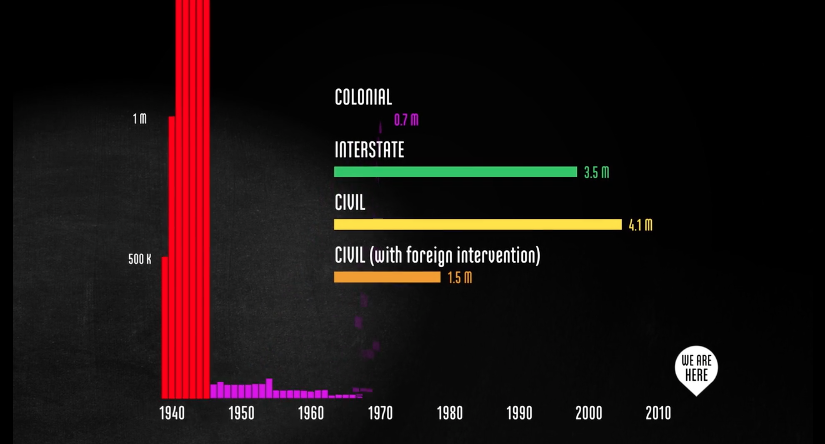
Statistics can sometimes be so big that we find it hard to contextulise them. That’s certainly the case when you’re dealing the amount of deaths in World War 2, the numbers are simply staggering. This animated video by Neil Halloran helps to put in perspective one of the deadliest wars of our time.
What Do You Feel Like Reading
Penguin
Infographic

Have you ever had that moment where you’re not sure what book you want to start next? Something mysterious, or maybe something edgy, and if that’s not your thing then there’s always something historical. With all the options we have available to us these days it can feel overwhelming when selecting a book. To help with this, Penguin have made an infographic which curates a selection of books which categorised under sections like ‘Something that will make you smarter’.
Project Ukko: Seasonal Wind predictions for the Energy Sector
Truth & Beauty Operations
Data Visualisation

This fantastic visualisation by Truth & Beauty Operations presents a novel way to spot patterns in seasonal wind prediction data. Understanding future wind conditions can become a crucial component block in supporting clean energy sources and climate change resilience. This post gives you a detailed insight into the design process and exploration that went into building Project Ukko.
Spurious Correlations
Tyler Vigen
Data Tiles

You know that phrase “correlation does not imply causation”, well, Tyler Vigen as taken that to the extreme with ridiculous examples of correlation between totally unrelated things — it’s quite hilarious. For example, per capita consumptions of mozzarella cheese correlates with civil engineering doctorates awarded. Of course it does!
Show, don’t tell
Microsoft
Data Visualisation

Data used to be something that was predominantly appreciated by engineers and statisticians, but that is no longer that case. Data is becoming cool — it’s now mainstream and essential. Microsoft’s Power BI enables those who are data-inexperienced or even data-phobic to transform spreadsheets into rich graphical reports. It also allows data experts to visualize data in a fraction of the time and to experiment with new ways to show and interact with their reports. It’s a useful tool for companies to instantly share their reports online – without any coding requirements.
What to Expect from Data Storytelling in 2016
Tableau
Data Visualisation

2016 will see an acceleration in the different ways data storytelling is done. Gone are the days of just focusing on computer screens as the stage for your content, as mobile and social media dominate as places where people consume content. This list by Tableau takes new behaviours into consideration and offers some great advice on what to focus on in 2016.
The infographic of Messi’s 500 games
Barcelona
Infographic

This is a nice simple infographic Barcelona did to celebrate Messi’s 500th game for the club. The man who’s regarded as probably the best footballer ever has an incredible record, and you can see in this infographic just how important he is to Barcelona.