Missing your data-led visual content fix? Fear not, we got you. The team at infogr8 have curated the most inspiring and interesting visual content we have stumbled on this week.
See Nintendo Gameworlds Turned Into Awesome Subway Maps
Visual News
Data Visualisation
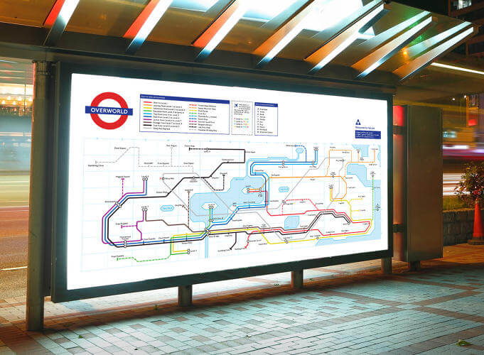
When playing video games you can feel as if you’ve entered a whole new world. Navigating this new world at first is tricky, but you soon start to become familiar with the different levels and what ghastly creature awaits you around the corner. Talking of familiar, Matthew Stevenson came up with this great idea to reimagine classic Nintendo games as the world’s most notable subway systems. Each map is a walkthrough of the game, creatively matched to a traditional transit line. If you’re a Nintendo nerd you’ll surely love these!
How do you build the world’s biggest dinosaur?
BBC
Scrollable Story

Dinosaurs, what’s not to like about them? They’re fascinating. This scrollable story by the BBC helps us discover some interesting facts like where significant fossils were found and how these findings over time shaped what we thought certain dinosaurs looked like. Ever wondered how we build dinosaurs? See the meticulous attention to detail that does into retrieving, cleaning, analysing, and reconstructing. It’s amazing.
Moon 1
Pavel Kedich
Scrollable Story

Seeing the moon in the night sky can sometimes seem ordinary — an everyday occurrence. But the moon is anything but ordinary. It’s integral to the how the Earth operates. No wonder we’ve made astronomical efforts to reach it, stand there, and look back at our home, Earth. This scrollable story by Pavel Kedich is a lovely visualisation of these efforts, the details are fascinating and compelling.
The fight against antimicrobial resistance across Europe
Nesta
Interactive Module

This Interactive Module by Nesta sheds light on Europe’s ongoing fight against antimicrobial resistance. Explore the resistance levels of five different bacteria to a range of antibiotics. It’s interesting to see the difference between different countries and regions.
The New New York Skyline
National Geographic
Scrollable Story

New York, New York. It’s really the epitome of a city — tall buildings, famous subway, cool places to wine and dine. This scrollable story in National Geographic shows New York’s skyline is changing with even more skyscrapers descending upon the city. The 3-D views are very impressive and help visualise exactly where these new buildings will be situated.
Whatever it takes – Together, we’ve made the difference for millions of children in crisis
Save the Children
Scrollable Story

This scrollable story by Save the Children shows what a traumatic year 2015 has been for children. From the refugee crisis in Europe, to the suffering in Yemen, and the massive earthquake in Nepal, Save the Children have been working hard to help those in need. This is an eye-opening insight into something that we mostly experience through the news on our televisions.
Learning to See: Visual Inspirations and Data Visualization
Giorgia Lupi
Data Visualisation

Abstract art has a lot more in common with data visualisation than one would expect. This is because learning how to see is essential to learn how to design. This post by Giorgia Lupi is a great insight into understanding data visualisation and she gives some great examples from real projects.
Trump Donald
Animal
Interactive Module

Well, this is just genius. Animal‘s reason for creating this site is: “The domain TrumpDonald.org was available and we just couldn’t resist. That’s it, really.” Fair enough, our hats go off to you!