Missing your data-led visual content fix? Fear not, we got you. The team at infogr8 have curated the most inspiring and interesting visual content we have stumbled on this week.
Djokovic’s 2015 was the greatest ever men’s tennis season
The Financial Times
Data Visualisation
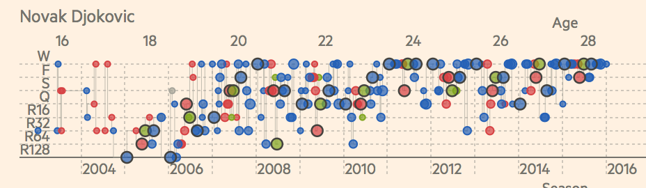
Even now and again a sports superstar comes along who manages to outshine all their competitors. It happened in F1 with Michael Schumacher, it happened in snooker with Ronnie O’Sullivan, and it’s happening now in tennis, thanks to Novak Djokovic. That is the impression we got when viewing this beautiful set of data visualisations from the Financial Times. His 2015 season was truly spectacular, seeing him enter the finals in every major championship that year, and winning the vast majority of then to boot. We are even treated to a series of dot plots showing the careers of other players as they won and lost on a range of different surfaces. Check it out, it’s truly ace.
World Earthquakes 2000 – 2015 Data Visualization
422 South
3D Animation

At least one of us here in the infogr8 office remembers the traumatic events of 27 February 2008 when an earthquake measuring 5.2 on the on the Richter scale shook the city of Lincoln in the UK, causing untold damage to loose roof tiles across the city. But this is just one among hundreds of thousands of earthquakes that shook the world in the last fifteen years. A 3D animation from 422 South in Bristol visualises all the world’s quakes between 2000 and November 2015 of magnitude 4 or more. Unfortunately the UK is not in view when that aforementioned quake struck the city of Lincoln, a problem which could be solved if this project was one day turned into an interactive spinning globe that the user can control. Now that would really rock our world.
Diversity Among Winners at the Oscars
Bard Edlund
3D animation

It’s that time of year again when movie lovers get excited about the imminent Academy Awards, but this year the event has been overshadowed but a wave of controversy. That’s right, we can’t believe that Inside Out did not get a Best Picture nomination either. Seriously, what were they were thinking? There’s also some who are being quite vocal about the lack of diversity in this years nominations, with black and Hispanic actors apparently being underrepresented. This 3D animation from Bard Edlund beautifully shows us how these groups have been represented in the years gone by, so make up your mind if the Academy really are out of touch, of all this fuss is a load of old ball.
Big Bang Data
Various Artists
Exhibition

You don’t need us to tell you that data is all around us, but for those lucky enough to live in London, you can immerse yourself in it like never before. Now extended until 20 March 2015, Somerset House are holding a major new exhibition on how data is collected and visualised, and how this impacts the new world we live in. Filled with artworks and interactive, there is plenty here for data lovers like us to geek out over.
US election: The 11 cards that sum up the Republican race
BBC
Data Cards
The Museum of the World
British Museum and Google Cultural Institute
Interactive Timeline

Museums are fascinating places, filled with artefacts from different periods and parts of the world. Wouldn’t it be wonderful to just jump to one point in history and see what life was like then? This interactive timeline lets you travel through time, continents and cultures, featuring some of the most fascinating objects in human history. The project is a partnership between the British Museum and Google Cultural Institute. Jump back in time to explore objects from across diverse cultures and listen to British Museum curators share their insights.
The Most Detailed Map to Date of Our Place in the Universe
Furturism
Video

The magnitude of our universe can be hard to grasp, our brain didn’t evolve to understand such complexity, yet it’s impossible to not be fascinated by stars in the night sky. This video maps out our place in the universe and does an excellent job in many us feel tiny. What seemed hard to understand before just got a little bit easier — ok, not so much, but it’s a great video.
Mekong: A River Rising
The Guardian
Scrollable story

The Guardian do some great scrollable stories, in this one they look at the potential problems that the Mekong river may cause to 70 million people in Laos. Filled with stunning images, this piece breaks down the effects climate change is having on these vulnerable regions.