Missing your data-led visual content fix? Fear not, we got you. The team at infogr8 have curated the most inspiring and interesting visual content we have stumbled on this week.
Every shot from every “Star Wars: The Force Awakens” trailer, logged and charted
Quartz
Data Blog
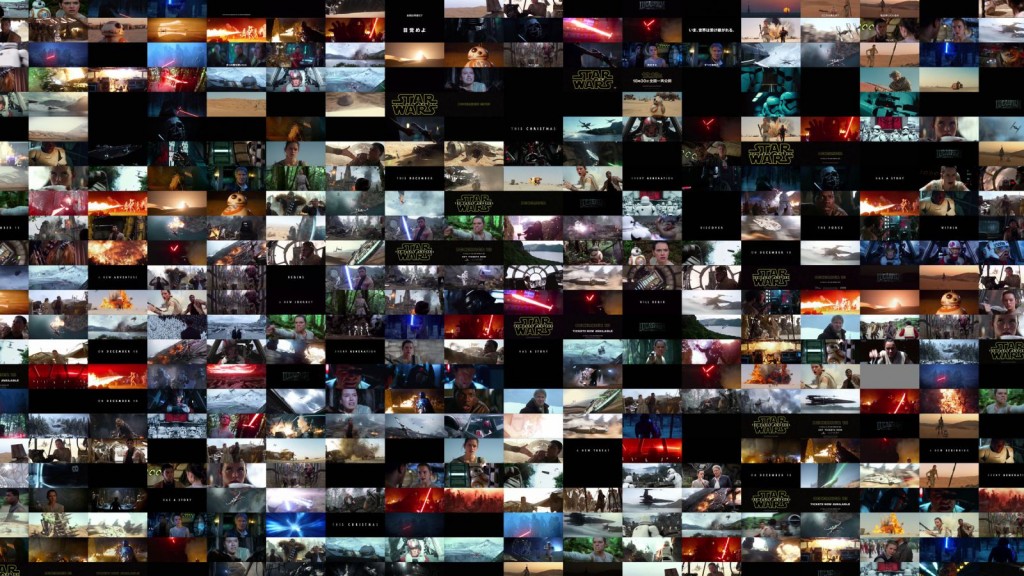
There are certain things from which you can not escape when visiting the cinema. The sickly smell of popcorn and people kicking your seat from behind spring to mind, but seeing a trailer for Star Wars has been another certainty of late. We must have seen it 40 times or more, and it is a relief that after over a year of hype the film will finally be released later this month. Quartz are probably even more sick of the trailers as we are, as they have poured even more time into analysing all of the shots, and how it has been drip-feed to fans around the world. The findings can all be found in their blog which you should definitely check out. The force is strong with this one.
A Blueprint for a Carbon-Free World
National Geographic
Data driven website

The EU has set the UK a target to generate 15% of its energy from renewable sources by 2020, a goal which it is struggling to hit with only a few years to go. But what could a totally renewable future look like for countries around the world? National Geographic have considered environmental and other factors across the world to help paint a picture of what energy mixes could look like from county to country. Apparently the UK should invest strongly in wind, both on and off-shore, and abandon hope of developing a strong solar infrastructure. After the weather we have been having of late, we think this could be a wise move.
Since You’ve Been Watching: Space Travel
BBC
3D Animation

It is sometime difficult to comprehend how expansive our own Milky Way is, but our stomachs took a turn for the worse when we learned that we are whizzing around the sun at 107,000km per hour. But we are actually traveling much faster than that, our galaxy is also spinning at around 220 km per second. This 3D animation from the BBC should come with a sick bag!
How to Build a Human by Eleanor Lutz
Tabletop Whale
GIF

Over previous weeks, regular readers of our ICYMI blogs would have seen a highlight of some of the entries for this years Information Is Beautiful Awards 2015 by showing some love towards our favourites. This week, the awards took place in London some of the team popped along for the knees up, I hear wine and copious amounts of sausage and mash was on the menu! Out of all the stellar pieces which made the longlist, shortlist and won awards, Eleanor Lutz’s How to Build a Human stood out for me as a clever idea executed impeccably. Now we all love a gif, who doesn’t, but for me Eleanor has taken a topic I for one struggled to comprehend at secondary school. It’s a credit to her for taking a subject and simplifying the process in such a way that the even a teenager playing on their phone at the back of the class can at least grasp the concept of how human’s evolve. If schools today aren’t using animated gifs to teach such topics to children, particularly processes like reproduction to photosynthesis the example by Eleanor should be a front runner as to why methods of teaching should evolve too.
by CCCCCCC
GIF
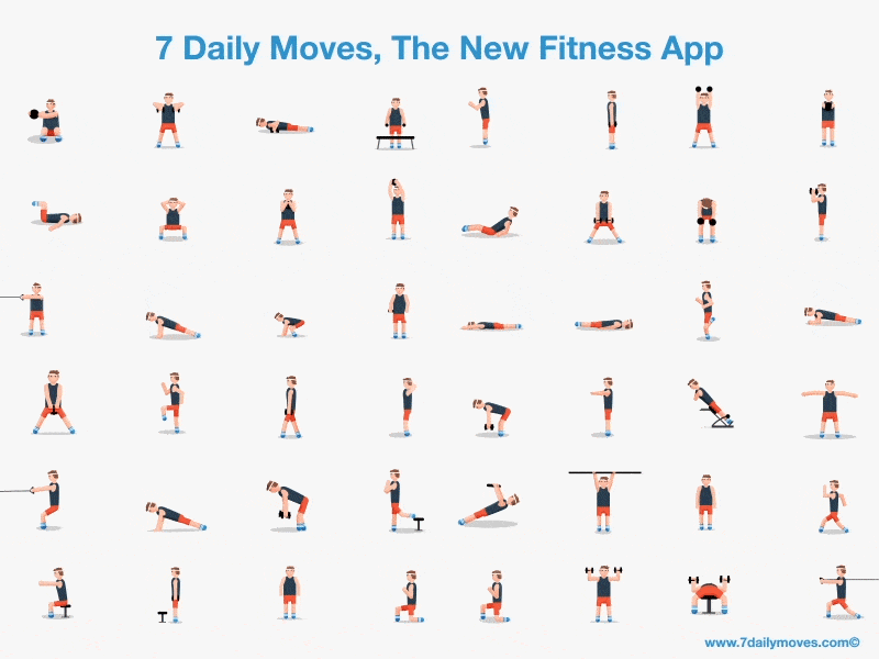
Who needs a Personal Trainer when you’ve got this cool GIF. Just watching the little fella do his workout is quite satisfying, and possibly even worth one workout for the week — ok, maybe not — but we’re super pumped right now.
Memory Champion Teaches You How to Memorize Anything
WIRED
Vlog
With the internet at our fingertips, we’re less likely to have to remember a lot of things these days (I can barely remember starting this sentence). However, the presentation of information is even more important in today’s digital age. This video by Joshua Foer, the former U.S.A Memory Champion,is intriguing in how he uses a story to remember things, further reinforcing the technique of storytelling as the best way to teach and present data.
Plume Labs
Data driven website

Where in the world are people choking under clouds of smog? Paris startup Plume Labs, hopes to that visualising data from 150 monitoring stations around the globe will add a sense of urgency surrounding the negotiations to reduce emissions. Their Air Report website allows anyone to see where the air is most toxic, on both a global and city level. We pity the poor fools working in the Oxford Street area who have to inhale some of the worst air in the London, but our capital apparently smells like a rose garden when compared to the likes of New Delhi. Keep calm, and carry on breathing.
New Report and Maps: Rising Seas Threaten Land Home to Half a Billion

With the global climate talks taking place at the moment in Paris, this report by Climate Central puts into perspective how important these talks are, and more importantly the critical need for action. Climate Central have used interactive maps to show the devastation that will be caused by 2°C and 4°C of warming. The images are scary to say the least.