ICYMI – Weekly round up of inspiring visual content Vol. 42
Reading time
Category
Missing your data-led visual content fix? Fear not, we got you. The team at infogr8 have curated the most inspiring and interesting visual content we have stumbled on this week.
Find out how you measure up against Simon Cowell
Lemoncake
Scrollable story
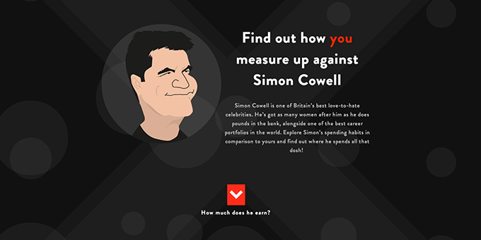
As it wasn’t depressing enough to go through the extortion of the Footballers’ salary calculator we wrote about in Vol 5, we now have to endure the same treatment being compared to Simon Cowell. This witty scrollable story from the guys at Lemoncake makes use of context in the best way possible giving you a glimpse of Simon’s fortune and how you measure up agains his lush cars and houses. Although the results are gloomy for us mere mortals, the execution is rather mesmerising. Go forth and try it out, we dare you!
Growing trends in wearable technology
Raconteur
Infographic
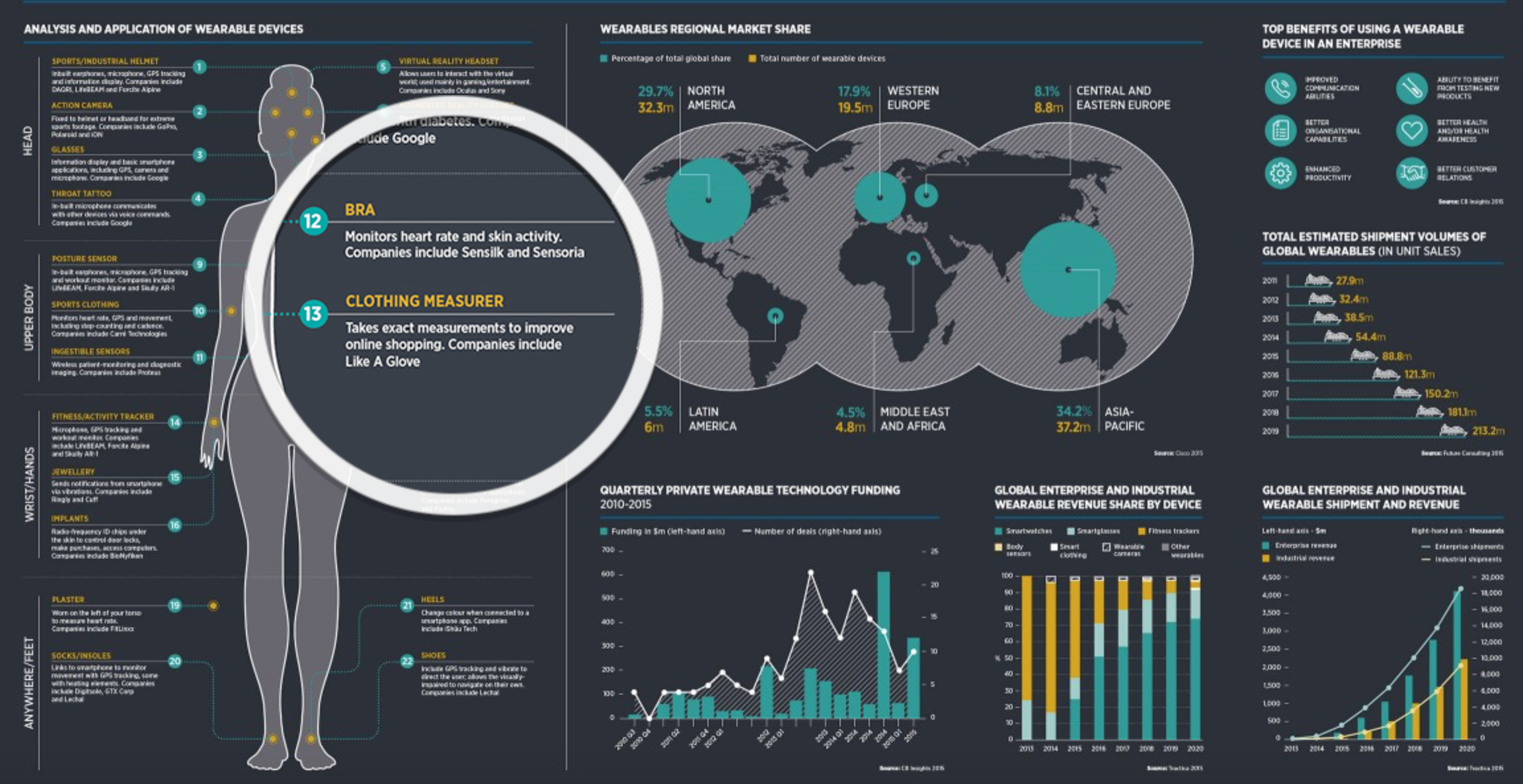
We’ve seen quite a vast growth in fit bands and smart watches lately, but we haven’t yet considered being completely digitalised from head to toe. This beautifully executed infographic from Racounter showcases some impressive innovation in wearable technology which is yet to become a trend.
Fleximize
Data driven website

The infogr8 team are all off to see the Steve Jobs move tonight. If you have wondered how the mind of an entrepreneur works? Fleximize have compiled a timeline of some of the worlds leading minds, from Colonel Harland Sanders, to Walt Disney, visualising events throughout their business careers. Judging buy this, it seams the secret to success is starting young.
Simon Anthony
Scrollable story

Who would have thought that monkey poo could teach us so much about virus patterns, and that it would make such interesting reading? With research led by Simon Anthony we are taken through a scrollable story that explains hows researchers are learning about how viruses behave and spread. To make sure you have understood you can even test yourself with the nifty game. It’s sh*t hot!
Stefanie Posavec and Giorgia Lupi
Micro content

Giorgia Lupi and Stefanie Posavec have taken a very analog approach visualising their own personal data, and they have been recording different personal activities using only a note book and pen over that last year. The data is then transformed into a hand sketched visualisation before being posted to the other. From counting the number of times they check the time, to how many times they say “thank you”, this is a revealing insight into the patterns and rhythms in their own existence. The infogr8 team were at the IIB Awards this week and saw the pair pick up not one, but two awards, including best piece in show. Top stuff!
10 Hilarious Charts That Explain What a Designer’s Life is Really Like
Creative Market
Micro content

Creative Market have put together some charts which make entertaining observations about the challenges designers face every day. From the relationship between coffee and productivity to the emails received from loved ones, and more so — “that client”.
30 dynamic and surprising animations gifs
WBD Team
Gifographic

Dynamic and animated GIFs are great for bringing design to life. As the world becomes more digital, designers are using GIFs to build more interactive content on devices which are capable of powerful graphics. The animated icons above by Virgil Pana show the sort of playfulness that can be achieved with GIFs.
We’re particularly fond of a video explainer communicating a complex subject in a clearer way. Vox manages to frame the Syrian war crisis in this engaging, well journaled five minute animation. The explainer starts with a matrix allowing the user to quickly get a feel for the different sides involved and it’s foreign backers. Pacefully running through a magnified timeline, Vox weave in news footage highlights to give context to the scenarios that unfolded. The map is the main vocal point allowing the viewer to see how territories were forming and the conflict areas between the groups. Not only is the story conveyed in a clear, engaging way, the art direction mimics the tone of the subject using clean treatments on the photos and key line maps. Add the subtlety of a tense soundtrack and narrative and here we have a broadcast quality explainer that would be well received on any of the large news broadcast channels. The video deservedly won a Bronze accolade at this weeks Information is Beautiful Awards 2015, congrats to all that were involved.