ICYMI – Weekly round up of inspiring visual content Vol. 40
Reading time
Category
Missing your data-led visual content fix? Fear not, we got you. From a story on the frozen lands of Greenland to and handy app to keep under control pollution levels, the team at infogr8 have curated the most inspiring and interesting visual content we have stumbled on this week.
How Red Meat Joined the 478 Other Things That Might Give You Cancer
Bloomberg Business
Scrollable story
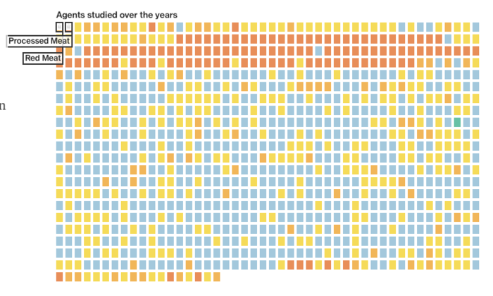
Last Monday the WHO released a report with shocking news for all meat-lovers: processed meat causes cancer and red meat increases cancer risk. A panel of global experts have crafted the report after six months of extensive research and one week of meeting in Lyon, France to render a decision. So, processed meat and red meat join the list of 478 of carcinogens. But how does WHO decide what to declare as dangerous for our health? This scrollable story explains how the process to identify potential carcinogen agents works and divides them into five main categories. Interesting fact: so far, only one compound taken under scrutiny by WHO has been classified as not likely to give you cancer.
The Increasingly Crowded Unicorn Club
CBInsights
Infographic

Every company able to reach a value of one billion dollars or more is entitled to become member of a fairly new club: the Unicorn Club. Although in recent times it seems that this club is losing a bit of its exclusivity. Between 2011 and 2013 only a few companies were able to gain this impressive valuation but during the last two years we’ve witnessed an explosion of unicorns, with over 60 in 2015 alone. The guys at CBInsights depicted this trend visually via this chart, it’s messy but for good reason, it really gets the story across. At the time of writing the leading unicorn company is Uber with and incredible valuation of $51 billion, followed by Xiaomi ($46 billion) and Airbnb ($25.5 billion).
Plume Labs
Application

Unfortunately for the ones of us living in big cities, pollution is a daily issue. The levels of smog in the air can drastically change in minutes and for the average person its not easy to keep track of these high and lows. Not anymore, an innovative app for iOS and Android is making its way through the charts. Its name is Plume.
Thanks to the live data gathered around the globe through sensors, this fantastic app shows live levels of pollution alongside a forecast for the rest of the day. There’s also a nice preference section to check recommendations based on whether you are intending to do outdoor sports, cycling, bring a baby out or eat outside. Everything is presented in a clear and simple structure and at the same time appealing style.
South China Morning Post
Infographic

The large majority of articles about smoking focus on how deadly cigarettes are. One question that is often asked is: why don’t governments ban cigarettes for good? The answer is quite simple: taxes. Many governments around the world earn billions on cigarette taxes and supported by massive tobacco companies they are not willing to lose those incomes. The South China Morning Post designed a very handy infographic comparing average prices, percentage of smokers and taxes of a number of countries worldwide alongside a series of data and graphs on the situation in China. Here the consumption of tobacco related products is rising, this is also due to the lack of regulation from the central government and more than 1 billion citizens are directly exposed to smoke and its unhealthy effects, enlightening!
The New York Times
Interactive

Usually scientists love spending time in front of their computer to carry out complex calculations and to apply complicated models to series of data to better understand the world and develop forecasts for the future. Sometimes they need to leave their offices and dive into a totally different, and often dangerous reality. This is the case of Dr. Laurence C. Smith and his team from the University of California. As reported in the New York Times’ interactive story, they left their comfortable office in L.A. to explore the frozen lands of Greenland with the final aim to collect data on global warming and rising sea levels. The Greenland ice sheet is one of the biggest and fastest melting ice sheets on the planet and this led the team to its desolated snowy plains. Read the full, super interesting story here.
Kornhaber Brown
Video Documentary
In recent years we’ve witnessed data visualization gaining more and more attention, importance and traction. As many practitioners will tell you, data visualization is nothing new. We have always tried to represent our knowledge in the most straightforward way possible. A notable example is Galileo Galilei. He used to draw what he was seeing through his telescope on paper to have clear notes of his findings. In this video documentary, Kornhaber Brown interviewed many dataviz influencers, from Edward Tufte to Jer Thorp, to understand their perspectives on the subject. It is quite impressive how they are able to summarize the essence of data visualization in just four words: Truth, Beauty, Revelation and Respect.
David McCandless
Toolkit

David McCandless is the man behind Information Is Beautiful and his latest project in beta, is know as Vizsweet. An idea born from the issues data visualizers face on a daily basis, the guys at IIB created this collection of dataviz tools with the final aim to generate quick appealing interactive data visualizations without starting form scratch and struggling with code every single time. The creators of this toolkit promise easy, powerful and fun to use products. Additional information about this is still sparse but from what we have seen so far, we’re looking forward to give it a try.
Lucify
Interactive

The topic of refugees is often on top of the news. You can hear about this tragedy almost everywhere but the team of Lucify approached it in a totally different way. Using data collected since 2012 they produced an interactive data visualization map showing the constant flow of migrants from their native countries to different EU states. Moreover, you can explore countries to see the flows from and to that particular country, with the major destination highlighted in different shades of green. To complete the picture the Finnish team added some graphs and charts to make it easier for the reader to clearly understand this dramatic situation.
We’ll be sharing more inspiration next Friday, for now you can follow the team on Twitter @infogr8. Please tweet & share your viz spotting stories to be considered for our future rounds ups. #vizspotting #ddj.
We’re hiring! Several new awesome roles within the infogr8 family including account management, digital PR manager & web development.