ICYMI – Weekly round up of inspiring visual content Vol. 37
Reading time
Category
Missing your data-led visual content fix? Fear not, we got you. From renewable energy to Instagram’s fifth birthday, the team at infogr8 have curated the most inspiring and interesting visual content we have stumbled on this week.
Data Cards
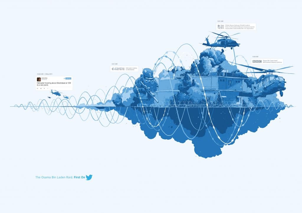
Traditional news websites are facing increasing competition from social media channels in the battle to bring news first to their readers. With the help of Ogilvy & Mather Singapore, Twitter have created a series of illustrative data cards to highlight how key news stories have broken first across their network and continued to unfolded in real time. Thanks to networks like Twitter, everyone has the power to be a news reporter, and with 304 million monthly active we suspect the traditional news outlets must be quaking in their boots.
London’s Underground languages
BBC
Data Driven Microsite

The London Tube system is normally just a means of getting from A to B, however the BBC have used the Victoria Line to take us on a tour of some of the riches and poorest areas of London, exploring commonly spoken languages along the route. The most recent censes revealed a densely packed Portuguese-speaking community at Vauxhall, and a highly concentrated Turkish population around Tottenham Hale. The article presents a series of choropleth maps that reveals other dialects commonly spoken between Brixton and Walthamstow Central, as well as a series of video’s from some of the residents you may encounter along the way.
Do you remember where Germany was divided?
Berliner Morgenpost
Quiz

With almost 26 years passing since the fall of the Berlin wall, the divide it caused between East and West Germany is a distant memory for many. Most of the team here at infogr8 would have just started primary school around that time, with some out-of-date geography textbooks being our only clue as to how Germans were separated from each other. The Berliner Morgenpost asks how united Germans are today, and challenges us to redraw the once famous boarder from memory onto a map. It even calculates the percentage of users who sketched better or worse, based on our efforts. Unfortunately, only 7.6% preformed worse compared to our lead designer’s effort. Perhaps more effort should have been spend during those history lessons.
Jonathan Harris, Greg Hochmuth
Data Driven Microsite

Social networks have become such a huge part of our lives, it is almost impossible to imagine a world where we are unable to gaze anonymously upon the lives of others. To highlight how much things have changed, Jonathan Harris and Greg Hochmuth have created Network Effect, a reflective piece which stitches together 10,000 videos from the internet that we can effortlessly voyeur through. Each is categorised by mundane subjects such as laughter or kissing, and additional layers of data are woven in for good measure. Our viewing time is limited based on the average life expectancy in the region attached to our IP address, so stop gawping and start living.
Behind the Bloodshed: The Untold Story Behind Americas Mass Killings
USA TODAY
Scrolling Story

It seems that hardly a month goes by without more stories emerging from the US of mass killings taking place. There have been more than 200 cases in the last decade alone, and USA TODAY has examined FBI data which reveals some starting statistics. More than half of the victims knew their killer, even if they were not the main target, with gunshots being the primary case of death. It is all pretty grim reading, but hopefully this will raise awareness and lead to changes for the better to help keep American safe in the future.
The Solutions Project
Data Driven Microsite

With much of the world struggling to transition to renewable energy sources from more traditional fossil fuels, The Solutions Project has created a Data Driven Microsite which showcases the benefits of switching to 100% clean, renewable energy for those across the US. The findings are all presented using bright and colourful dynamic infographic charts, and with more jobs and lower healthcare costs being some of the outcomes of this vision, the future sure does look sunny. Let’s just hope there are enough PV plants to capture all of that energy.
Reuters
Microsite
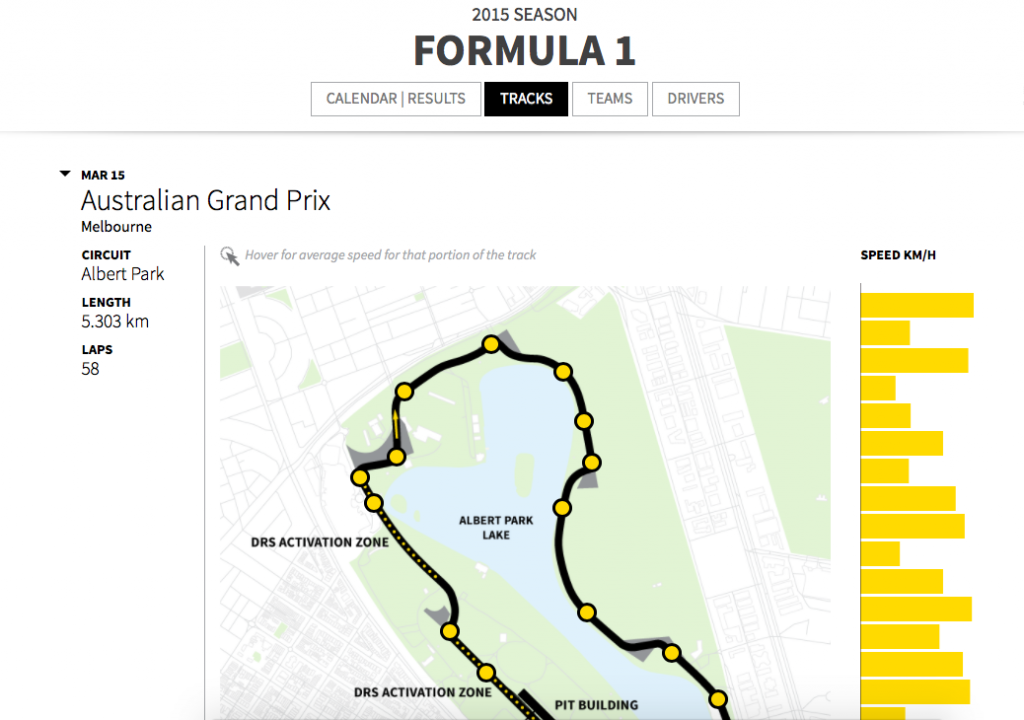
It takes one of two criteria to really like this… you’re either a data nerd like us or a keen F1 fan, if you’re neither well then that’s just the pits.
Reuters have developed this clean, functional microsite presenting the drivers, the team standings and circuits with plenty of statistics to drill down on. It’s debatable on whether it’s deliberate but there’s something in the smile of Lewis Hamilton sitting at that Number 1 spot compared to a not so chirpy looking Kimmi Raikkonen just off the podium. As a further iteration, we’d love to be able to compare the track speeds across one visual but for a top level overview this is a really useful resource.
Happy Fifth Birthday Instagram!
One Productions
Gifographic

The photo-sharing app Instagram recently snapped up it’s 400 millionth user, quite a feat for a platform that only celebrated it’s fifth birthday this week. To help commemorate this impressive milestone, One Productions, a Dublin-based creative communications agency has created this gifographic, highlighting the journey the company has taken and sparking life into some of the amazing numbers. With 100 million followers joining in the last nine months alone, there appears to be no sign of slowing. We look forward to seeing what the next five years has in store for this social media phenomenon.
We’ll be sharing more inspiration next Friday, for now you can follow the team on Twitter @infogr8. Please tweet & share your viz spotting stories to be considered for our future rounds ups. #vizspotting #ddj.
We’re hiring! Several new awesome roles within the infogr8 family including account management, digital PR manager & web development.