ICYMI – Weekly round up of inspiring visual content Vol. 36
Reading time
Category
Missing your data-led visual content fix? Fear not, we got you. From a London ‘rent map’ to the cost of ads on mobile, the team at infogr8 have curated the most inspiring and interesting visual content we have stumbled on this week.
Which animals travel the most?
BBC
Animated Video
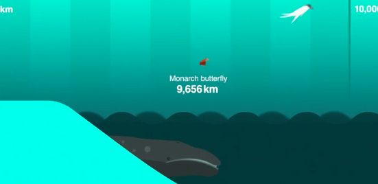
Migrations have always been part of the lives of many species of animals around the world. Some birds are going South to enjoy warmer weather whilst some fishes are swimming back to their birthplace to start a new cycle of life. But have you ever wondered how many kilometres they actually travel? We love the approach and execution to this project, working to a consistent theme holds attention and the transitions are beautiful.
BBC‘s gorgeous, snappy animated video shows the three species that travel the furthest yearly. The Monarch Butterfly classified third, whiles the massive Grey Whale second with a stunning 19,312 km. Can you guess the first one?
After watching the video our commuting travels do not look so bad anymore.
The London underground rent map: Where you can’t afford to live, by stop
Jason Allen – The Thrillist
Map

Ok, so you are moving to London. Or you just want to change neighbourhood. We’ve got it: you want to save on the rent, right? If these are the options, the team at The Thrillist created an illustrated map to help you based on find properly’s data who we featured in our insights section exactly a year ago . Thrillists have replaced the actual name of the stations with the average median rent of a one-bed flat, for 4 weeks, within a kilometre radius form each tube stop. The most expensive? Hyde Park Corner, of course. The cheapest one? Right on Heathrow’s door step!
The Cost of Mobile Ads on 50 News Websites
The New York Times
Website module

After Apple allowed Ad-blockers on iPhone and other iOS devices the issue around whether these apps are going to destroy websites based on the ad-revenue model seems to be gaining momentum. Website’s owners are feeling betrayed, claiming an infringement of the non-written rule ‘you consume my content for free, you bear my ads’. Gregor Aisch, Wilson Andrews and Josh Keller from The New York Times analyse 50 news websites comparing the loading time of content vs. ads and the cost difference on data consumption for mobile users. Their findings are very interesting. Is it maybe time to rethink the intrusive ad-revenue model in favour of emerging advertising forms such as native advertising?
How the rise of ‘posh’ burgers threatens fast food
Jonathan Bacon
Data blog

Fast-growing chains such as Byron account for only a small market share among burger and chicken restaurants, but changing preferences and rising incomes could encourage more consumers to trade up from fast food brands such as McDonald’s. In this article, Jonathan Bacon from Marketing Week, analyses this trend, but also notice that the ‘traditional’ brands are still growing, with a stunning +23% in the last five year for the burger giant Mcdonalds. Nevertheless, consumers are looking for tastier and healthier options. Many are growing sick of the extra thin meat the multinational chains are serving and are willing to spend a little more to have ‘proper burgers’. So, who’s going to win the burger market in the next five years?
Every recorded meteorite impact on Earth from 2,500 BCE to 2012
Tableau
Interactive Map

The morphology of our planet has changed dramatically throughout the ages due to hundreds of factors. Amongst the most interesting, and more scaring are those effects due to meteors and asteroids. Since our planet formed millions of years ago, Earth has been riddled by thousands of falling rocks of different sizes and shapes, from tiny meteorites that cannot survive the impact with the atmosphere to massive asteroids that probably caused mass extinctions. Tableau designed an interactive map gathering the data from 2,500 BCE to 2012 showing the impact sites where hundreds of celestial bodies fell from space. The map also lists the most common type of meteorites and the different sizes in a clear and straightforward way.
Taking Data Visualization From Eye Candy to Efficiency
Geoff McGhee – National Geographic
Data Card

Data Points is a new series from National Geographic focussing on the exploration of everything related to data visualisation, information design and cartography (I’m layman’s terms maps!). Geoff McGhee sums up popular trends in data visualisation namely on how we can squeeze much more data onto one page whilst ensuring the reader can interpret it quickly. There’s some insightful examples along the way such as Periscope’s “More than 400,000 Stolen Years” and Kirk Goldsberry’s “Bin for the Win”. This selection of examples rounds up with an overview as to what we can expect for the future, well worth a read!
The Next Web
Gifographic

The big news early this week has been the discovery of actual salty water on the Red Planet. NASA presented the finding during a conference on Tuesday, and almost instantly, the Web started shouting about it. Speculations and improbable theories have been carted around for the rest of the week, and we bet it will go on for a while. Indeed, Mars’ history is extremely fascinating and the possibility to be there one day is a dream for many of us, finding water on that red rock is a step forward. But there is one specific thing that The Next Lab is sure we’ll never find on Mars, or any other planet in our system. Check out the gifographic to find it out (and we dare you to disagree)!
The 7 Excel Tricks Every Office Worker Should Know
Lindsay Kolowich
Infographic

Everybody knows Microsoft’s staple software, Excel. Yes, quite old but still a must for almost every business and serious business person. If you work in an office, probably your boss demands some basic (often not so basic) knowledge on how to handle this useful tool. The guys at Hubspot found this interesting infographic from the archive of Microsoft Training, listing the most practical tricks and tips for a better and more conscious use of Excel. From the very basics to something more elaborate, master these essential functions and you’ll never be worried to work out complex spread sheets again.
We’ll be sharing more inspiration next Friday, for now you can follow the team on Twitter @infogr8. Please tweet & share your viz spotting stories to be considered for our future rounds ups. #vizspotting #ddj.
We’re hiring! Several new awesome roles within the infogr8 family including account management, digital PR manager & web development.