ICYMI – Weekly round up of inspiring visual content Vol. 35
Reading time
Category
Missing your data-led visual content fix? Fear not, we got you. From the years you still have to live to the tragedy of the Syrian refugees, the team at infogr8 have curated the most inspiring and interesting visual content we have stumbled on this week.
Nadeem Haidary
Interactive module

When we look at flags we see them as a consistent indicator of countries, places, and organisations. Always solid, fixed and constant they fly high in the sky as an ever lasting symbol.
Although if we look at the American flag we can see over its history it was dynamic design that dated over the years added more and more stars as more states joined the union, until finally settling in 1960 with the currently used 50 star flag. With his State of the Union project designer Nadeem Haidary continues in this tradition and reimagines the American flag as a dynamic, interactive module adapting its design to represent different data sets.
Using data spanning from 1890 to 2013, Nadeem uses the different elements that make up the American flag to represent state several different factors of life in America, from the state of wealth to equality, health to education which you can glide you cursor across and explore the individual years data. The Red horizontal lines and blue solid transform into bar charts while the the stars record the state of health by representing American’s life expectancy, all of it combining to create a interactive that is just as graphic and beautiful as it is informative.
Years You Have Left to Live, Probably
FlowingData
Data Blog

They say you should live every day as if it were your last. At lest this ensures you have lived a rich and full life before eventually passing on. But for those interested in seeing the statistical chances of when they are likely to pop their clogs we have this. Nathan Yau from Flowing Data has created an animated simulation that estimates the number of years we have left, based on our age and gender. Rather than simply calculating our time remaining based on the average life expectancy, we are shown the statical chances of us biting the dust in decade chunks, reminding us that life really is unpredictable. Time to duct of the old bucket list and make the most of our time left, however long that may be.
Interactive app

The marketing world changes at an incredible pace and it’s not always easy to keep up with it. So, why not exploiting your commuting time, or any other dead moment throughout the day, to learn new skills or refresh some basics? Google gives you the chance to do this with its renewed Primer app. With a smart interactive series of micro content, organized in simple but well-designed swappable cards, this useful app transforms your everyday commuting in a learning journey. You can decide to follow the path the app suggests or jump form a lesson to another in the order you prefer. And the feature that we liked the most is that you can do all of this offline! Doesn’t matter whether you’ve got just few moments or an entire hour. Guess what? Each lesson last exactly five minutes!
On a side note, Primer’s website is an excellent example of a scrollable story.
Need some data? Check the Atlas…
Quartz
Data Blog

Have you ever been stuck for some data? Tight deadlines are closing in and you need that killer chart or stat to support your article or proposal? Look no further than Atlas brought you by the clever people from Quartz. Quartz is a digitally native news outlet, born in 2012, for business people in the new global economy, they focus their output mobile devices such as smartphones and tablets and use a lot of data visualisation elements in their articles. This is what has prompted them to launch Atlas, an archive of the charts and graphs used by the Quartz team in their articles. In using over 4000 charts last year, charts have always played an integral role in Quartz journalism, they realised their readers love charts and more importantly love to share charts. With Atlas you can now download the data behind the charts, embed them elsewhere on the web, grab an image, and share the charts on social media. Atlas is an ever-growing platform with Quartz looking to expand the site to allow others to create and archive their charts too. So if you ever need a quick data visualisation or just feel like getting lost in some data, there is a mountain of content to check out over at Atlas.
The Syrian Refugee Crisis Explained
Kurzgesagt
2D Video Animation
https://www.youtube.com/watch?v=RvOnXh3NN9w
The Syrian civil war rages since 2011. When its population realised that thing were not getting better, they decided to leave the refugee camps scattered around Middle East looking for a safe life in the European and Western countries. They didn’t expect to face the fear and dullness of the so-called civilised world. In this 2D animated video, the guys at Kurzgesagt explain clearly what happened in the past few years and what’s happening right now, conducting a logical and deep analysis of the Syrian situation, busting the myths around Syrian migrants and listing the pros for European countries if they would allow Syrians to cross their borders. Of course it’s not an easy process, but we cannot turn our back to the suffering population of Syria.
Project Gutenberg
Interactive website

We all like killing time on our phone when having our bathroom break scrolling through social media news feeds. But what happens when you run out of Facebook posts? Poopfiction is here to give you a bit of of relief in your time of need. With a selection of tiny to long (4+ mins) stories, there is a variety that will suit even the ones with the shortest attention spans. The stories are courtesy of Project Gutenberg, and completely free to read! Give it a go, when you go!
Metropop
Infographic + Interactive module

Like many places in Europe lately, population is on the rise across Vienna, partly due to international immigration. However these new arrivals are usually ineligible to vote, as only Austrian nationals are granted that right. The population has risen by 11% since 1971, however the electorate has actually decreased by 10% during that same time, causing quite a predicament. One out of four people at voting age will be unable to participate in the 2015 Vienna elections. To visualise the changing population landscape, Metropop have created an infographic and a smart interactive module using small multiples to visualise the data across all 23 districts. It’s an incredible simple yet effective means to present a complex data set, and certainly gets our vote.
The Scale of the Volkswagen Crisis – in charts
George Arnett – The Guardian
Datablog
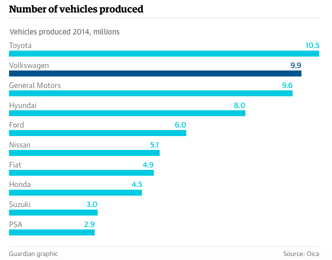
Volkswagen is the second biggest car manufacturer in the world, with 9.9 millions car produced in 2014. Or probably, it was. The German colossus installed an emission cheating device on 11 millions diesel vehicles worldwide, with real emissions, measured by EPA, 10 to 40 times the legal limit in US. This scandal, that forced the CEO Martin Winterkorn to resign, has already burned more than 25 billions of Volkswagen share value in the stock market. George Arnett wrote an interesting data blog post for The Guardian, where highlights the key figures of the crisis using clear charts and data. Will Volkswagen be able to survive the darkest passage of its history?
We’ll be sharing more inspiration next Friday, for now you can follow the team on Twitter @infogr8. Please tweet & share your viz spotting stories to be considered for our future rounds ups. #vizspotting #ddj.
We’re hiring! Several new awesome roles within the infogr8 family including account management, digital PR manager & web development.