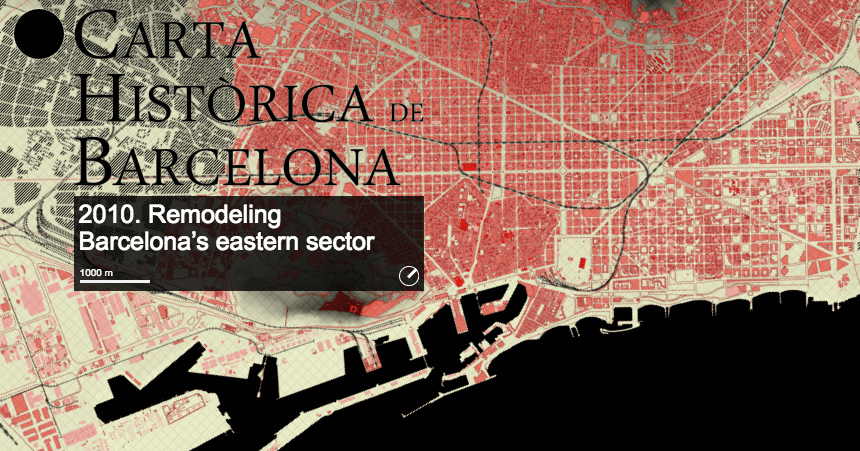
The Historic Charter of Barcelona
300.000 Km/s
Interactive microsite
Immerse yourself in the history of Barcelona in this interactive microsite, which lets you travel through time all the way from 150 A.D. to 2010. This project, crafted and constructed by data-viz collective 300.000 Km/s allows you to draw on the map meaning everyone from cartographers to urban planners to your average internet troll can scrawl notes on the maps. The interactive also incorporates several layers, showing viewers different aspects of the city like Cerdà’s 1859 city plan before Barcelona expanded and topographical surveys. If you’re a bit of a mapping nerd and history buff, this is one for you.

The Nature Index
Interactive module
Ever wondered how much countries and their respective universities talked to each other? Nature Index captured patterns of international collaboration and collated it into this rather beautiful web of information where you can explore each country’s collaboration efforts. It comes as no surprise that the USA’s top institution for collaboration is Harvard and then the UK with Oxford and Cambridge in spot 1 and 2. You can explore the collaboration subject by subject.

All the world’s immigration visualised in 1 map
Metrocosm
Interactive module
Immigration is a hot topic in today’s world, dominating headlines, discussions, interviews and elections in the UK, Europe, the USA and Australia, among others. We’ll leave the politics out of this one but you have to admire Metrocosm’s fascinating interactive map that gives an insight into where the world is moving. They took data from the U.N. Population Division spanning five years (2010 to 2015) and mapped net immigration between countries all over the world, visualising it using dots and bubbles. Simple but effective.

Tour de France 2016: Stage by stage
The Guardian
Data blog
With the Tour de France kicking off this weekend, it was only right for the data-visualisation enthusiasts at The Guardian to put together a data-led piece on the race. Those of you who follow the event will love the stage by stage breakdown where the Guardian have provided maps, commentary and gradient graphs that give you a whole new appreciation for the pros racing this route to make the time cuts. We’d recommend keeping this page bookmarked throughout July.

Rutland Remembers
Interactive map
In memory of their fallen soldiers of the First World War, Rutland, the smallest county in the UK, built a website commemorating the men and three women who served their county. They recently launched a microsite around the Battle of the Somme which began 100 years ago today. The map details the name and information of each solider and the location where they died. This information is presented along a timeline that the user controls, which is contextualised with information regarding the battle and the successes and hardships the army went through.

Game of Thrones relationships infographic
HBO
Infographic
A dark cloud has just settled over telly land once again this week with the final episode of season 6 of the critically acclaimed Game of Thrones airing for all the world to see, leaving die-hard GoT fans with another year of winter until the light of an new episode shines down on us again. So what to do till then? How do we get our fix? Well through great infographics of course! Like this awesome relationship infographic from HBO, off the back of the revelation of one characters family lineage in a particularly crucial flashback during “The Winds of Winter” this chart maps how some of the shows most prolific characters are related to each other. Great for a casual fan to get a handle around GoT’s extensive, while hardcore fans of George R. R. Martin’s epic series will love to deep dive into the subtle treads that connect their favourite characters.

July 4th and fireworks injuries
Stat
Interactive module
For the USA, fireworks season will arrive in full force this weekend. The US Consumer Product Safety Commission tracked emergency room reports from a bunch of hospitals around the country to see whether July 4th celebrations had any effect on fireworks-related admissions. Spoiler alert: It did. Watch the and interact with the visualisation to see the yearly explosion of injuries around the weekend. Happy 4th to our American friends (and stay away from fireworks)!
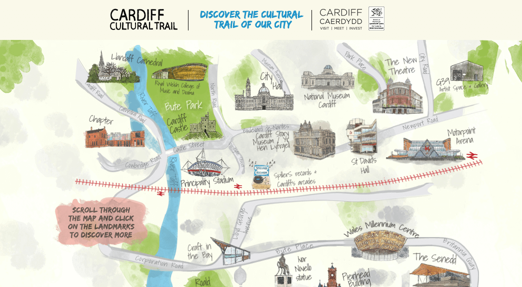
VisitCardiff.com
Interactive module
#Brexit has happened, your savings are worth a tiny bit less and you’re not too keen on buying flights to go abroad so what can you do for that annual leave you booked off? Head to Cardiff and hit their cultural trail of course! Where else but Wales could you get a good dose of culture? VisitCardiff have even created an interactive map so you can figure the best sightseeing spots and get your ‘to do’ list together. Get those bags packed!