Missing your weekly infographic and data viz fix? Fear not, ICYMI, the infogr8 team have curated some of the best bits we’ve stumbled on this week.
Super Bowl Tweets – Katy Perry’s Sharks
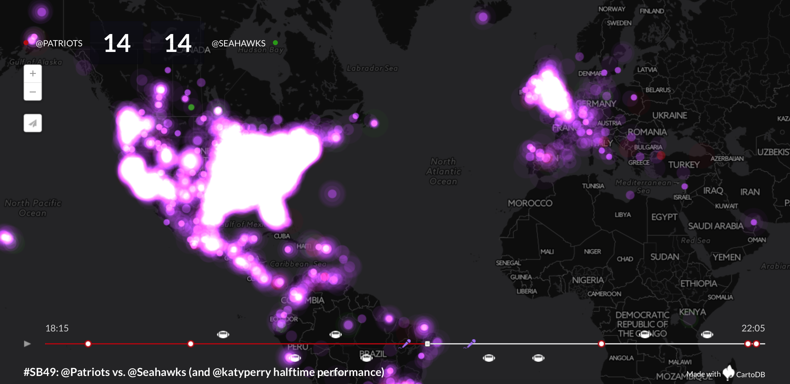
The Super Bowl #49 surely set the whole of USA on fire last Sunday. We have to admit, we didn’t watch the game but we definitely followed the buzz online – and we’ve come across a lot of interesting content. From Column Fives ‘who to root for based on your location’ bitesize, to Katy Perry’s left shark dancing fiasco, the Internet had quite a lot to deal with. This Twitter animated timeline summarises it all in less than a minute. Patriots won you’d think?
Quartz
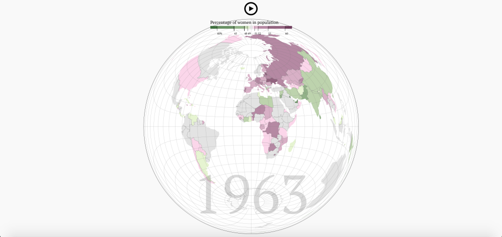
In 2011 we learnt that the Earth’s population was estimated to exceed 7 billion for the first time, now an interactive globe from David Bauer via Quartz allows us to see the gender inbalance per country and the shifts that have occurred during the last fifty years. Thanks to a longer life expectancy, women outnumber men across much of the developed world. However widespread gender selective abortions in some Asian countries have tipped the balance the other way, and men are now thought to outnumber woman by about 60 million globally.
Can you cut your food bill by a third?
BBC iWonder

It’s a known fact that food cost has sky rocketed in the past decade, even when it comes to essentials like bread and eggs. We are seeing quite a trend lately in useful tools and apps to help you save on food bills by being mindful and creative with your choices. This BBC multimedia interactive certainly makes the cut. Apparently, if a working couple quits takeaway coffees, lunches and snacks they can save up to £4,000 a year! Well, that will surely keep us off those juicy burgers and takeaway pizzas for a while.
Greatest Tennis Players of All Time
John Burn-Murdoch, FT

On Sunday we witnessed a gripping men’s singles tennis final at the Australian Open between Novak Djokovic and Andy Murray. Had we seen this interactive visualisation served by the Financial Times, the result may have been somewhat easier to predict. Djokovic eventually snatched the victory in Melbourne, which is hardly surprising as his win percentage is visibly on the rise, while Murray is showing signs that he may have already reached his peak. We are able to select from 156 players and compare win successes over their career, helping us decide who is the greatest player of all time. “You cannot be serious?” mutters an uncanny character down the byline.
City A.M.
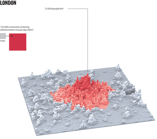
If you thought London feels crowded now, then the latest report from City A.M. could make for some grim reading. The number calling the capital their home is expected to swell from the current 8.6m, up to 11m by 2050. Although that figure may seem eye-watering at first, it’s worth pointing out that London actually has a relatively low population density when we consider some other major cities around the world, as a series of maps from LSE Cities beautifully illustrates. Maybe there’s no need to panic just yet.
Kantar Media

The NFL Super Bowl provides advertisers with a unique opportunity to reach audiences on unparalleled scale, and the amount they are willing to pay for the privilege shows little sign of slowing. That’s the impression we get after immersing ourselves in this interactive visualisation from Kantar Media using Tableau. Total advertising spend over the last 20 years is displayed and dissected by category, and we can probe further still to discover how much each brand has forked out for a few precious seconds of airtime. To be perfectly honest, we find some of the adverts more entertaining than the game itself.
Bill and Melinda Gates Foundation
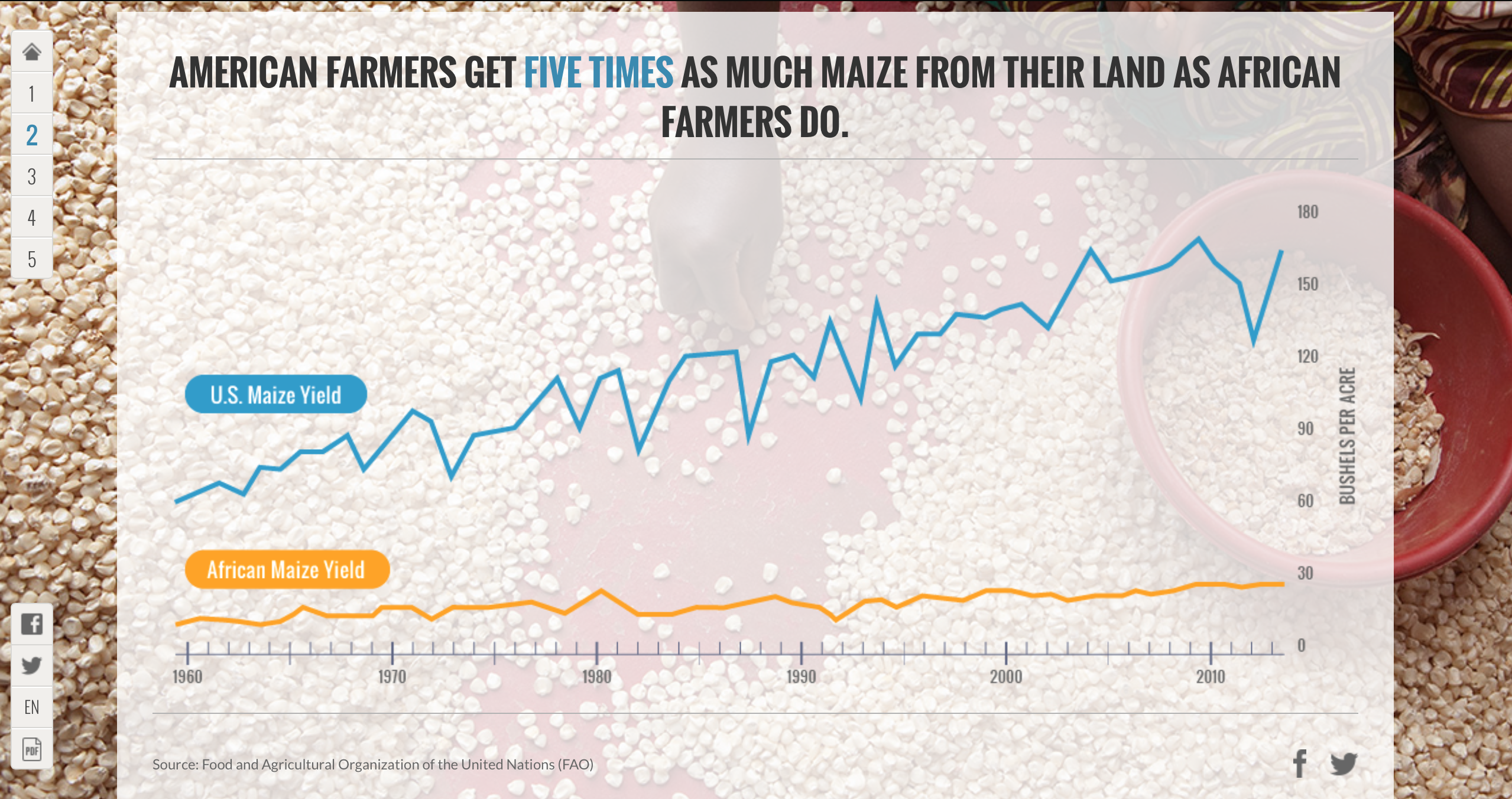
The lives of many people living in poor countries has improved in recent years, however it’s clear that there is still much more needed to be done. Although he is most famous for revolutionising the way people use software and computers, Bill Gates and his wife Melinda are now working on improving the lives of those less fortunate, believing that the rate of improvement will be faster in the next 15 years than at any other time in history. The 2015 Gates Annual Letter features a series of informative animations and data visualisations, helping us understand the importance of breaking the poverty cycle once and for all.
Chaim Gingold

When it comes to textbooks there hasn’t been much innovation other than shifting from paper to digital. At least not untill now. From Chaim Gingold, the designer of Spore Creature Creator, comes Earth Primer, an exciting interactive textbook that educates by putting the user in control of its contents. The Earth is literally your playground, you can form glaciers, sculpt sand dunes, make mountains, and control the weather. It’s a whole new level of experience and learning. If this doesn’t keep kids in school we don’t know what will.