Gay Marriage State by State: From a Few States to the Whole Nation
The New York Times
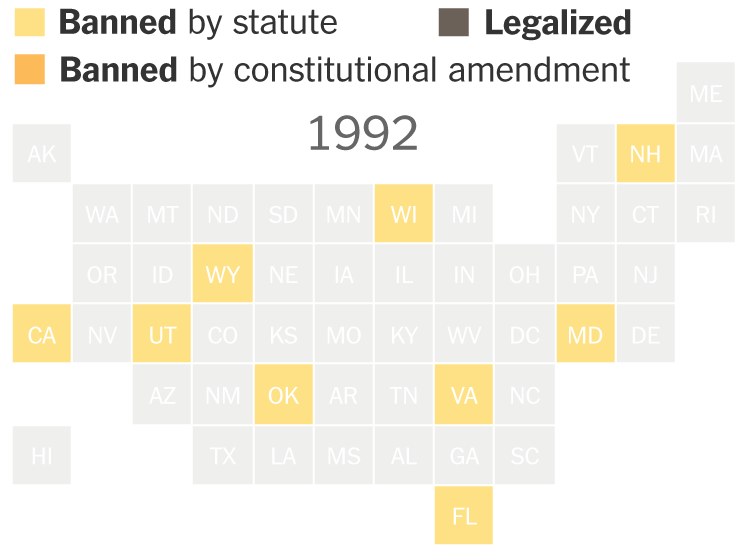
Last Friday 24/06/2015 marked a monumental day in the history of the United States of America when The Supreme Court said that same-sex couples had a constitutional right to marry, effectively requiring that the 13 states that still prohibited such unions to reverse their ban and making same sex marriages legal throughout the entire nation. The New York Times have created a great animated gif map which plots the stages legalisation from 1990 through 2004 when Massachusetts became the first state to issue marriage licenses to gay and lesbian couples to 2015 where same-sex marriage is now legal across the whole of the United States.
Jaguar
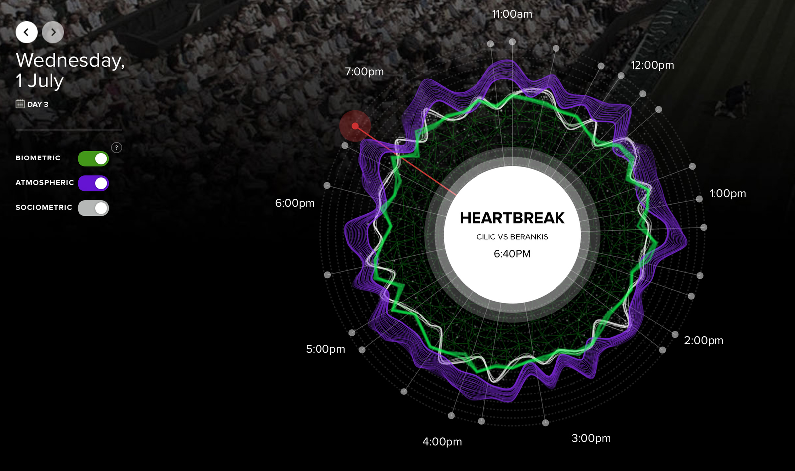
Pimm’s and strawberries at the ready its Wimbledon time again. Tennis’ most prestigious grand slam is back and greater than ever, full of excitement, upset, and edge of your seat moments over the two week tournament. As British number 1 Andy Murray is safety through to round 3 yesterday after his straight set win over Robin Hasse we can let out a sigh of relief and start to think about what all that excitement would look like? Well in an attempt to visualise the atmosphere of the event Jaguar have teamed up with media agency Mindshare, and using GPS-enabled step counters with heart rate monitoring and burying sensors around the courts to measure volume levels, crowd movements and infa-red to track the excitement of the occasion on beautiful constructed graphs. And, of course, it’s monitoring the world’s social feeds, taking the internets pulse on the action into consideration as it happens. Head over to the #FeelWimbledon website now and see how the crowd feels the competition.
Visualising New Zealand Members of Parliament Twitter Networks
Chris McDowall
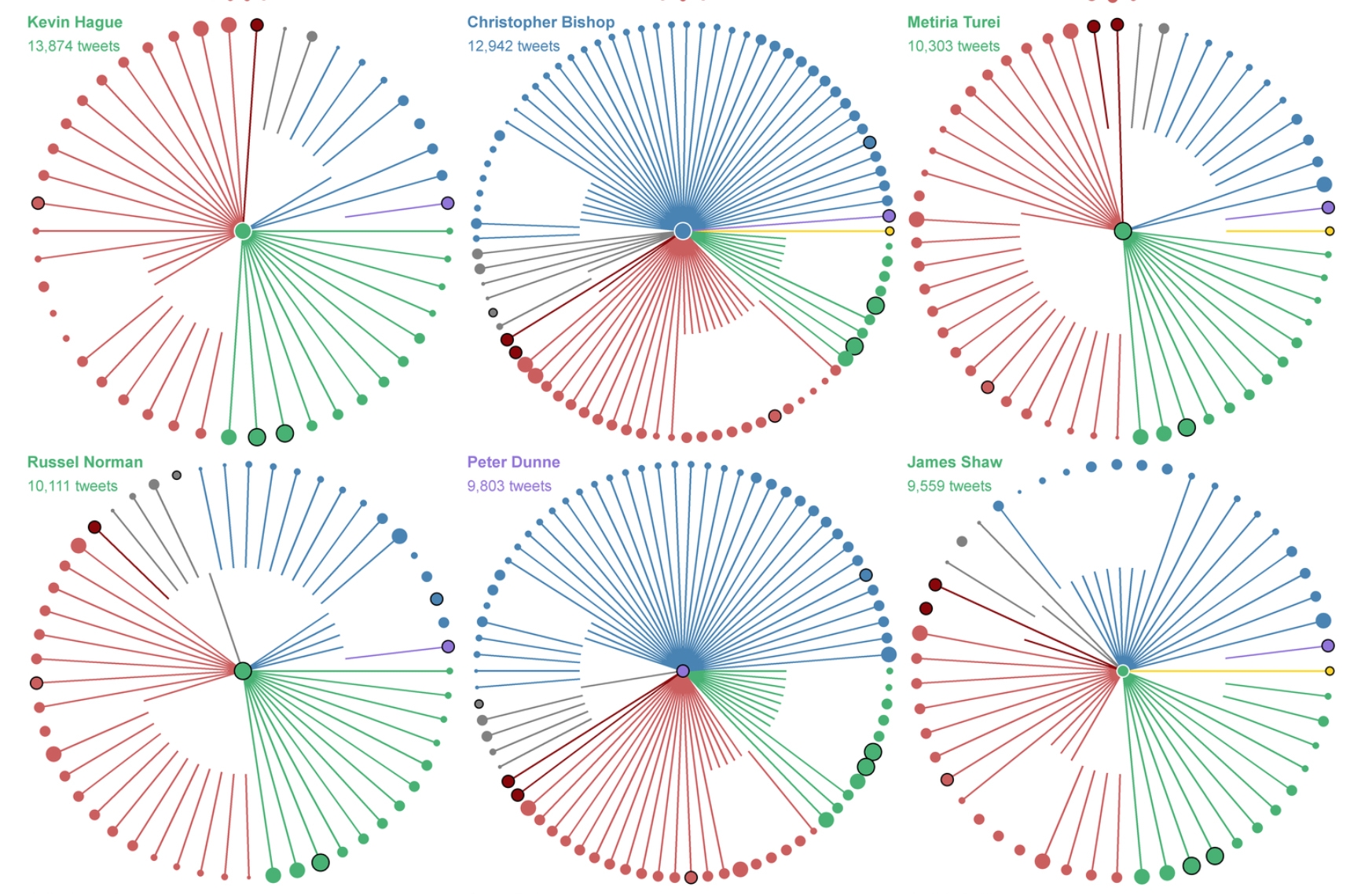
Politicians across the world may have amassed many thousands of Twitter followers in recent years, however questions have been raised asking if this medium is an effective means of interacting and creating a fruitful dialogue. Of course, this all depends on the politician in question. Some view the platform as a means to simply broadcast their message, while others see it as an opportunity to spark conversations and draw themselves closer to the electorate. As well as looking at what each MP Tweets about, their follower network can but equally as revealing. A series of small multiples created by Chris McDowall highlights the connections between New Zealand MPs and shows who follows who. It’s really interesting to see how individuals are linked to members of the same or opposing parties, with some opting to focus on those with similar political views, and others creating a rich, diverse network. Knowing your enemy could be the key to victory, and Twitter makes this easier than ever.

Clubhouse Studios

Have you ever wondered how happy the people around you are? Where you work, where you live, where you spend your free time? Well is you are a Londoner the clever people over at Clubhouse Studios have created beautifully designed, intelligent, interactive map showing the happiness of the capital called The Happy Forecast. By scanning Twitter’s API for tweets based on geo-coordinates mapped from Google relating to each postcode The Happy Forecast then analyses the Tweets using a machine learning sentiment API called Sentiment140, developed by Stanford computer scientists, to classify a tweet into positive, negative or neutral grading. By selecting a postcode from the map the areas happiness is calculated by comparing the positive tweets against the negative ones, this information is then displayed like a weather forecast. Happy places are are represented by sunshine and green trees, while less happy areas of the capital display lightning bolts and grey skies. Scores are ranked by body language, verbal interactions and acts of kindness or violence.
The Consistent, Slightly Above-Average Schlock Of Seth MacFarlane
FiveThirtyEight

Love him or hate him, Seth Macfarlane has been bringing his own brand of potty-mouth humour to the masses for over 15 years. The creator behind the TV phonemes ‘Family Guy’, American Dad’ and ‘Cleveland Show’ has amassed over 200hours for airtime over the years and more recently has made the leap to the big screen with 2012’s Ted and 2014’s Million ways to die in the west. With the upcoming release of Ted 2, FiveThirtyEight have painstaking created a graph of all 3 of Macfarlane’s animated series as well as his movie’s plotting them based on their Imdb ratings. ‘American Dad’ seems to be the most consistent of his animated content, but more interesting ,and timely, is that his big screen adventures have never quite lived up to his TV output, will Ted 2 follow this pattern on its release?
Where Europeans Spend the Most on Rent, Mapped
National Housing Federation

Did you know that the average renter in the UK pays over twice the EU average to rent their home? Shocking as it is, thats the picture painted by the Britain’s National Housing Federation, who have released a set of maps visualising the disparity between EU nations. The First of the 2 maps deals with the information in average monthly amount of rent spent while the second considers the percentage of a renters income that is spent on their home, with the UK, sadly for the us here at London based infogr8, coming top of the scale on both maps.
BBC

As Wimbledon is full swing its no surprise that not just one, but two of our ICYMI stories are associated with the worlds greatest grass court competition. In celebration of the tournament the BBC has launched the Wimbledon Time Machine, an interactive scrollable achieve of annual moments of history of the grand slam represented by facts, images and video. You can interact with the Time Machine either by entering you birthday to scroll the archive back to the year of your birth and reveal some choice comparisons between you own birthday and the superstars of tennis past and present, or simply hit time travel and randomly jump back in time as far as the first championships in 1877.