infogr8 (yep, that’s us!)
We live in an age when health and fitness has become an obsession. And surprisingly still, we were sound to find out that is still a huge problem in Europe, “burning” 80 bn euro per year, equivalent to what the entire world spends on cancer drugs each year! The solution is simpler that you think, only 20 minutes activity per day, keeps the doctor away. Freshly squeezed this week on the infogr8 pipeline – our latest video for NowWeMove, check it out!
BBSR
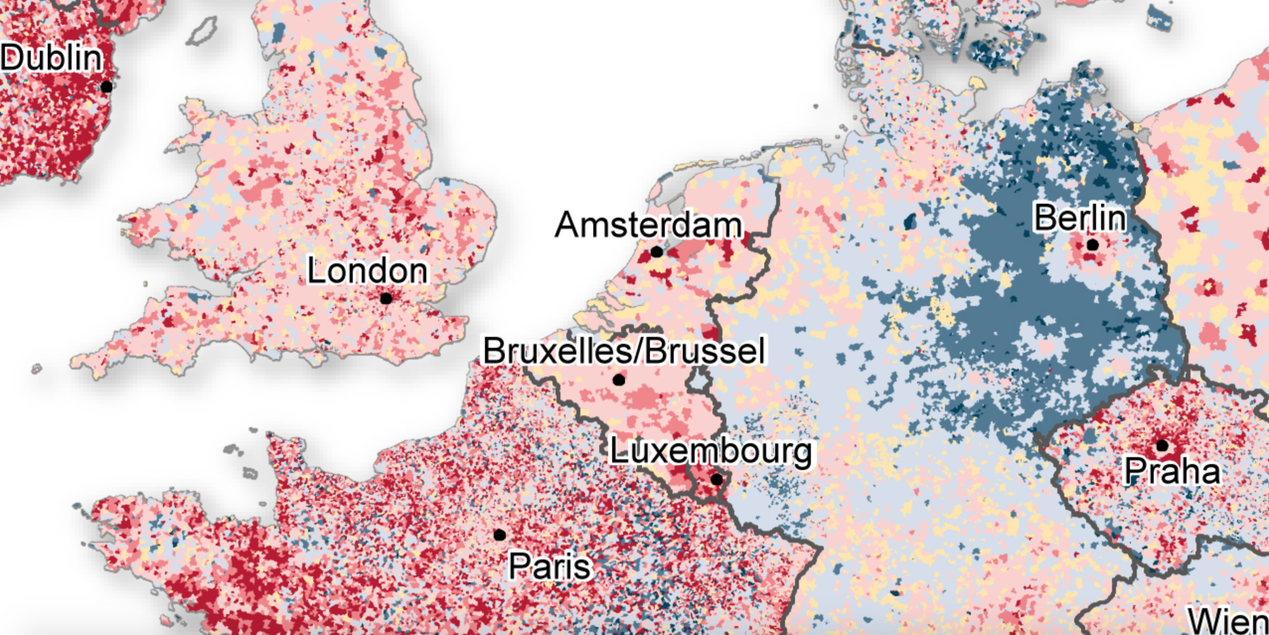
The flow of people immigrating and emigrating across Europe over the last decade has been quite extraordinary, and a new map created by Germany’s BBSR, the country’s Federal Institute for Research on Building, Urban Affairs and Spatial Development allows us to see exactly what the shift looks like. Between 2001 and 2011 we see many trends and micro-trends, with people abandoning Greece and the Balkans in favour or more western territory. East Germany and northwest Spain have have also apparently been deserted, with France and Ireland the destination of choice for many.
A Visual Guide to Hollywood Age Gaps
Vulture
There has been a lot of buzz around Hollywood lately about the ever growing age gap between female leads and their on-screen love interests. Considering one of the worlds biggest female leads, Emma Stone at 26 has had four on-screen love interests over 40 in the last cinematic year alone, and even Maggie Gyllenhaal reveals she was told by a Hollywood producer that she was too old, at 37, to play the love interest of a 55-year-old man! But what does the difference actually look like when we are talking about gaps of anywhere between 5 and 20+ years? Well using some of the worlds biggest female romantic leads Emma Stone, Scarlett Johansson, and Jennifer Lawrence, the good people at Vulture went ahead and created some great line graphs to help illustrate what kind of generational difference we’re talking about the relationships between these mega stars.
Bryan Christie & Kai Krause

Converting the Earth’s spherical surface into a two-dimensional map causes a whole range of complex distortion problems, and methods such as the Mercator projection result in areas of land becoming increasingly exaggerated as we move away from the equator. It’s for this reason that misconceptions about the true size of Africa exist, and a few years ago we were treated to a fantastic infographic from Kai Krause that highlights the size when other nations were overlaid on top. Many were quick to point of flaws in his design, and to silence the critics he has now updated his design in glorious 3D. Seeing countries like China, India and the US fitting snuggly inside, with space left for much of Europe leaves us astonished at how big this magnificent continent actually is.
A graph of the transfer history of Arsenal Manager Arense Wenger
City AM

The football world is all a frenzy with the anticipated transfer of Petr Cech to Arsenal, the Gunners have long searched for solid representative in goal and Cech, one of the premier leagues finest has come back on the transfer market. According to reports, 33 year old Cech is likely to fetch £11.5M in the transfer to Arsenal, but what really caught our interest here at infogr8 is how this purchase would be so out of character for Arsene Wegner when reviewing the Arsenal managers past transfer purchases. Since taking over at Arsenal in 1996, Wegner has only spent £25m on a total of 12 goal keepers, and only 8 players over the age of 30 have been signed. How significant is this really, and how does Petr Cech’s transfer measure up against the rest of Wegner’s past purchases? City.A.M. are here to help with a great interactive graph showing how old a player was when he signed as well as his position and cost across the whole history of Aresne Wegner transfers at Arsenal.

Graphic Methods for Presenting Facts
Willard C. Brinton

Willard C. Brinton may be a name that’s unfamiliar to many, but data visualisation geeks like ourselves often recognise him as one of pioneers who helped to establish best practice when visualising information towards the end of the 19th century. In fact, our lead data visualisation designer Ben Willers cited his work on numerous occasions in his MA Design dissertation . It therefor came as a pleasant surprise to discover his 1914 book, Graphic Methods for Presenting Facts, has been digitalise and made available to everyone, and it remains as relevant today as it was the day it was written.
Information is Beautiful
