Spotify Running
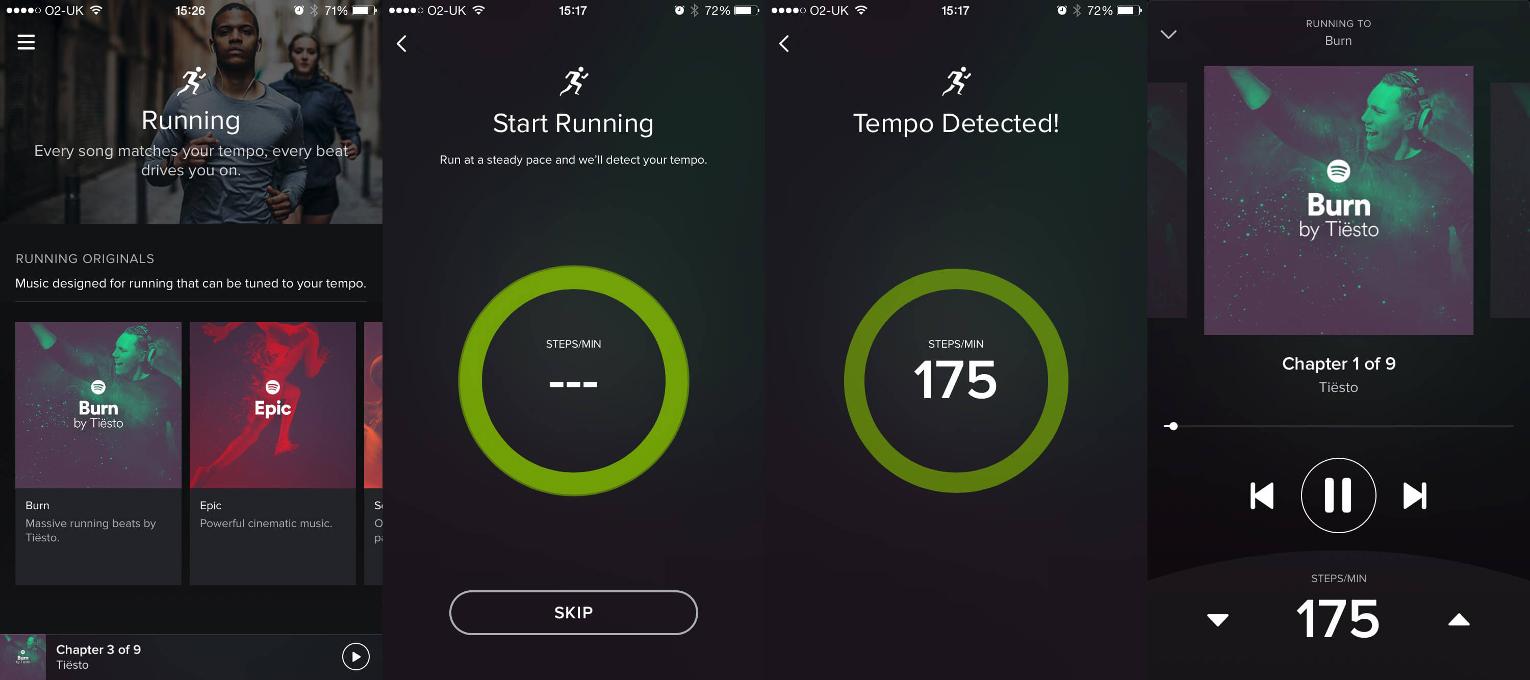
This week, Spotify released potentially one of the most powerful health and fitness features to date – Running. You can choose a music theme/genre to boost the pace at which you run. The app detects your tempo via the phone sensors and syncronises the music tempo with the one you run to. It’s pretty accurate. The music is just as incredible going from softer tones to magnificent crescendos and give you that extra little push to want to run more!
There is one slight limitation Spotify can improve on though, if you decrease your pace, the app doesn’t detect this automatically to adjust the music. This can be easily addressed by integrating Spotify into Jawbone’s UP24 or Fitbit as both apps sync data in real time. Sending real time data from your wearable to the app can make the experience more effortless and immersive. But hey, lets not run before we walk 😉
You Draw It: How Family Income Predicts Children’s College Chances
The New York Times

We don’t think it is very surprising that children from more wealthy backgrounds are more likely to attend college in the US, however the New York Times has produced a rather ingenious interactive article to really get us thinking. We are challenged to draw a line on a blank chart as accurately as we can before the true trend is revealed, and then we are judged based on how good our estimate was. Our guess was apparently about 58 percent more accurate compared to people who have tried so far, which makes us feel pretty smart indeed, if we do say so ourselves.
The Counted – People killed by police in the US
The Guardian
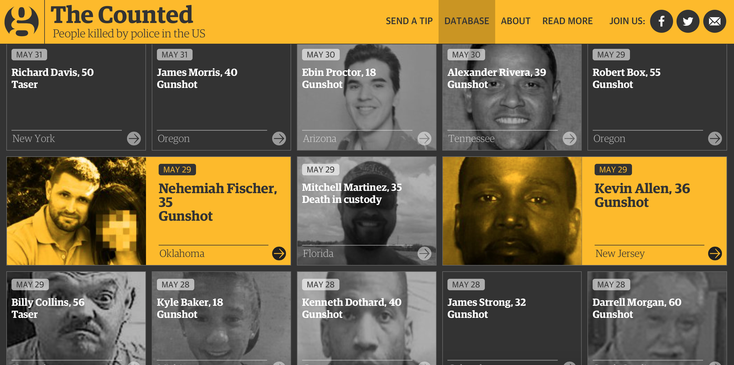
This week we learned that there have been more fatal police shootings in the the US during the first 24 days of this year, than England and Wales has seen in the last 24 years. The Guardian have decided to get right to the heart of this issue and has created an interactive database of all those who lost their lives to police officer intervention throughout 2015. The stunning use of photography and personal stories behind each case really took our breath away, making this more impactful than statistics alone could ever manage.
April Zero
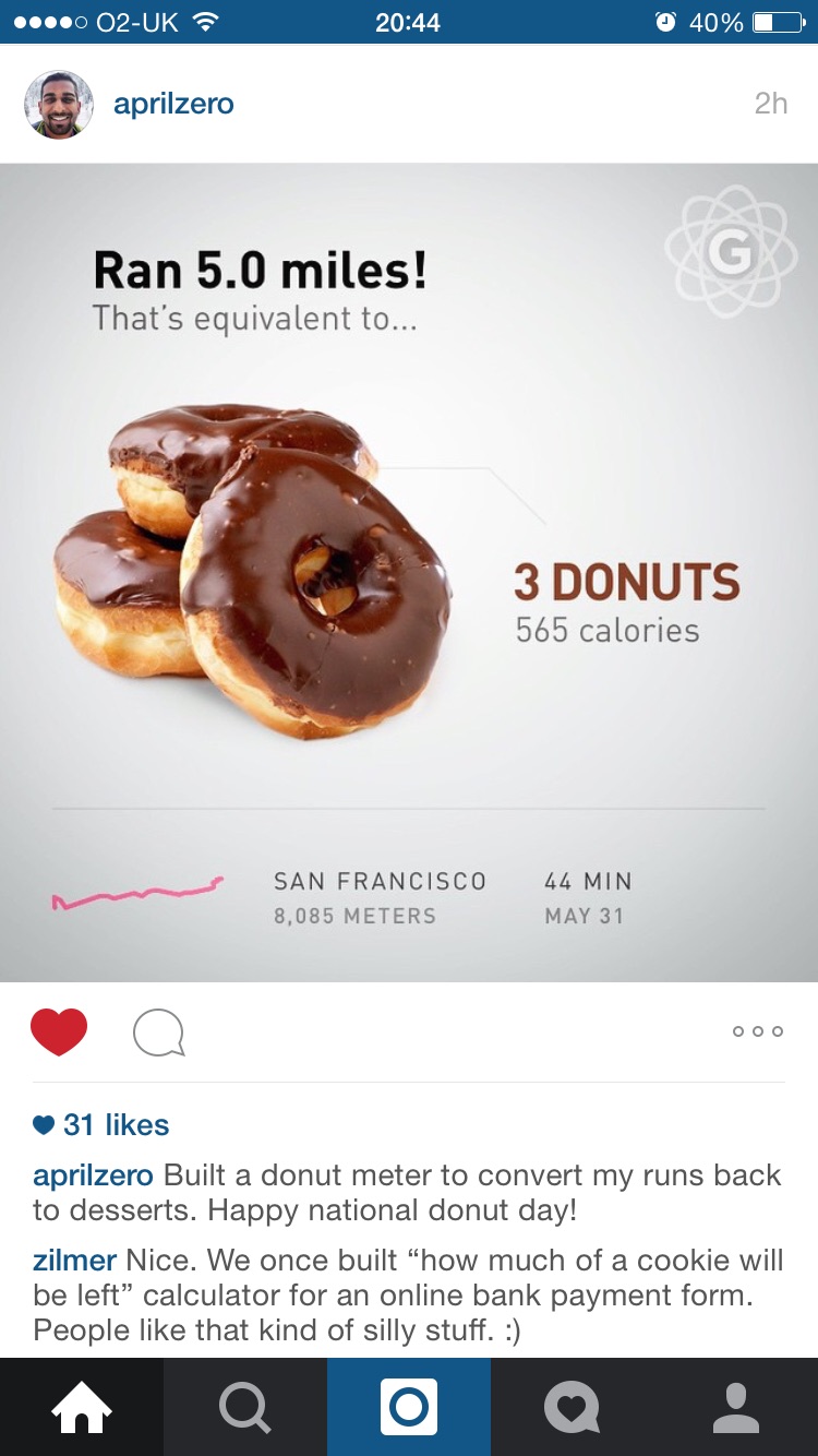
Following Gyroscope’s development, its father Anand Sharma is doing a really good job not only delivering data to users but making it useful too. In sight of International Donut Day, April Zero built a donut meter to convert his miles to desserts calories. Apparently, running 5 miles will burn you 3 donuts! Data loves context. We have written about this in our latest Trend Report, it’s exciting to see new upcoming apps shaking up the industry and putting the user at front mind.
Ben Moore

Next time we are roaming the streets of Scotland’s capital we will be sure to take particular care to avoid accident back spots, and a new map detailing vehicle collisions between 2010 and 2013 allows us to take evasive action. Created by Ben Moore, a computational biology/bioinformatics PhD student at the University of Edinburgh, we can see exactly where accidents took place, and apply a range of filters including the time of day, number of casualties and severity of every incident. We found the interface to be a tad on the clunky side, but it is far from being classed as a write-off.
Arman Naji
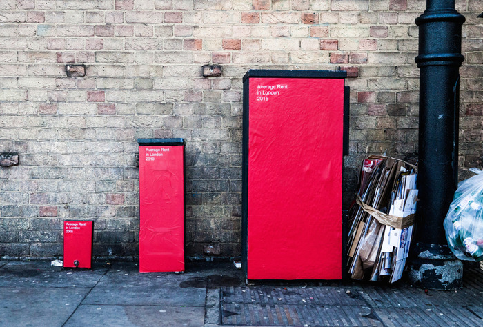
Data loves the outdoors, simplest data ideas live around us. On the streets of London, you can find utility boxes visualising the housing crisis in London and the UK based on real stats, smart creation of Arman Naji. You would agree it’s quite powerful to be able to compare differences as the message gets across in a heartbeat. This reminds us, visualisations are not meant to be always beautiful per se, it’s often the medium used to power it that captivates us.
What Does A Western Really Look Like?
The Outtake

A few weeks ago in our ICYMI we got to explore shifts in colour palettes over more than 50 years of Avengers cover artworks. Using a similar technique, the Outtake has compiled thousands of movie images to reveal what a western actually looks like. And the results surprised us all. We were all expecting to see sandy colours to dominate, but the results are far more vibrant than we would ever have thought possible. The wild west sure is pretty it would seem.
IDV Solutions

Hollywood may have turned it’s back of UFO stories of late, but it would appear that the memories linger long in the minds of the American public. This infographic from IDV Solutions uses data from the National UFO Reporting Center to show where in the US people reported seeing strange doodads in the sky, and what shape they took, and it would appear that E.T. spends most of his time touring the western states. Of course, much of the military’s weapons and experimental aircraft testing takes place in the Nevada desert, however we are sure these events are entirely unrelated. We want to believe, we really do.
Seen any cool data viz pieces we have missed? Hit us a tweet @infogr8!