HBO
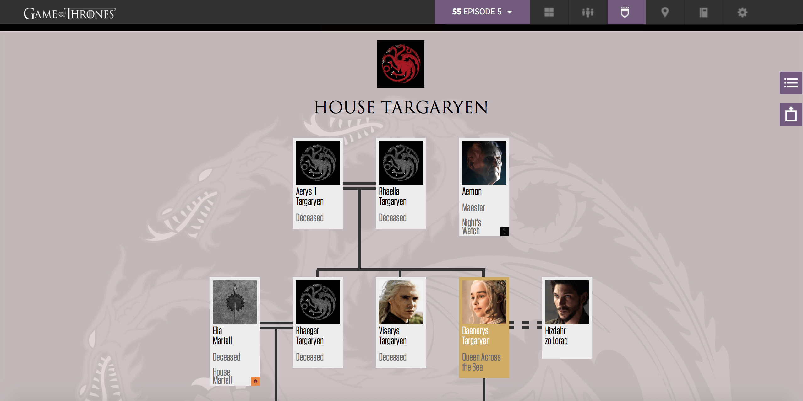
You’ve probably ended up puzzled when watching a new Game of Thrones episode and a bunch of new (but very important) characters come in. It’s hard to keep track and you are not alone. HBO have produced this content rich interactive guide to help you power through those question marks piercing your brain. We promise you, once you drill down into those houses, it’s all going to start making a lot of sense…we hope 😉
curley33
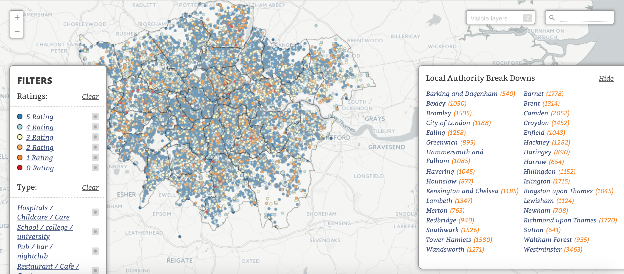
Feeling peckish and fancy a trip to the local takeaway? Before you do, you may want to take a moment and digest the information in this map cooked-up by curley33 using CartoDB. Restaurant and food outlets across London are rated on a hygiene scale from zero to five by the Food Standards Agency, and the results have been mapped and visualised for us to devour. Thankfully, most places appear to be adhering to the high standards that should be expected, although there are somewhere we found the results a little difficult to stomach.
Igrape Institute
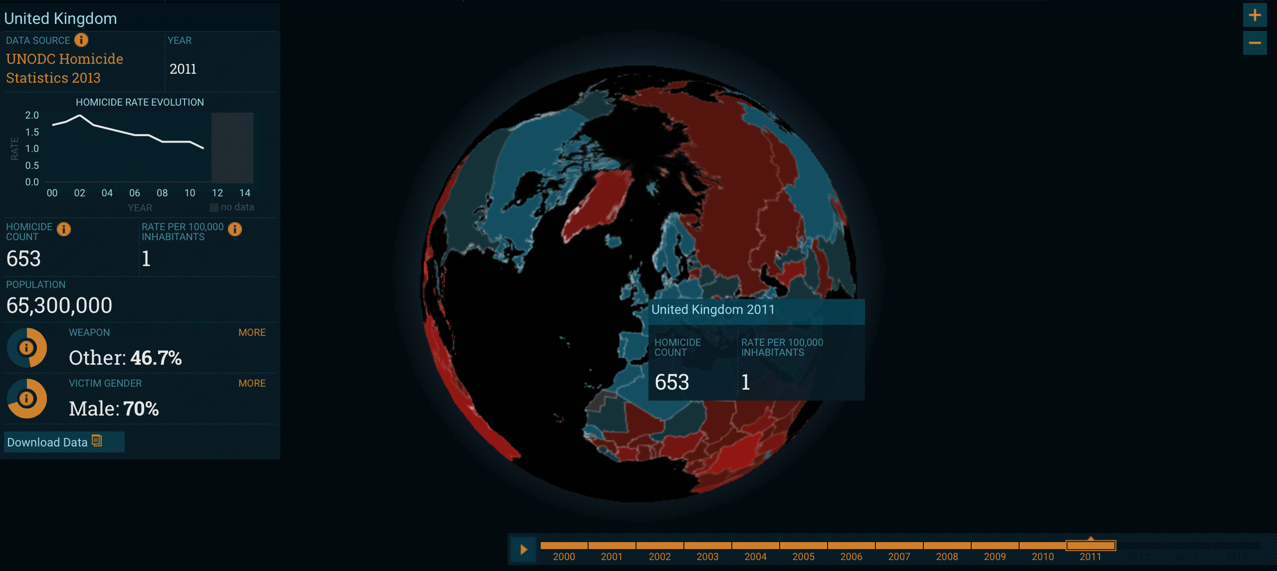
We were pleased to learn this week that homicide rates across the UK are in sharp decline. In fact, the rate has halved from the levels seen in 2002, down to just one death per year per 100,000 inhabitants. Unfortunately, the picture is not so rosy when you look at many countries across Latin America and the Caribbean which typically have some of the highest rates on Earth. The Homicide Monitor, an interactive globe from the Igarapé Institute allows us to explore these tragic patterns, helps bring this unsettling subject to the world’s attention.
The New York Times

We may have just witnessed the future of online journalism. The New York Times recently published an article examining how much children go on to earn based on where they grew up. The choropleth map splits the US down to the county level, meaning there are simply too many regions to cover in depth in the written article below. Except here’s the amazing thing, the article will rewrite itself based on the users chosen location, making for a truly personalised reading experience. If newspaper reporting isn’t dead already, is it only a matter of time?
Jill Hubley
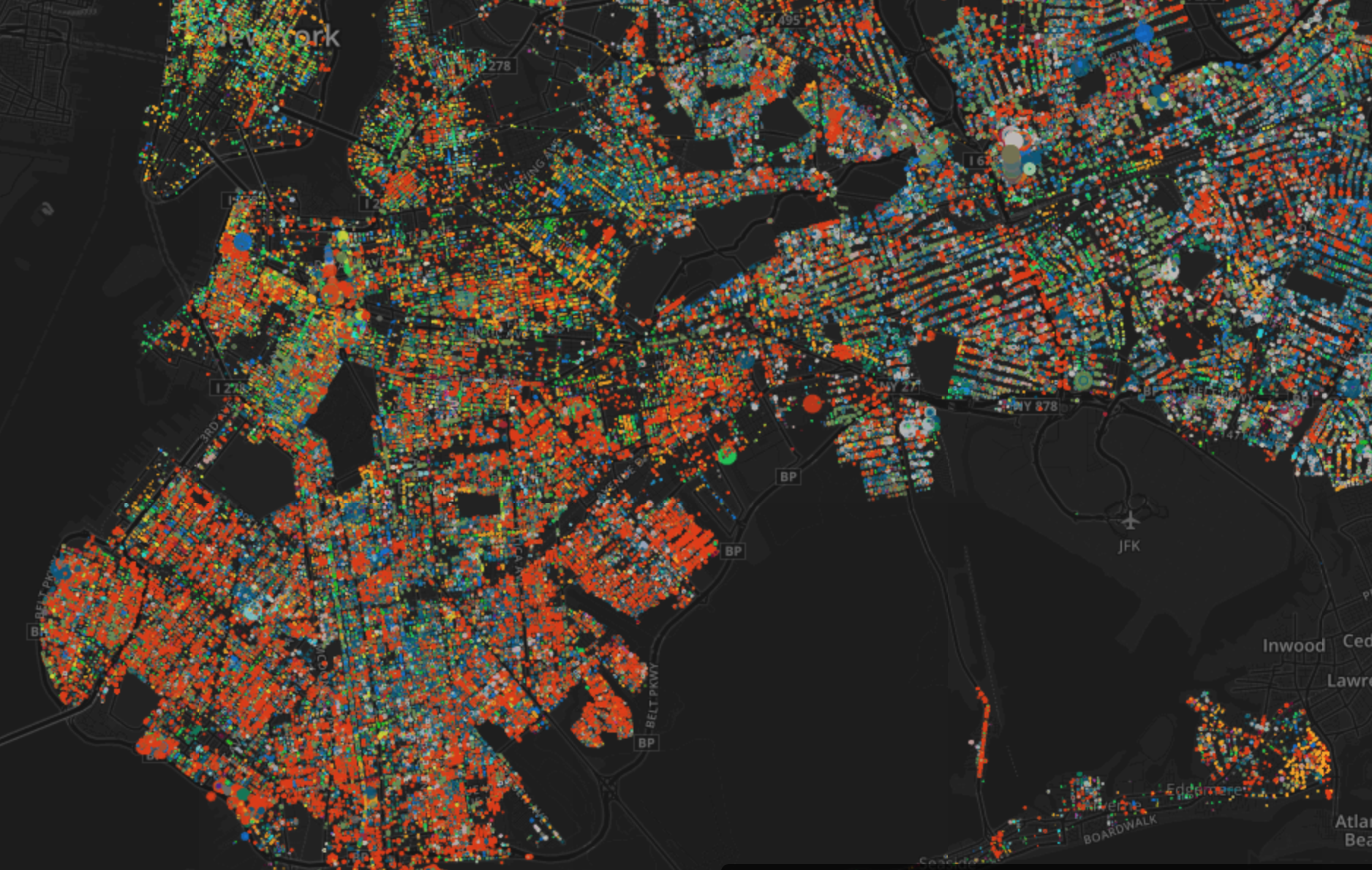
New York City is a bustling, multicultural metropolis. Or perhaps that should be a horticultural metropolis? A map produced by Jill Hubley shows the most prevalent trees in each borough according to the latest tree census, revealing distribution and clusters of each species across the neighbourhood. Surprisingly few apple trees in the big apple, it would appear.
Jorge Moreno
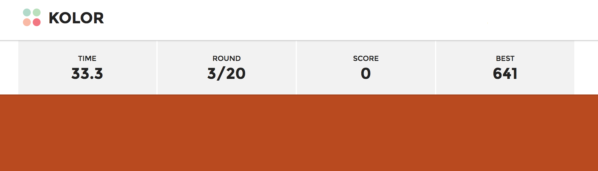
We like to think we have a good eye for colour here at infogr8, but now we can put that theory to the test. A new browser-based quiz from Jorge Moreno pits our retinas against the clock as we are asked to match colour swatches as fast as possible. Our lead designer clocked up a score of 641 on his first attempt, and we don’t see much work being done until that record is beaten.
Javier Arce
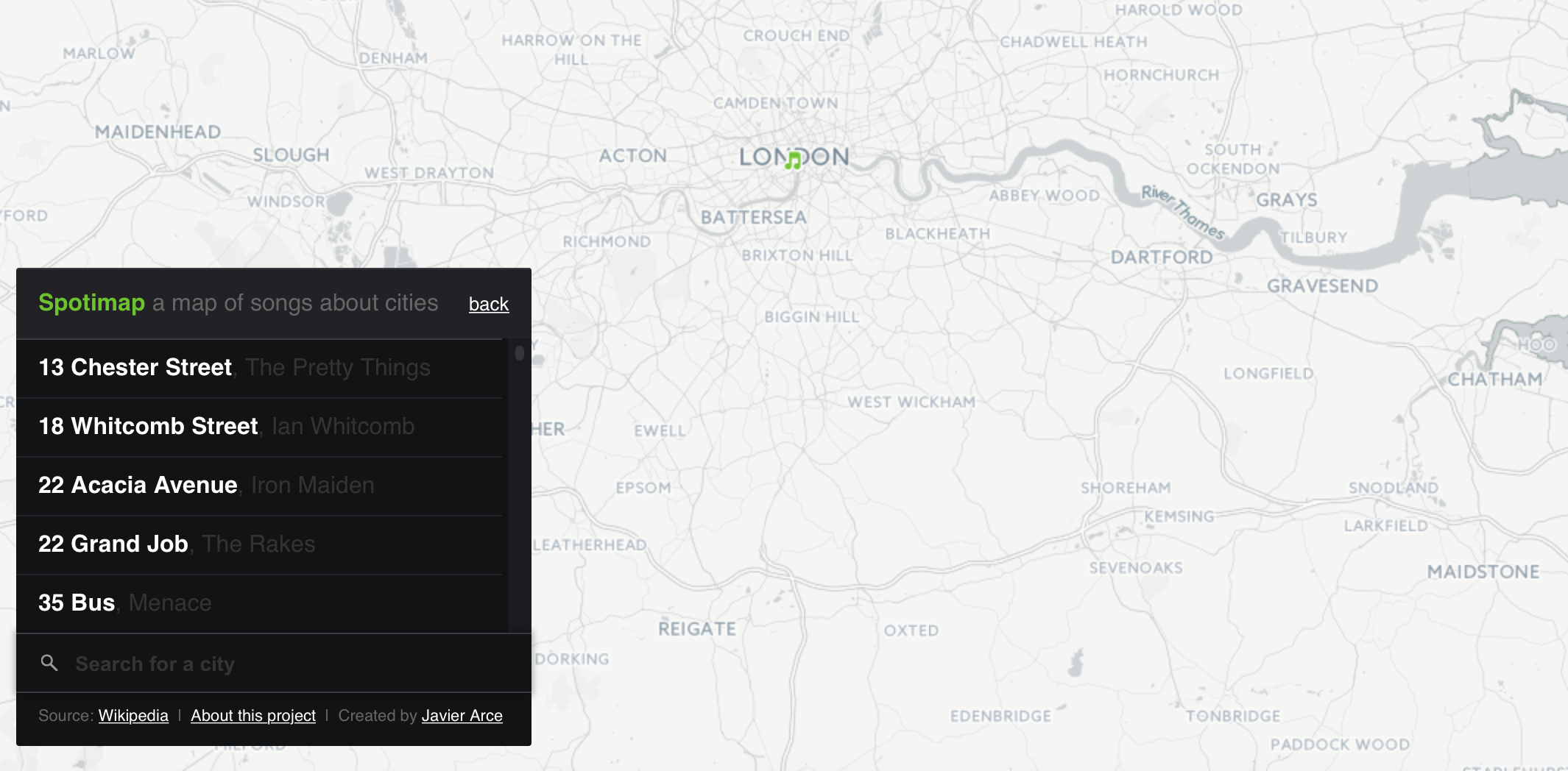
Ever wanted to browse and listen to songs based on your city of choice? Then this map composed by Javier Arce could be right up your street. London Calling to Viva Las Vegas, and Fake Tales Of San Francisco, there are plenty of tunes that take inspiration from famous places across the globe. So, to discover a world of music you may never know existed until now, a pair of headphones and Spotimap are all you need.
BuzzFeed
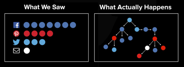
Truly understanding how the latest internet trend went viral can be a nearly impossible task. However, BuzzFeed developed a tool to track how pieces of content get passed from one channel to the next. It’s called POUND, this new tool shows how content ripples across the internet, showing not just the number of shares, but where those shares originated. The tool offers editors and advertisers a window into their users sharing habits on a scale not possible before.