Missing your weekly infographic and data viz fix? Fear not, ICYMI, the infogr8 team have curated some of the best bits we’ve stumbled on this week.
Bryan James
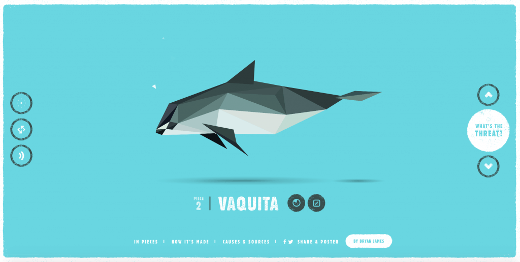
We’ve put this interactive at the top of the list for three reasons, its an important subject, its incredibly well executed, oh and the soundtrack is so beautiful it replaces our overused Ed Sheeran Spotify playlist, sorry Ed.
Bryan James has taken this project on himself which is an incredible feat in itself, with the research coming from a number of sources including the Alala recovery plan you can view 30 endangered species is beautifully illustrated context. We also love the thought that has gone into the project living on users desktops where users can download endangered animal illustrations as wallpapers.
Animagrafs – How speakers make sound
Jacob O’Neal
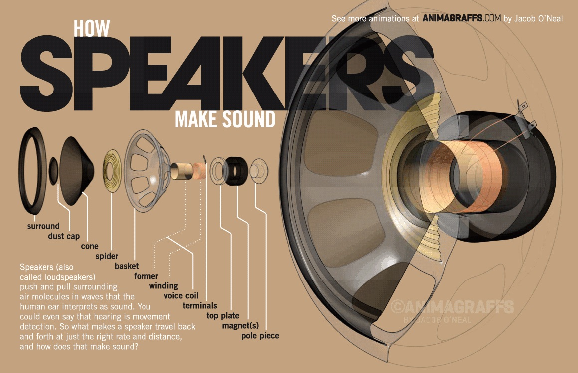
We’ve written about gifographics a while back in our first ICYMI where we featured this incredible work from Eleanor Lutz. Animagrafs which are more extensive version of gifographics, were making some waves in her Malofiej conference keynote. Jacob O’Neal have created a series of animated graphics that explain how technical sounds speakers and car engines work. The movement of the graphics accomplished by the animation is what makes these so compelling, one thing that we would maybe suggest is adding sound to enrich the experience.
#eclipse2015 Total Eclipse of the Heart
jeannie

There was so much fuss around the solar eclipse this week, when it finally happened we were all left a bit underwhelmed as there was no sun to see through the gloomy clouds. To fill in the void we decided to turn to the one eclipse that never lets down, the iconic Bonnie Tyler’s hit. This flowchart will not only make you sing it, but sing it like a boss. We promise it works. Come on, play it and give it a go, you know you want to!

Stefanie Posavec and Giorgia Lupi
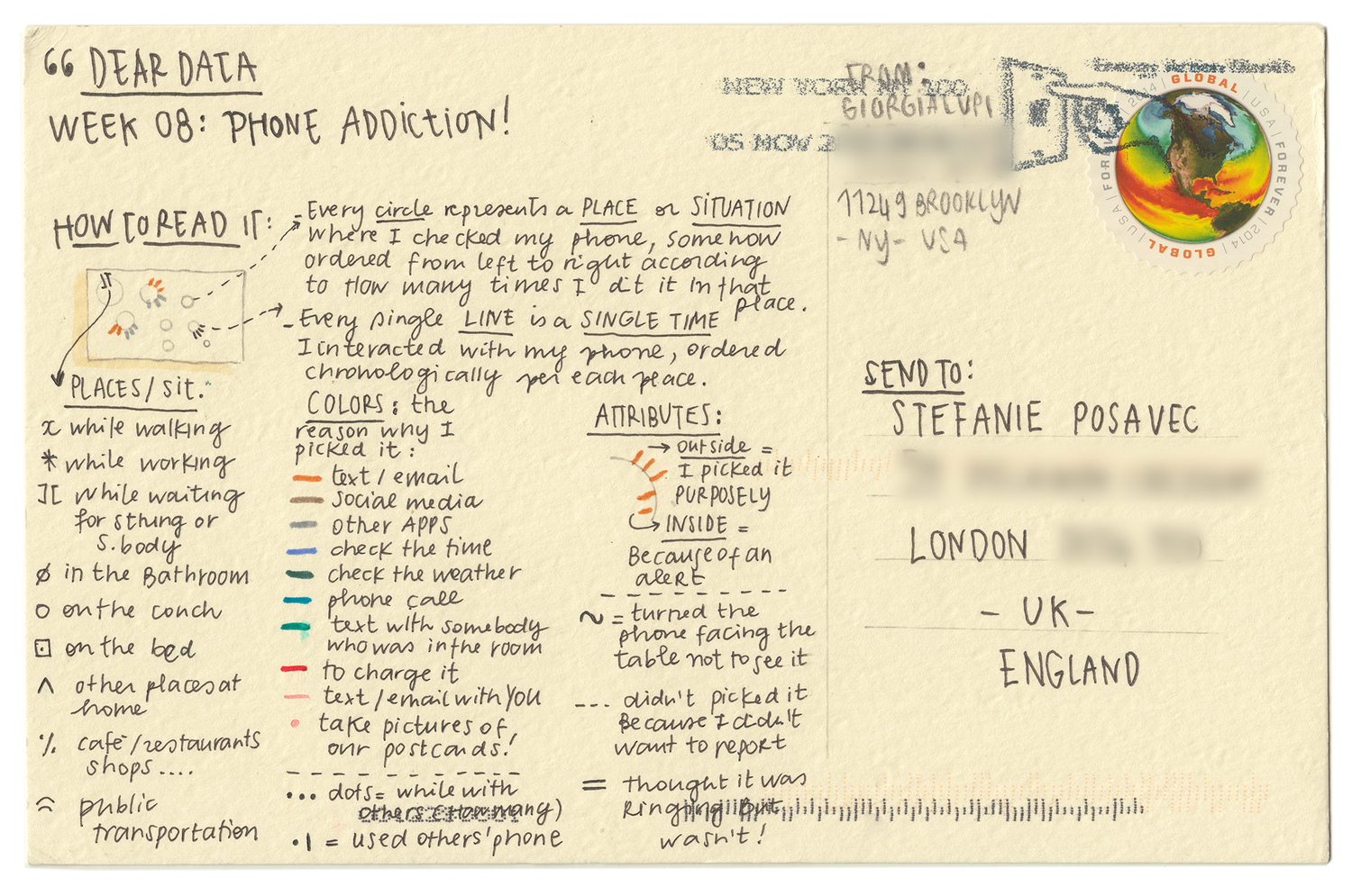
We are huge fans or wearable gadgets and self monitoring data trackers here at infogr8, however we have found that they all have their limitations. Things like exercise and sleeping can easily be monitored, but there is so much that can go completely unnoticed. Giorgia Lupi and Stefanie Posavec have taken a very analog approach to this problem, and have been recording different personal activities using only a note book and pen. The data is then transformed into a hand sketched visualisation before being posted to the other. From counting the number of times they check the time, to how many times they say “thank you”, this is a revealing insight into the patterns and rhythms in their own existence.
Ellie Balk
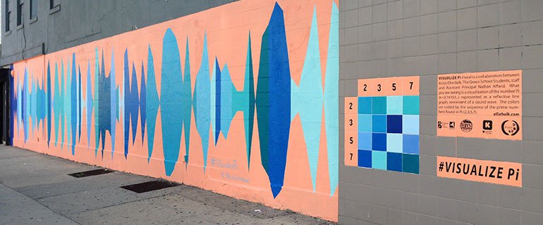
Last Saturday, 03.14.2015 was Pi Day, another phenomenon that happens once in a lifetime. Artist Ellie Balk and students from The Green School in East Williamsburg Brooklyn combined mathematics and art to Visualise Pi as a mural in their community, in this charming Kickastarter project. It’s encouraging to see such young minds already making their way in the data visualisation space, especially when it’s a project that brings everyone together and motivate children to go outside and learn while they play.
Racounter

As you will see in next weeks visual trend report, we’re getting revved up by some of the latest technology hitting the car industry of late, perhaps more prevalent across the World is Formula 1’s 425 million TV viewing audience.
Raconteur have done the number crunching in this intriguing blog on the business of F1 including how much an F1 car costs. Those new Mercedes steering wheels may look like X box gamepads but we’re talking a whole new price tag 🙂