Euro 2016: How England can advance to the next level
The New York Times
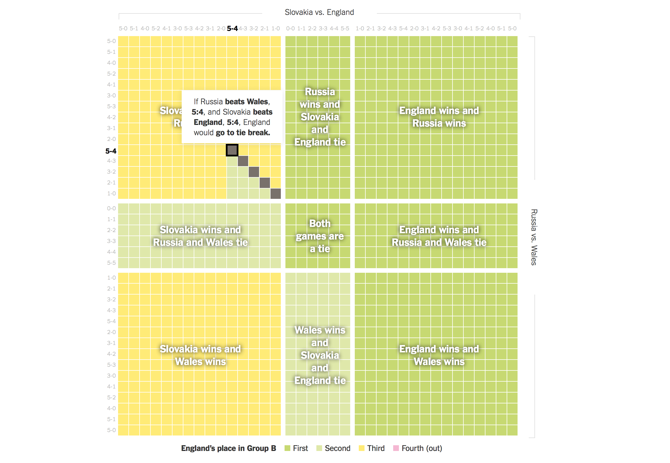
The UK, and the rest of Europe is currently gripped by teams of grown men kicking a bag of air backward and forwards. However the excitement has failed to grip this writer at least, to the point it took several minutes to work out what colour England were playing in when forced to watch England vs Wales yesterday. Figuring out the probability of England progressing after their game with Slovakia is therefore a task that sound far too tiresome to even contemplate. Luckily the New York Times has done all the hard work for us, and produced an interactive module that visualises all of the possible outcomes for each group and their remaining games. England it seams are likely to go through, judging by the proportion of the grid covered in green squares. How exciting.

NME
Flower crown, sunglasses, glitter, Hunter wellies and your tent – check. You’re ready to hit Glastonbury 2016, but where’s the best place to camp? NME created this interactive map of the festival grounds so you can work out well before you arrive where you’re going to collapse onto your mat in the early hours of each morning. They’ve even separated camping sites into ‘lively’, ‘quiet’ and ‘restful’ so you can sort yourself appropriately.

James Talmage and Damon Maneice
Ever wondered how big Antarctica/Russia/Canada/somewhere else actually is? Find out with this microsite.

CIAT – CGIAR
We now live in a world where we want [insert delicious food here] on the supermarket shelves ready for us to chuck into the trolley whatever the season (#expectationeconomy). CGIAR-member CIAT have updated an incredible resource about the origin of different crops with recent data so you can find out exactly where the crop came from, how much of it was exported or imported as well as several other snippets of data, all within a beautiful, colourful data visualisation

The sumo matchup centuries in the making
FiveThirtyEight
The people over at fivethirtyeight have been at it again, crafting incredibly engaging editorial pieces supported by slick interactive modules and snippets of data throughout. This time Sumo is the subject and the article chronicles over 250 years data of the sport (although it is thought that the sport is well over a 1000 years old), while comparing two of its most prolific wrestlers, Raiden born in 1776 and modern day champion Hakuho born in 1985. Through the use of well research narrative and immersive interactive content the team at fivethirtyeight have been able to highlight a rivalry that has been centuries in the making, go check it out and learn more about one of the worlds longest standing sports.

The Economist
Stay? Leave? Remain? Go? The Economist are keeping track of polls to see where things are at in various groups in an interactive module. Not long to go until we find out …

NZZ
Prefer to watch paint dry than sit at the pub watching the Euro 2016? Why not combine the two… German publication NZZ has illustrated how artist Mondrian might have looked at #EURO2016.

Quartz
Researchers at Yale University have digitised 6000 years of city records in the hope that it might offer more of an insight into human civilisation. The team at Quartz have converted this data into a stunning animation of how cities have grown, moved, evolved, increased and decreased over time providing an insight into how cities grow and present-day urbanisation and potentially, uncovering solutions to the problems that affect cities today.