ICYMI – infogr8’s weekly round up of inspiring visual content Vol. 68
Reading time
Category
Data driven microsite
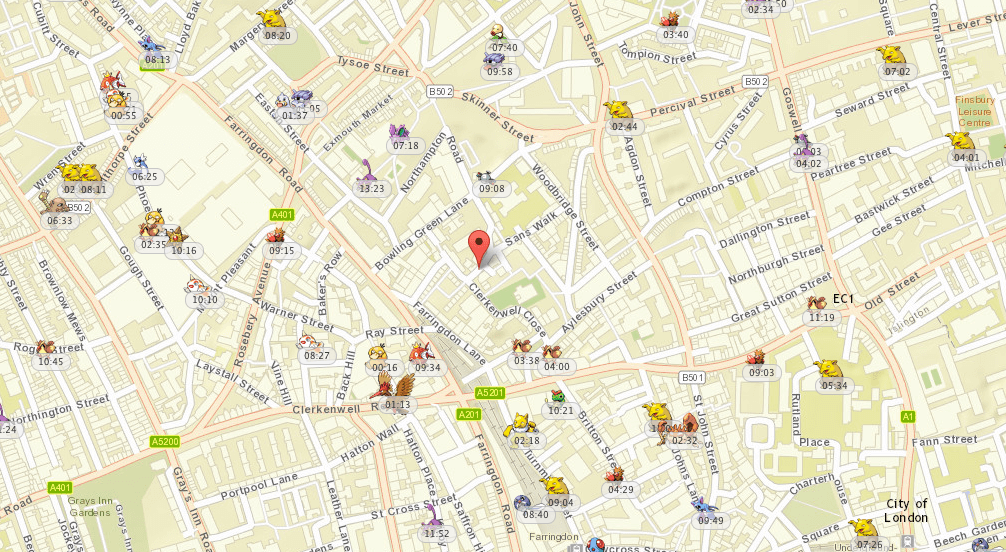
We don’t know about you, but we haven’t been outside in the last week without ensuring we have a healthy stash of Pokeballs and Super Potions. But now we have a new tool to help us hunt down those pesky critters everyone is talking about. Pokevision is a data driven microsite that sucks data from the Niantic API to grab the location of all Pokemon near you, which you can then catch for yourself in the Pokémon GO app. Of course we could not recommend this without testing it first, and just to prove that it work we snook out of the office to see if we could grab a Seel that was lurking by the pub around the corner. Check it out, it’s super effective!

Watch how fast the world becomes obese
Metrocosm
Data blog
Obesity is a topic which we hear about often in the news these days — especially here in the UK. But things weren’t always so tragic. Mainly, the figures have ballooned over the last 40 years, and the average adult today is 3x more likely to be obese than the average adult in 1975. Let’s hope that the new trend for fitness wearables and keeping active will start to reverse these figures.

Data visualisation
I’m sure everyone’s tangled with the nutrition label on food packaging before, squinting to discover to your horror the amount of calories you’re about to bring onboard. Yet, it’s so easy to pan over the information without it influencing your decision-making. But what if you knew that to you’d have to do 14 minutes of swimming to burn off this a pack of Gummy Bears? Makes a difference, right? Sage Project have provided some fantastic visuals on particular foods which gives you a much better experience than squinting at the nutrition label.

30 essential Google search tips
Lifehacker
Infographic
When Shakespeare was crafting his masterpieces he would never have imagined that “google it” would become one of the most used phrases in the English language. Google has become essential to our everyday lives, but are you using it to its full potential? There are some great nuggets in this infographic which you either didn’t know you could do with Google or didn’t realise how far you take it.

The Slow Journalism Company
Infographic
What makes a good speech? A combination of the reading age needed to understand speech and the number of mentions of “me”, “myself”, and “I”? Perhaps. This infographic shows some of the most famous speeches laid out according to the above criteria — there are some pretty interesting results.

Tensions in the South China Sea
Business Insider
Infographic
There are many conflicts around the world which are steeped in historical debates and legal shenanigans, which makes understanding somewhat painful. This is where infographics come in — take a complex topic and simplify it by adding visuals and a story flow. In this case, Business Insider have done a good job at explaining the tension in the South China Sea.

World Economic Forum
Interactive module
The World Economic Forum’s Human Capital Report ranks 130 countries on how well they are developing and deploying their talent. The index takes a life-course approach to human capital, evaluating the levels of education, skills and employment available to people in five distinct age groups, starting from under 15 years to over 65 years.

Canada’s oceans: Planning for a better future
WWF
Scrollable story
Our oceans are essential to life on Earth and probably deserve more attention than we give them. WWF have created a great series on Canada’s oceans, going into depth on the unique ecoysytems and marine environments that surround Canada.