VentuSky
Microsite
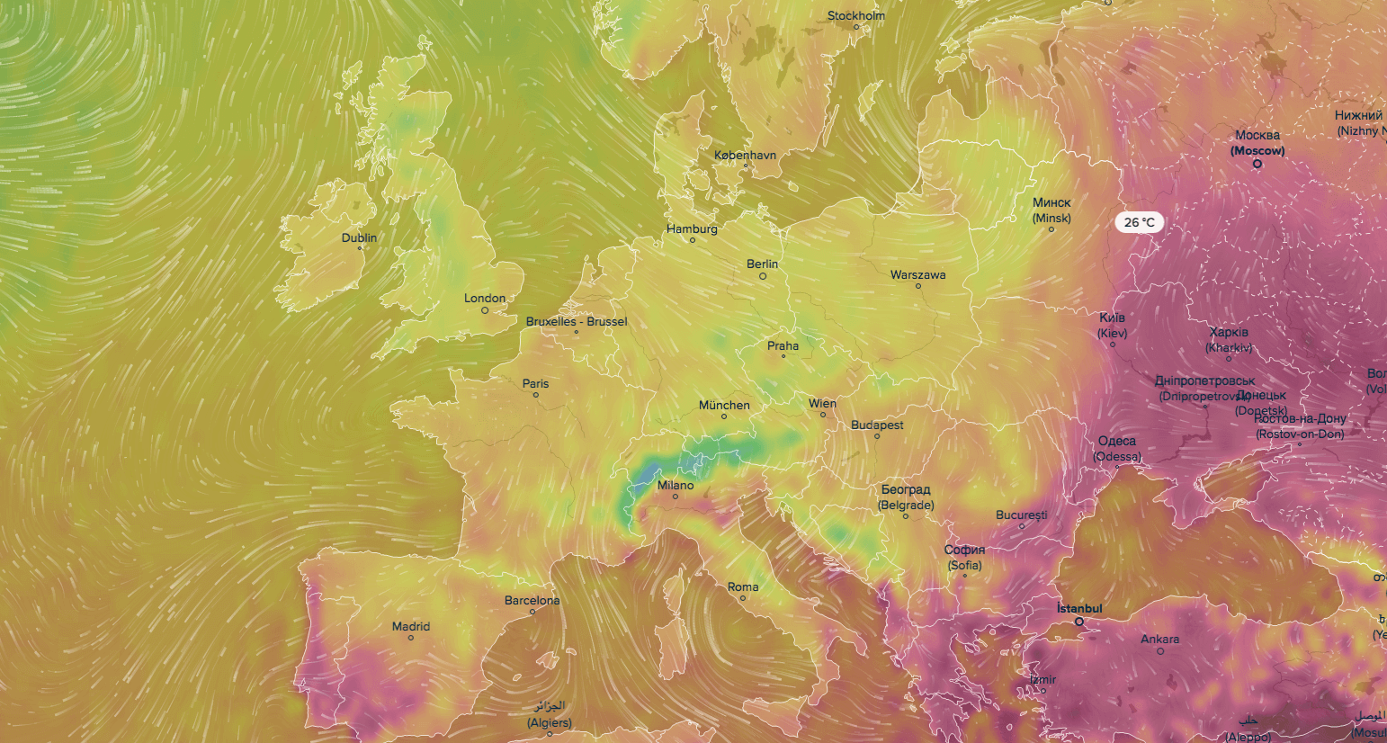
If your google search this morning for ‘today’s weather’ has led you sadly astray and you’ve put on a completely weather-inappropriate outfit, at least you can shelter indoors and watch the weather in real time on VentuSky’s microsite. Every cloud has a silver lining (except the ones on this map)!

Brandwatch
Data blog
Pokemon Go launched in the UK yesterday.. Need we say more? Brandwatch put this blog piece together, collating stories and data on reactions to the game all around the world. All we know is that there are WAY too many Drowzees in Clerkenwell and we saw an Onyx near Farringdon and then it disappeared.

Moovel lab
Data visualisation
Do all roads lead to Rome? That’s the question Moovel lab set out to answer in this interactive map. We’d recommend checking out their About page too to learn about the open source software they used to build this incredibly comprehensive map.

FiveThirtyEight
Interactive module
This interactive module was crafted by the expertise of the FiveThirtyEight team. They collected data on deaths within America from multiple sources, combining them into one so that people could investigate the statistics themselves. The interactive explores 33,000 gun deaths and what it would take to bring that number down. An incredibly harrowing piece that reminds you of the power of data visualisation in facilitating an understanding of something affecting such a huge society like America.

Futurism
Editorial infographic
Being more than halfway through the year now, we’re starting to see how 2016 may feature as a pioneer year in the evolution of tech. The Futurism team picked up on this and have collated the technologies that are shaping up to be pretty exciting breakthroughs for this year that could change our lives forever.

Tracy Tonnu
Editorial infographic
We think it’s pretty safe to say that Harley-Davidson is an iconic brand but we didn’t really know where the company started out. This infographic explores their full history, including major milestones, using their brand colours, of course.

A trail of terror in Nice, block by block
New York Times
Scrollable story
We still find it quite unfathomable at how NYT can consistently deliver immersive, interactive experiences towards breaking news stories at such rapid pace, it is also quite unfathomable as to why one human being could take a celebratory night along a mile of beachfront and shatter it.
New York Times have shown the events that unfolded through this well documented, clear visual story using stitched Google Aerial imagery across the promenade in Nice. When informing the public, simplicity is key and NYT present what unfolded well by showing one clear fact for each ‘slide’. In Andy Kirk’s most recent book ‘A handbook for data driven design’ his 3 guiding principles of good visualisation design ring true for this interactive: it must be trustworthy, it must be accessible and it must be elegant.

Interactive module
England may not have had much to shout about during the recent Euro 2016 tournament, but Wales certainly did, and the fans certainly made themselves heard over Twitter. A goal from Vokes during the Belgium game saw one of the largest spikes in Tweets during the championship. Twitter has put together an interactive module which allows us to explore which goals got the loudest reaction across social media, with goals colour coded to show what effect they had on the game. Unsurprisingly, excitement tends to build towards the end of each game, with penalties really whipping fans into a frenzy.