Sunscreen facts and important sunscreen questions answered
Carrington College
Infographic (editorial)
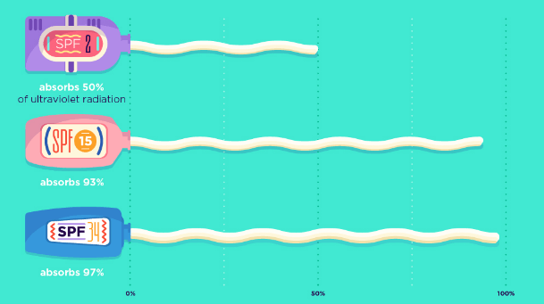
Those enjoying the blistering English summer sun should take a note from Baz Luhrmann and wear sunscreen. But in case you have any questions about what SPF is right for you, when to apply and how much, the Carrington College have you covered. Lather yourselves in glory of this infographic which answers all of the questions you thought were too silly to ask (but aren’t).

Umi Syam
Interactive module
Wimbledon is all over for another year but the infogr8 team are still hankering for strawberries and cream. But what food do people yearn for around other events and public holidays? Umi Syam has scraped Twitter clean, and reveals what foods are mentioned alongside the keyword ‘craving’ at different times of year. Want to see what food is even more popular than turkey at Thanksgiving? Head over to Collective Craving and tuck in.
 Ranking the pain of stinging insects, from caustic to blinding
Atlas Obscura
Infographic (editorial)
If you thought bee stings were bad enough, you probably don’t want to know what other creepy crawlies are out there to ruin your day. From the Ferocious Polybia Wasp, to the scary sounding Bullet Ant, this infographic by Michelle Enemark beautifully illustrates 30 little buggers, and rates them on a scale of pain they are capable of inflicting. We just hope the illustrations are not to scale, time to stock up on the bug spray.

Is sushi ‘healthy’? What about granola? Where Americans Nutritionists disagree
The New York Times
Data blog
A second post about food? It must be nearly lunch time in the infogr8 office. But what should we fill our tummies with today? A granola bar? Frozen yogurt? Orange juice? All are considered healthier by the American public than nutritionists who are in the know. We would be better off opting for quinoa, sushi and wine apparently, as the New York Times has beautifully illustrated through charts. At least both parties could agree that regular soda drinks such as Coca-Cola are the work of the devil.

A 24-hour guide to living a smarter day
BBC Future
Interactive module
We’re certified coffee addicts here at the infogr8 office (apart from the Australian who prefers tea?) but we never stopped to think when the most efficient time was to drink it.. According to the BBC, its between 8am and 10am – a while after you wake up and when your cortisol starts to dip. This interactive module, created in collaboration with Beyond Words, gives you an insight into the times of day things are most likely to happen or the best time for. FYI, 11am is the best time to ask for parole.. but also the time you’re most likely to die.

How air pollution affects your health
The Guardian
Interactive module
BREAKING NEWS: Air pollution is slowly killing us. Shocking, right? Living in London, we accepted a long time go that the smog has probably taken a few years off our lives. But what does pollution really do? Where does it come from? This interactive infographic from The Guardian details the sources and impacts with data collected from the Royal College of Physicians.

Why are left-handers more likely to win Wimbledon?
BBC iWonder
Data blog
“Just 10% of the world is left-handed. Yet since the Open Era began, 23% of Wimbledon singles titles have been won by left-handed players.” This data blog created by BBC iWonder, in collaboration with Greg Rusedski, explores the history of lefties in Wimbledon. You can also use their interactive module to learn how right-handed or left-handed you are.

Automa-nation: Will robots take your job?
Macleans
Interactive module
Self-service check outs, self-driving cars – who knows what will be automated next? Macleans, inspired by the team at Quartz, have looked at the likelihood of jobs and industries that can be automated and will be automated in this cool interactive module. Check out the bubbles to see what jobs are and aren’t at risk.