Erin Wilson on helping younger generations to better navigate their careers through visual data
Reading time
Category
We asked dataviz expert Erin Wilson for her take on career planning tools and how they can help younger generations of professionals to find more fulfilling work.
Where would you go when you’re feeling that itch to take the next career step?
You might Google skills to gain or brush up on. Perhaps you’d search YouTube to hear others’ experiences, check your Linkedin network, research salaries through Glassdoor, and finally submit an application through Indeed.
There is an abundance of apps and websites to help people through the process of getting a job – arguably too many. However, all of these tools are rendered useless if people feel lost about which direction to head in the first place. The Guardian has referred to this struggle as “career paralysis”, which Forbes defines it as “the inability to make any career decision for the fear of making the wrong career decision”. Both sources elaborate on how this often plays out for millennials in particular.
Data exists to help people sort through this conundrum. But most of it lies dormant in databases. The real task here lies in democratising this information to make it useful. Data visualisation tools are an optimal way to help regular people sort through career data and leverage it to navigate their own career paths. And unlike popular existing solutions such as online checklists and lists of general tips, this new wave of tools can offer interactivity and personalised insights.
Certain data visualisation solutions already provide career planning insights and imagine improved concepts for career navigation. For my part, I conceptualise visual tools to showcase career skills to learn, paths to pursue, companies to choose, and salaries to request – most notably beneficial for younger generations.
Career trajectories do not look like they used to. Gallup goes as far as naming millennials the “Job-Hopping Generation”. They found that “21% of millennials say they’ve changed jobs within the past year, which is more than three times the number of non-millennials who report the same”. They hypothesise that millennials are searching for jobs that feel worthwhile, and the data shows that they will keep looking until they find it. Given this desire to keep things interesting, a visual tool mapping out potential roles for their next job-hop could be immensely helpful.
Network graphs: Reveal connections between skills
Imagine a searchable network graph that reveals how your current skills could apply to similar roles. What if the network graph showed alternative occupations that require a tool that you already have expertise in? Further insight could be drawn by connections between these different skills. If you’re already a pro with one piece of software, the graph could suggest similar software to learn that would unlock your potential to branch into new types of jobs.
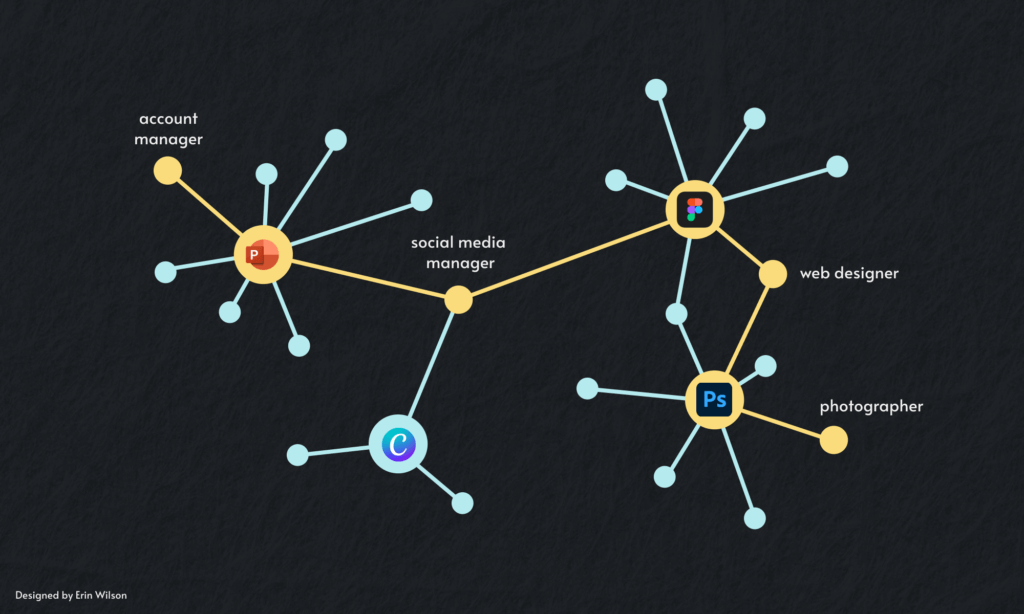
Agilities’ Occupation Explorer is an existing tool built for a similar purpose. It displays 10 core soft skills that, when clicked, filter for occupations requiring that particular skill. My proposed tool would provide more specificity in skills, showcasing connections between specific software and positions.
These connections are not always as obvious as they may seem. Starting my career as a data analyst, I regularly leveraged PowerPoint for data storytelling and insights. As my interest in data visualisation grew, I became more involved in the community and learned that many specialists design using Figma. It took several months before I motivated myself to start learning this tool, primarily because I underestimated the similarity it had to my tried-and-tested PowerPoint. I was delighted to discover a huge overlap of features between the two. It was much like learning a new coding language; I already knew most of the features, I just needed to figure out the correct syntax – or, in this case, the correct button – to accomplish the goal (for example, the button to align or evenly distribute objects).
It was a quick win for me to learn Figma and, by adding it to my resume, I became more marketable to data designer roles rather than strictly analyst positions. My hope is that other people are able to have this same epiphany with quick-win software to add to their toolbelt. The network graph imagined above could illuminate this sort of insight for specific individuals, leading them to new careers that they might not have imagined otherwise.
But sometimes you need to see it to believe it. Imposter syndrome is a common phenomenon that leads to thoughts like “There’s no way I could ever be a designer, I’m a developer!” These types of job-seekers could benefit from seeing how real people navigated their career, step by step. In the business world, we’re familiar with customer journey mapping. This framework could easily be applied to career journeys as well.
Sankey diagram: Learn from the career paths of others
Imagine an interactive Sankey diagram fed by LinkedIn data. Filtering for your own “lookalike audience” (similar to what Facebook offers), you could see real examples of people who started their career in a comparable way – whether with similar education, roles, or companies.
Comparable tools that exist include a career pathway visualisation specific to finance and accounting roles, launched by the Association for Financial Professionals in collaboration with infogr8. Other career mapping solutions are offered through companies like People 1st and Zavvy, but these are limited to journeys within organisations. The proposed solution expands on these concepts by spanning industries and serving up profiles of real people who could help with network building or potential mentorship.
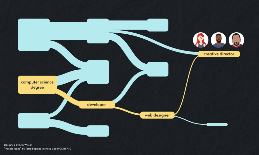
As the owner of this data, this sort of project would undoubtedly be easiest for LinkedIn to do, but it is also feasible for an outside party. It is legal to scrape public profile data for personal or educational uses and is well documented online. There are even tools to do so without any coding experience. A potential roadblock could be grouping similar job titles, since the same role at two different companies could have completely different names. However, I have seen others (on blogs and StackExchange) tackle this through natural language process (NLP) algorithms.
The efforts to work through this solution could be rewarded by providing unsure jobseekers with the confidence to take a leap into a new field, given the exposure to other real people who have already successfully made that leap. Millennials could benefit from achieving these irregular career paths by feeling more stimulated at work, learning the ins and outs of a new field, and adding new tools to their professional toolkits.
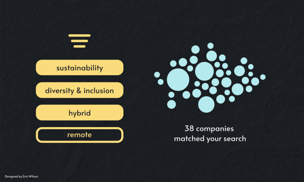
A career isn’t just what you do, though. For many, it’s important to consider who you work for. What’s your impact on the world? What legacy will you leave behind? Younger generations care more about where they work and why.
Expanding filters for personal priorities
According to the Deloitte Global 2022 Gen Z and Millennial Survey, these two generations are “prioritising work/life balance, learning and development, and well-being”. They want to work for companies who have “a clear purpose and [give] employees the opportunity to address societal issues through their work”. These generations hold a high standard and stand firm over what matters to them.
A visual tool could take this a step further to narrow down potential employers for these jobseekers with filters aligned to these values. Let’s look at some examples. In 2021, LinkedIn introduced new filters to their job search feature including remote, hybrid and on-site roles. In their recent collaboration on the American Opportunity Index, infogr8 created a data portal that offers a corporate scorecard for 250 US companies, revealing which employers are providing workers with the most equitable opportunities.
This is a great start, but why stop there? Filters for diversity and inclusion programmes and sustainable practices would directly address the other priorities of younger generations as well.
Let’s say we’ve solved the problem of selecting an ideal job at the perfect company. A visual solution could round out the process by providing salary transparency. Democratising this data is imperative to fighting the wage gaps that very much still exist around the world. In the words of Forbes, “the gender pay gap could be reduced by 40% with broad pay transparency”.
Leveraging public data for pay transparency
With abundant public data sources such as the US Department of Labor (DOL), Glassdoor and H1B Visa salary databases, this is not something that needs to wait for private-sector adoption. A sleek visual tool could make this data readily available and easy to consume.
Armed with the confidence of concrete evidence, professionals could negotiate a higher salary when they realise they’re underpaid. This is especially important for women who, according to research, “negotiate their pay less frequently and vigorously than men” (Forbes).
While the DOL has published a series of dashboards using income data, I believe that there is still opportunity to make this information more accessible to less data-savvy audiences. As a personal project, I used the same data to create a dashboard highlighting the difference in men and women’s median salaries. Many people are familiar with the statistic that in the US, women are paid 84% of what men are paid. Rather than showcasing similar percentages, I wanted to focus on the annual dollar difference for specific occupations to make the gap more tangible.
For example, below I’ve filtered for CEOs. The insights read: “26% of Chief Executives are female. They are paid 4.2% less than their male counterparts, which equates to $36.5k per year.” You don’t have to be a data person to imagine what you would do with an extra $36.5k in your annual pay packet.
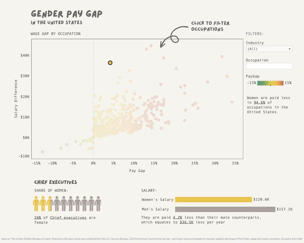
In a way, then, this dashboard democratises this data for the general public. Yet opportunity for improvement remains. For some, a dashboard may still seem too technical. Is there a visual solution to make this data truly accessible to everyone? I’m not sure, but I believe deeply that it’s a worthwhile cause to continually strive for.
Navigating a career is by no means an easy feat. By definition, it takes (almost) a lifetime, and it’s typically filled with twists and turns that seem to only make sense in hindsight. However, businesses now visualise data every day to make similarly complex decisions. The same methodology can and should be adopted to help individuals navigate this complex maze. Because after all, data is for everyone.
Career planning tools offer a host of benefits to professionals, especially from younger generations. In addition, they can help organisations improve employee satisfaction, talent retention and the provision of relevant professional development opportunities.
Is your organisation interested in developing a career planning tool? Reach out to us at [email protected].
About Erin

Erin Wilson is a data visualisation specialist from the US, now based in Paris, France. She has worked in data analytics across various industries, including e-commerce, retail, banking, media and technology. Follow her information design projects on Instagram at @info.illustrated