Elsie Nduta on incorporating Looker Studio into your dataviz mix
Reading time
Category
From dynamic collaborative exploration to advanced customisation and parameterisation, Elsie Nduta explains why Looker Studio is worth considering alongside Tableau or Power BI for analysing your organisation’s data.
Don’t overlook Looker Studio: A comparison guide of BI tools
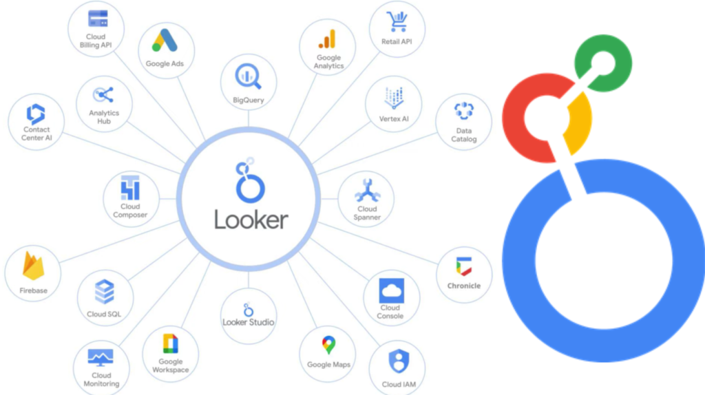
Looker is a comprehensive business intelligence (BI) and data analytics platform that offers a unified view of data by allowing organisations to explore and analyse their data through interactive dashboards. In a big move to amp up its tools for understanding data, Google Cloud acquired Looker for $2.6 billion in June 2019. This strategic step shows Google’s commitment to providing top-notch data analytics and business intelligence services in the competitive cloud computing world, facing off against big players like Amazon Web Services and Microsoft Azure.
Google recognised the unique strengths in Looker’s toolkit, and this deal was a way for Google to offer businesses a comprehensive platform for digging into and making sense of their data. By blending Looker’s user-friendly data exploration tools into Google Cloud’s lineup, the aim was to create a one-stop-shop for businesses to get the most out of their data.
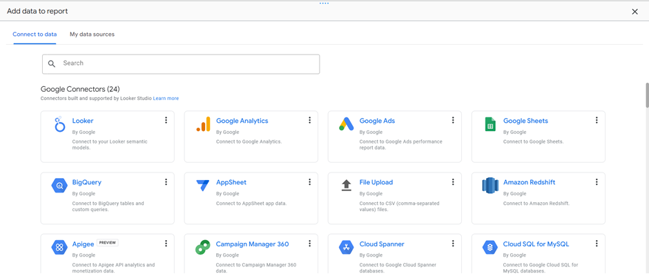
Screenshot of Looker Studio data connection sources page by Elsie Nduta.
The hefty price paid by Google in acquiring Looker underscores the confidence the tech giant has in the value that Looker brings to the realm of data analytics. Beyond competitiveness, this significant financial commitment reflects Google’s dedication to equipping businesses with robust tools essential for thriving in an era where comprehending data holds paramount importance.
This article aims to thoroughly explore the features of Looker Studio, distinguishing it from widely-used alternatives like Tableau and Power BI. As leaders in the business world contemplate the most suitable BI tools for their analytical requirements, it considers the unique advantages that Looker Studio presents, making a compelling case for its adoption in unleashing the full potential inherent in data.
Looker Studio vs. Tableau vs. Power BI
1. Dynamic collaborative exploration
While Tableau, Looker Studio and Power BI all facilitate collaboration through shared dashboards, online platforms and commenting tools, each platform brings a unique flavour to the realm of dynamic data exploration.
Tableau stands out for its established collaborative features such as Tableau Online – a cloud-based platform that allows users to publish, share and collaborate online while creating dashboards in Tableau Desktop. Users can collaborate by leaving comments on specific data points, visual elements or calculations. However, the effectiveness of collaboration on Tableau depends on the specific deployment model (Desktop, Server or Online) and the organisation’s workflow.
On the other hand, Looker Studio takes collaboration a step further with its real-time approach and the integration of community visualisations. This sets the stage for a dynamic and diverse collaborative environment, enhancing the collective understanding of data trends.
Power BI provides robust collaboration tools such as PowerBI Workspace; users can share dashboards and reports with others within or outside the organisation and collaborate on the same report in real-time.
In contrast, Looker Studio’s emphasis on real-time exploration and community visualisations adds an extra layer of dynamism. It creates a space where teams not only collaborate effectively but also engage in a more fluid and inclusive exploration of data, making Looker Studio a standout choice for organisations seeking an advanced collaborative analytics platform.
2. User-friendly data exploration
In the realm of user-friendly data exploration, Looker Studio stands out by providing an immersive experience tailored to users of all proficiency levels. The platform seamlessly integrates intuitive data modelling and transformation features, including dimensions, metrics and calculated fields, ensuring a comprehensive and effortless exploration journey.
While Tableau is renowned for its user-friendly interfaces, Looker Studio takes a step further with a specific focus on approachable data exploration tools. This commitment transcends mere simplicity; it crafts a streamlined adventure through data, making each interaction purposeful and insightful.
Comparatively, in the landscape of user-friendly data analysis, Power BI enters the scene with its intuitive exploration tools that are readily accessible. Yet, within this landscape, Looker Studio emerges not just for simplicity but for its dedication to making data exploration an art of simplicity. Here, the focus on approachability elevates the exploration process into a uniquely streamlined and inviting experience, setting Looker Studio apart in the realm of user-friendly data analysis. It transforms the act of uncovering insights into a captivating and accessible adventure, making it a standout choice for organisations seeking a truly user-centric data exploration platform.
3. Structured data dashboard creation via templates
In the realm of structured dashboard creation, Looker Studio stands out as a dynamic hub, breathing life into data narratives. It surpasses mere empowerment by providing users with a versatile canvas and inclusive template dashboards, serving as a structured foundation for crafting impactful visualisations. The emphasis here goes beyond dynamic dashboards; it creates a creative haven for users of all levels, transforming data exploration into a seamless and compelling experience.
In contrast, Power BI empowers users to sculpt dynamic dashboards, offering flexibility and adaptability. While Power BI supports creative exploration, it does not provide the same structured starting point as Looker Studio. Power BI excels in providing users with tools to customise and shape their dashboards dynamically.
Tableau, on the other hand, distinguishes itself with an intuitive design interface and an extensive array of built-in visualisations. While it may not offer the same level of structured narrative building as Looker Studio, Tableau provides a powerful platform for users to design visually compelling dashboards with ease.
In summary, Looker Studio transforms dashboards into immersive data stories with its unique dedication to structured narrative building, setting it apart. Power BI empowers users with flexibility, and Tableau excels in intuitive design, providing organisations with diverse options for structured data dashboard creation based on their specific preferences and requirements.
4. Integration of community visualisations
Looker Studio seamlessly incorporates visualisations from third-party developers. This distinctive feature expands the range of available visualisations beyond the platform’s native options, providing users with a diverse toolkit for data representation. While Tableau offers a rich selection of built-in visualisations, Looker Studio’s community integrations introduce an additional layer of versatility.
Power BI, much like Tableau, offers a variety of built-in visualisations. However, it differs from Looker Studio in that it has limitations regarding the direct integration of community visualisations into its platform. Power BI users typically rely on visualisations provided by Microsoft or those accessible through Microsoft AppSource.
5. Advanced customisation and parameterisation
Looker Studio, Tableau and Power BI each bring distinct offerings to the table here. Looker Studio distinguishes itself by providing unparalleled flexibility, offering users a comprehensive array of style and branding options. The inclusion of parameterisation in Looker Studio allows dynamic adjustments to visualisation elements, presenting users with granular control over tailoring visuals to specific requirements.
In contrast, both Tableau and Power BI share common ground in supporting customisation. However, Looker Studio’s commitment to flexibility, enriched by parameterisation, elevates the customisation experience to an artform. While Power BI extends support for customisation, Looker Studio’s nuanced approach ensures that users possess not merely tools but instruments for crafting a visual language that resonates uniquely with their organisational identity.
The core features and capabilities of Looker Studio
Data modelling and transformation
Manipulating data to support your business objectives is known as “data modelling”. In Looker Studio, the fields in a data source have certain properties, such as name, data type and aggregation. These properties are provided by the connector used when the data source is created.
Types of data fields
A data source can contain the following kinds of fields:
- Dimensions describe or categorise your data. They contain unaggregated data. Dimensions appear as green fields in the data source editor and report properties panel.
- Metrics measure your dimensions. They contain aggregated data. Metrics appear as blue fields in the data source editor and report properties panel.
- Calculated fields are fields you create by applying functions, operators and/or branching logic to your data.
- Parameters store user-defined data. You can use parameters to customise or personalise your reports and data sources based on user input or variables defined in the underlying dataset.
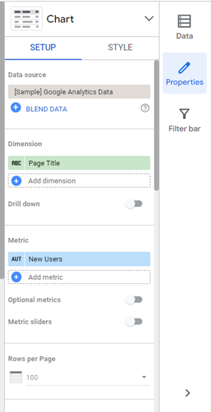
Screenshot of Looker Studio properties by Elsie Nduta.
Interactive data dashboards and reports
Looker Studio stands as a versatile and interactive hub for crafting dynamic dashboards and reports. Users wield the power to construct visually captivating data presentations, seamlessly integrating a number of charts, graphs and tables. The tool’s interactive features play a pivotal role in fostering a real-time data exploration and analysis experience.
Beyond the surface appeal, the inherent interactivity within the dashboards transcends aesthetics, fostering an immersive and enlightening data exploration process. Users can effortlessly drill down into specific data points, revealing intricate trends and conducting real-time analyses all this from a click on a visual. This not only deepens the exploration experience but also facilitates the articulate communication of findings, cultivating a profound understanding of the data across team members.
For those embarking on the journey of data dashboard creation from the ground up, Looker Studio goes the extra mile to ensure inclusivity for users of all proficiency levels. The provision of template dashboards streamlines the process, offering a scaffold that users can leverage to reinforce their data narratives. This thoughtful approach ensures a user-friendly and efficient workflow from initiation to insight.

Screenshot of Looker Studio Dashboard Templates page by Elsie Nduta.
Data sharing and collaboration
Looker Studio takes collaboration to the next level, establishing a seamless environment for teams to share and engage with data effortlessly. The platform allows users to share data dashboards, reports and specific insights with colleagues, guaranteeing that the entire team has access to the most current and pertinent information.
This collaborative spirit is further amplified through Looker Studio’s advanced features. Users can actively engage in discussions by commenting on specific data points, promoting a dynamic dialogue that enriches the understanding of shared data. Additionally, the ability to share annotations provides context, offering valuable insights that accompany the data visualisations.
Looker Studio’s collaborative filtering feature enables teams to collectively sift through data, identifying intricate patterns and trends collaboratively. This inclusive approach ensures that diverse perspectives can contribute to a collective understanding, ultimately leading to more informed and robust decision-making processes.
In essence, then, Looker Studio not only facilitates data sharing but also cultivates a collaborative ecosystem where insights are exchanged and discussions flourish, and where decisions are strengthened by the collective intelligence of the team.
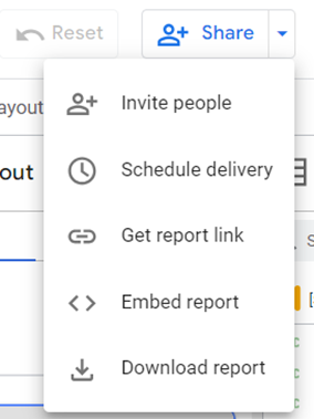
Screenshot of Looker Studio’s data sharing and collaboration feature by Elsie Nduta.
Customisation and visualisation options
Looker Studio excels in providing an unmatched level of flexibility for users to customise their data visualisations. This extends far beyond mere aesthetics, allowing users to precisely tailor visual elements to align with their branding and adhere to specific style guides. The tool enables a cohesive and visually appealing representation of data, ensuring that each visualisation reflects the unique identity of the organisation.
The range of visualisation options within Looker Studio further enhances its capabilities. From standard charts and graphs to more advanced and intricate visualisations, the tool offers a diverse spectrum to cater to varying user needs. This versatility empowers users to select the most effective visualisation type for their specific dataset, elevating not only the accuracy of data communication but also the overall storytelling capability.
One notable aspect contributing to Looker’s flexibility is the integration of community visualisations. These charts, crafted by third-party developers, seamlessly work with your data and can be configured just like Looker Studio’s default charts. This inclusiveness broadens the array of available data visualisations, providing users with additional tools to enhance their data representation.
To achieve flexibility in Looker, users can leverage a variety of customisation features. This includes comprehensive style and branding customisation, ensuring consistency across reports and dashboards. Template usage provides a structured starting point for visualisations, maintaining uniformity while allowing for customisation. Parameterisation then facilitates adaptability by enabling dynamic adjustments to visualisation elements. Additionally, the integration of custom visualisation extensions allows users to bring in specialised visualisations or unique data design elements tailored to specific requirements.
In summary, Looker Studio’s commitment to flexibility, enriched by the incorporation of community visualisations, empowers users to create impactful and tailored data representations that align with organisational branding and effectively communicate insights.
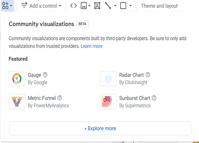
Screenshot of Looker Studio’s community visualisation page by Elsie Nduta.
Data security and privacy
One key element of Looker Studio’s security infrastructure is its implementation of role-based access controls (RBAC). This feature allows administrators to define and manage user permissions based on roles within the organisation. By assigning specific roles to users, the platform ensures that individuals have access only to the data and functionalities essential for their designated responsibilities. This granular control enhances data protection by minimising the risk of unauthorised access.
In addition to role-based access controls, Looker Studio prioritises the confidentiality and integrity of data through data encryption. The platform ensures that data is encrypted both in transit and at rest. Encryption in transit safeguards data as it travels between the user’s device and the Looker platform, protecting it from potential interception or unauthorised access during transmission. Similarly, encryption at rest secures data when it is stored within the Looker environment, adding an extra layer of protection against unauthorised access to stored information.
7 key considerations when choosing a visualisation tool
In the dynamic landscape of data-driven decision-making, the choice of a data visualisation tool is a critical decision for organisations seeking to derive insights from their data.
Several key factors should be taken into consideration to ensure that the selected tool aligns with the specific needs and goals of the organisation:
- Scalability and performance – The chosen tool should seamlessly scale with the organisation’s growth, accommodating expanding datasets and meeting increasing user demands. Simultaneously, it must exhibit robust performance in handling intricate queries and providing real-time visualisations.
- Ease of use and accessibility – A user-friendly interface fosters widespread adoption across diverse teams, empowering users with varying technical expertise to create and interpret the data visualisations. Additionally, accessibility across different devices and platforms facilitates collaboration and decision-making.
- Integration capabilities – Seamless integration with various data sources, databases and data warehouses is crucial. Additionally, the availability of connectors and APIs for third-party integrations with other business applications enhances the tool’s versatility.
- Customisation options – Look for a tool offering a high degree of customisation to match your specific organisational requirements and branding. Assess the range of data visualisation options available, and ensure alignment with diverse data presentation needs.
- Collaboration and sharing features – Features facilitating collaboration among team members, such as sharing insights, comments, and annotations within the tool, enhance collaborative decision-making. Easy sharing of reports and visualisations with stakeholders is also essential.
- Security and compliance – Prioritise a tool adhering to robust security standards to safeguard sensitive organisational data. Verify that the tool complies with industry-specific regulations and data protection laws relevant to the organisation.
- Total cost of ownership (TCO) – Consider the overall cost of implementing and maintaining the tool, encompassing all licensing fees, training costs and potential additional expenses associated with scaling the tool.
Thoughtful consideration of these key factors can guide organisations in selecting a data visualisation tool that meets current needs while providing a scalable solution for future growth. This process involves a careful examination of specific use cases and industries, ensuring the chosen tool is flexible enough to adapt to various scenarios and address unique requirements.
In light of this, Looker Studio emerges as an excellent choice due to its versatility, excelling in retail, healthcare, finance and technology deployments. Its capacity to deliver real-time data insights, generate interactive dashboards and provide dynamic visualisations positions it as a powerful asset for organisations with diverse data visualisation needs. Ultimately, Looker Studio’s cross-industry applicability offers a compelling solution for businesses aiming to transform raw data into actionable insights.
We thank Elsie for her extensive coverage of Looker Studio and list of considerations to help you pick the right business intelligence tool for your organisation. If you’re looking to create a bespoke solution to your data visualisation needs, reach out to us to learn more about how we can help you do more with data.
About Elsie Nduta

Elsie is a dynamic data scientist and analyst from Nairobi with a background in machine learning and innovation. Beyond the data realm, she is a skilled technical writer and volunteer in several tech communities.