Data lies at the heart of everything that we do. Whether it be gaining insight from business analytics or telling a compelling data-driven story, we believe that data holds an enormous amount of potential for connecting and converting users through content marketing.
We also believe that it shouldn’t be exclusive knowledge; instead, data is for everyone.
That’s why each month we endeavour to share our latest sources of inspiration from around the web. These are the pieces that challenged, inspired and spurred us on in March to think differently about data storytelling.
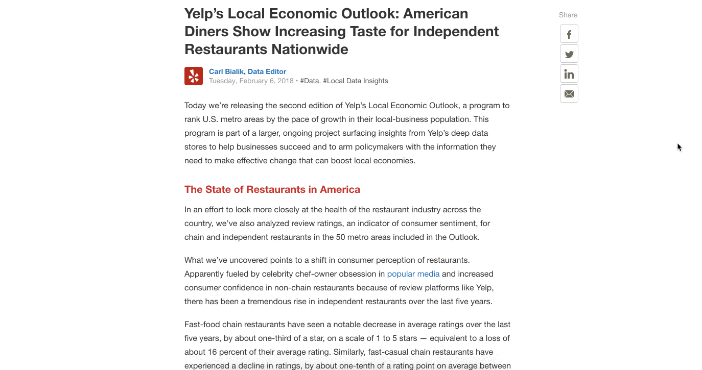
Yelp’s Local Economic Outlook
Brand objectives
- Educate policymakers
- Establish publication as a leader in local business insights
Approach
As a popular restaurant review app, Yelp has an abundance of data on the best places to dine out. The Local Economic Outlook report is Yelp’s latest attempt at doing good with their data by delivering insights for policymakers around the restaurant industry.
Why it worked
Yelp could have taken the traditional approach and sent out a static, PDF whitepaper of their key findings and analysis. But instead, they transformed their data into an engaging and interactive piece of content by visualising their key takeaways. By using a scrolling format that feels familiar to all kinds of users, they made the piece accessible to a range of audiences to navigate the data.
NBC + Intel: VR coverage of the Winter Olympics

Brand objective
- Engage viewers with a one-of-a-kind sporting experience
Approach
In preparation for the 2018 PyeongChang Winter Olympics, NBC wanted to do something different with its coverage by using new technologies to bring people closer to the games. By partnering with Intel True VR, NBC was able to bring 30 different events to viewers in a fully immersive format.
Why it worked
Every two years the Olympic games bring a wealth of new innovation and technology in digital media. Often times these innovations can signal where the most impactful storytelling methods are headed. Virtual reality in many ways is still in early days; but it’s clear that the potential it carries is only increasing with time and, here, NBC prove what can can be done: as early adopters they successfully surprised their audience with a new way of being served content, who in turn responded with delight in exploring it.
National Geographic’s “Billions of Birds Migrate: Where do they go?”

Brand objective
- Educate and engage readers on a familiar topic
Approach
National Geographic has always been a leading publication in visual storytelling, primarily through amazing photography and video documentaries. But in this latest piece, the magazine publisher took a different direction in explaining a common natural phenomenon: the migration patterns of birds.
Why it worked
Most people are aware that birds migrate, and there are plenty of photographs and stories of what this process looks like. However, through visualising these flight paths on a map and combining them with editorial copy, National Geographic breathes new life and brings depth to an otherwise well-covered topic.
NYT: Interactive video format

Brand objective
- Engage and educate readers with an exciting new format
Approach
NBC wasn’t the only news brand who pushed the boundaries this Winter Olympics. The NYT trialled a new interactive video format to cover four of the top athletes at the games.
Why it worked
This new mobile-first approach puts the user in complete control, allowing them to interact with the short guided video clips throughout the story. Swiping through the clips felt more like Snapchat than a video, which was likely it’s intent. By adapting to the trends that users are already comfortable with (swiping-on-demand), the NYT brought readers even closer to the athletes they admire through a familiar experience.
Gates Foundation: the progress of Africa

Brand Objective
- Educate their audience on a counter narrative about Africa
Approach
Data has the potential to tell powerful stories, and perhaps even more importantly, to tell stories that confront tired news narratives with hard numbers and facts. The Gates Foundation has taken this approach to great success with a micro content series depicting the story of progress in Africa.
Why it worked
By turning the map data into a gif, the Gates Foundation was able to engage viewers with something different, something with movement. This provides the perfect teaser to learn more by posing an additional set of questions: why is Africa growing? When did it start? The answers to which can be found in an nicely placed link to their blog.
DataFace’s Exploring Ted Talks

Brand objective
- Engage audiences with a new way to explore qualitative data
Approach
We loved exploring the DataFace’s recent passion project on the past 10+ years of Ted Talks. If you visit Ted’s website, you can find any of these talks by searching, filtering or simply scrolling. But by visualising each talk by the number of views, the DataFace adds a new dimension to how people search for talks.
Why it worked
This visual representation allows the user to see lots of things at once: which topics perform better than others, how views have changed over time and which are the top speakers. By making the chart interactive they also give the user complete control to filter and find the kinds of talks they most care about, with a nifty tooltip to show a preview trailer of the talk.
FiveThirtyEight’s Oscars 2018: Here are our final predictions

Brand objective
- Educate users on the best odds for the Oscars 2018
Approach
When it comes to geeking out on data, FiveThirtyEight takes one of the top spots. It all comes down to a matter of approach: instead of reminiscing an actor’s performance or quoting film reviews, FiveThirtyEight dives straight into the data in order to predict the most likely results.
Why it worked
We loved their take on Oscars predictions because it’s a brilliant example of storytelling with data — allowing the numbers to come first, supported by the editorial. This piece also demonstrates how a saturated subject matter contains greater potential, when you can dive into data to uncover new angles.
Trulia data micro content

Brand objective
- Educate and engage with relevant content to their service
Approach
Trulia specialises in providing a complete resource for finding your next apartment (mainly in the US). And like many other real estate sites, Trulia have been publishing more content around the neighbourhoods of apartments rather than their own services or listings.
Why it worked
What set Trulia apart for us was their smart use of data-driven content, both on-site and through micro content on social. This gif chart on home growth in San Francisco tells a story in itself, while still leaving the user curious for more. Though the animation is subtle, it’s enough to introduce the narrative surrounding growth in homes over the past few years, and acts as a compelling teaser to draw readers in.
Stay tuned for the next set of inspiration from Data for Everyone. Until then share your inspiration with us, or if you have any questions on what’s covered here, send them to [email protected].