As a data-led creative agency, we’re always looking for sources of inspiration. Whether it be new breakthroughs in immersive storytelling or serendipitous discoveries, our #creativeteam Slack channel is always brimming with smart, purpose-driven content.
This year we’re opening up the locker with a new monthly series, named after one of our key pillars: Data for Everyone.
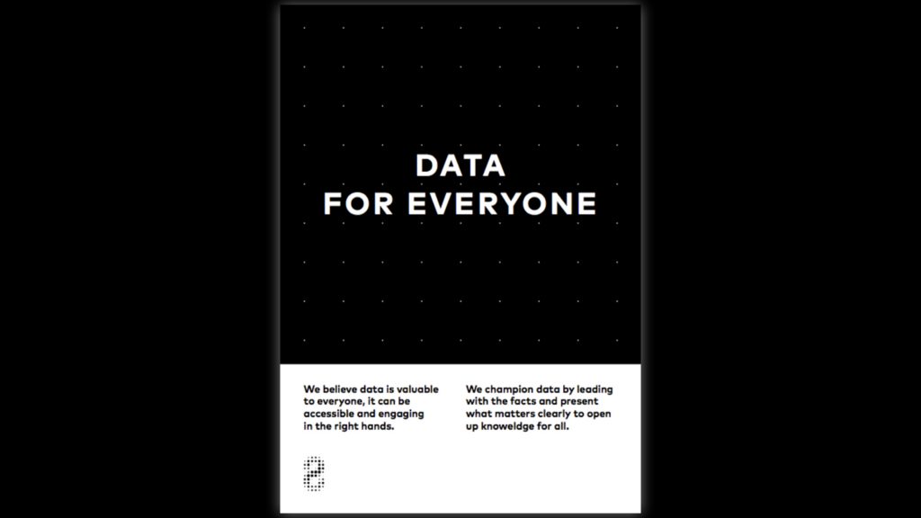
We believe that data should be accessible, useful and open to all. In a world where fake news runs rampant and social media has contributed even more to the noise, data-driven content has become more important than ever. Making good data useful can cut through this noise.
So in the spirit of opening up more data, let’s get to it: here’s what caught our studio screens in the month of January.
Four of the World’s Best Olympians, as You’ve Never Seen Them Before

In preparation for the upcoming 2018 Winter Olympics, the New York Times created an augmented reality scrollable story that breaks down how each olympian has mastered their craft. When using a mobile device users can drag and drop the athletes, and then walk around the figures to explore their expert form and technique.
As an immersive story, this piece takes the reader deep into the details of each athlete in a way that using only text never could before. By combining augmented reality graphics with editorial text, the reader is drawn closer to what makes up an Olympic athlete than ever before—a fantastic example of the power of immersive content.
The Emoji Report

Brandwatch started off the new year by taking a look back at two year’s worth of emojis published on Twitter. The resulting “Emoji Report” breaks down how people have used emojis in relation to the top 100 brands currently on Twitter.
Emoji is the new web language, and as such, analysing this data can bring about some important insights. The report answers questions like: which brands were associated with positive or negative emojis? What months of the year were people more likely to use happy emojis? In the age of big social data, Brandwatch shows how the answers to these questions are well within reach.
How to release an Oscar winning film

This scrollable story from Market Watch caught our attention for a few reasons. The charts and graphics throughout the piece tell the story in a clear way, with colour highlighting the important bits of data as the user scrolls through the piece.
We also loved the idea behind the data analysis: the author’s started with an interesting question (how does a release data affect an Oscar nomination?) and then drove into the data to explore. A fantastic example of using open data to answer a cultural question.
History of Rock in 100 Songs

How are the top artists in rock music connected? Data science company Silicon Valley Data Science created an interactive data visualisation to find out.
The network graph shows how each band from The Guardian’s top 100 list of influential songs in rock music had an influence on each other. The visualisation goes even further by combining multiple other data sources to show each song’s valence and energy. Spoiler alert: The Beatles are by far the most influential band in rock.
What is the pizza capital of the US?

This colourful map came from a collaboration between Google News Lab and Polygraph studio. Based on anonymised Google Location History, it shows for each US county which restaurant cuisine is most popular.
It’s no secret that Google is one of the biggest players in big data. This data analysis is a great example of how this data can be used to extract regional insights on where people are going and what kinds of food they prefer. Plus, it’s just plain fun: who doesn’t love pizza and Mexican food?
Flourish data tool launch

We were very excited to see the public launch of Flourish public last week, a new interactive data visualisation tool for newsrooms, agencies and brands. The tool claims to “give your spreadsheets superpowers” by making interactive data viz more accessible to non-coders. You can get started with a free public account.
As friends of the infogr8 studio, we look forward to seeing how Flourish’s tool will increase the amount of great data-driven content on the web (and maybe a few collaborations in the future!).
Global heatmap of exercise routes

Big data can be quite a relative term these days. But one thing is for certain: this heatmap from Strava most certainly qualifies as big data viz.
The heatmap shows over one billion workout activities from Strava users by visualising three trillion latitude/longitude points. That’s a total ot 10TB (terabytes) of user data. If you strung together all the runs, bikes and swims, the distance would cover over 17 billion miles. That’s pretty big data.
Users can filter and explore by location, activity and intensity to see which areas of each city have the most common fitness routes. But not everyone is happy with the new map…recent reports have shown that the map may have revealed the location of secret military bases. Goes to show: with big data comes big responsibility.
So that’s it for January. Be sure to catch our next Data for Everyone round up by subscribing to our newsletter at the bottom of this page or following us on Twitter.