Upping your visual content game is imperative in this day and age. Whether it be a simple infographic or an immersive interactive story, marketers are looking for a multitude of different ways to keep their audience’s eyes on the page.. and their brains through the sales funnel.
Here’s this month’s round-up of content we just had to click.
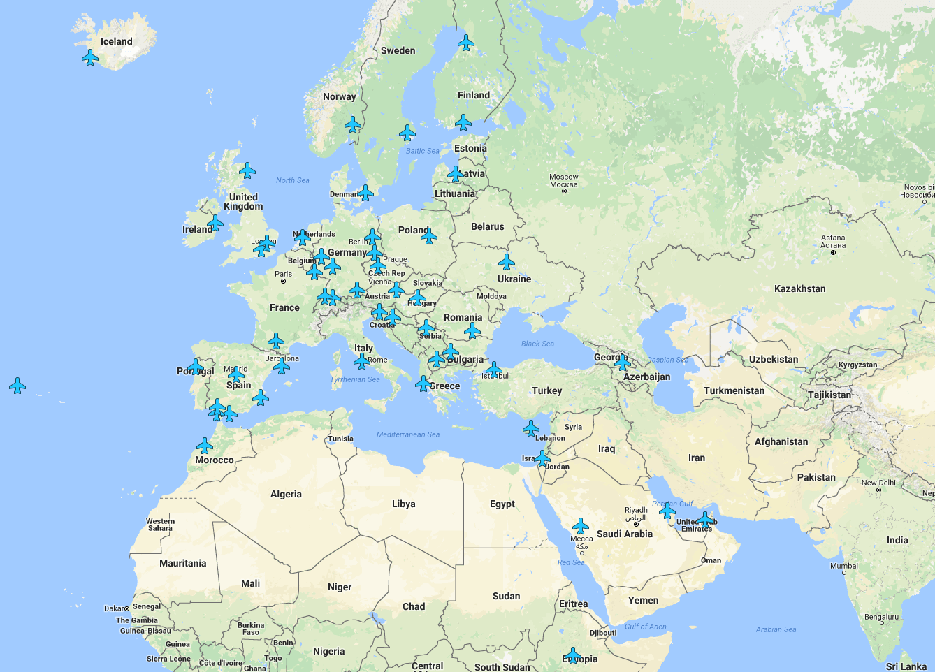
Wireless passwords from airports and lounges around the world
The ShortList
Interactive map
I think we all dread going to the airport only to find out they don’t have wifi – especially if you’re not in your home country and don’t have the luxury of 4G. Our favourite part is when they ask you for a phone number to “send you a code” but.. you can’t because you’re overseas. Good thing this interactive map exists – it details wi-fi codes, limits and other handy information so you can check that Instagram post got more than 11 likes.

From Moscow to Vladivostok: Along the Trans-Siberian railway
International Business Times
Scrollable story
In 1916, a railway that crossed some of the world’s most harsh and inhospitable landscapes was completed. It has attracted tourists from all over the world and transported Russians across their far-reaching country. For the 100 years celebration of the Trans-Siberian railway, the International Business Times put together an interactive scrollable story taking the vieweron a journey through the Far East, visiting cities and hearing their histories and stories.

The Washington Post
Data blog
While we’re all counting down the days until the endless media cycle of the US Election, the Washington Post has been looking back at elections gone by and who would have won had the US had a different parliamentary system. If the US had practiced the UK system in 2012, we would have said goodbye to a second term for everyone’s favourite president, Barack Obama. Scary stuff!

Google Trends
Interactive data visualisation
There’s nothing like a search engine round-up to see what the world is really thinking. Google Trends, in collaboration with Pitch Interactive, created this interactive detailing what the public thought through the lens of Google searches.

TabletopWhale
Infographic
Architecture buff? Love a good Georgian or Victorian blueprint? What about a spine? In a collaboration with Nerdcore Medical, top tier designer TableTopWhale designed ‘the architecture of the spine’. A beautiful and straight-forward design to get people interested something they probably normally wouldn’t be.

Raconteur
Infographic
Raconteur created this interesting infographic based on the number of surgical procedures in 2014 and 2015 and ancient beliefs about beauty. Excuse us while we book into a whole body cosmetic surgery session…

The entire history of Kickstarter projects broken down by city
Polygraph
Data visualisation
We know different US cities all have their own unique vibe, but we’ve never seen it visualised quite like this before. Black Rock City is clearly overrun with art connoisseurs, Nashville are crazy for their music, while Dallas is brimming with hardcore gamers. At least that is the impression we get after seeing what Kickstarter projects emerged from these, and other locations across America. A series of beautiful cluster charts by James Wenzel also reveals which type of projects attracted the largest number of supporters. This project certainly gets our backing.

Skyler Johnson
Interactive module
So this one might be for the die hard Potterheads out there, which I can only assume is everyone! I’m sure we have all sat there wondering which spells get the most mentions in the Harry Potter books, well wonder no more! This simple chart by Skyler Johnson illustrates exactly when each spell was explicitly said in the books and even has the corresponding quote. Beautiful, nerdy and interactive, enjoy testing your HP knowledge.