Best of Data for Everyone, September 2023: Daylists, droughts and dreaming flies 💤
13 mins
Reading time
Reading time
all
Category
Category
Each month we share some of the best dataviz the world has to offer.
On the menu this month:
- Can a fly dream? by the Howard Hughes Medical Institute
- Daylist by Spotify
- America is using up all its groundwater, like there’s no tomorrow by the New York Times
- What is the climate impact of eating meat and dairy? by Carbon Brief
- Hand controls in maps by Ordnance Survey
- Searching the Women’s World Cup by Google/Polygraph
- It’s birthday season, according to the data by Mona Chalabi
- Data Soap by Clarice (Tze Ching) Lam
Can a fly dream? by the Howard Hughes Medical Institute


- Intro: Scientists at the Howard Hughes Medical Institute in the United States have created the most detailed view of a fruit-fly’s brain to date. In order to piece together the 25,000 neurons (about a quarter of the total), the team partnered with Google to develop an algorithm that could accurately predict where each neuron aligned, based on 2D cross sections, to build out the 3D image.
- Why it matters: It is a testament to advancements in AI that visualisations like this, considered impossible only a couple of decades ago, can be seen in their full glory today. Not only is the image itself fascinating, but it also contains important insights into how neural connections are able to create and store memories, perform motor function and even dream. So, do flies dream? Until recently, this would have been a purely philosophical question, but through recent scientific advancements, we might actually discover the answer. And by doing so, we’ll be one step closer to understanding the foundations of consciousness itself.
Daylist by Spotify
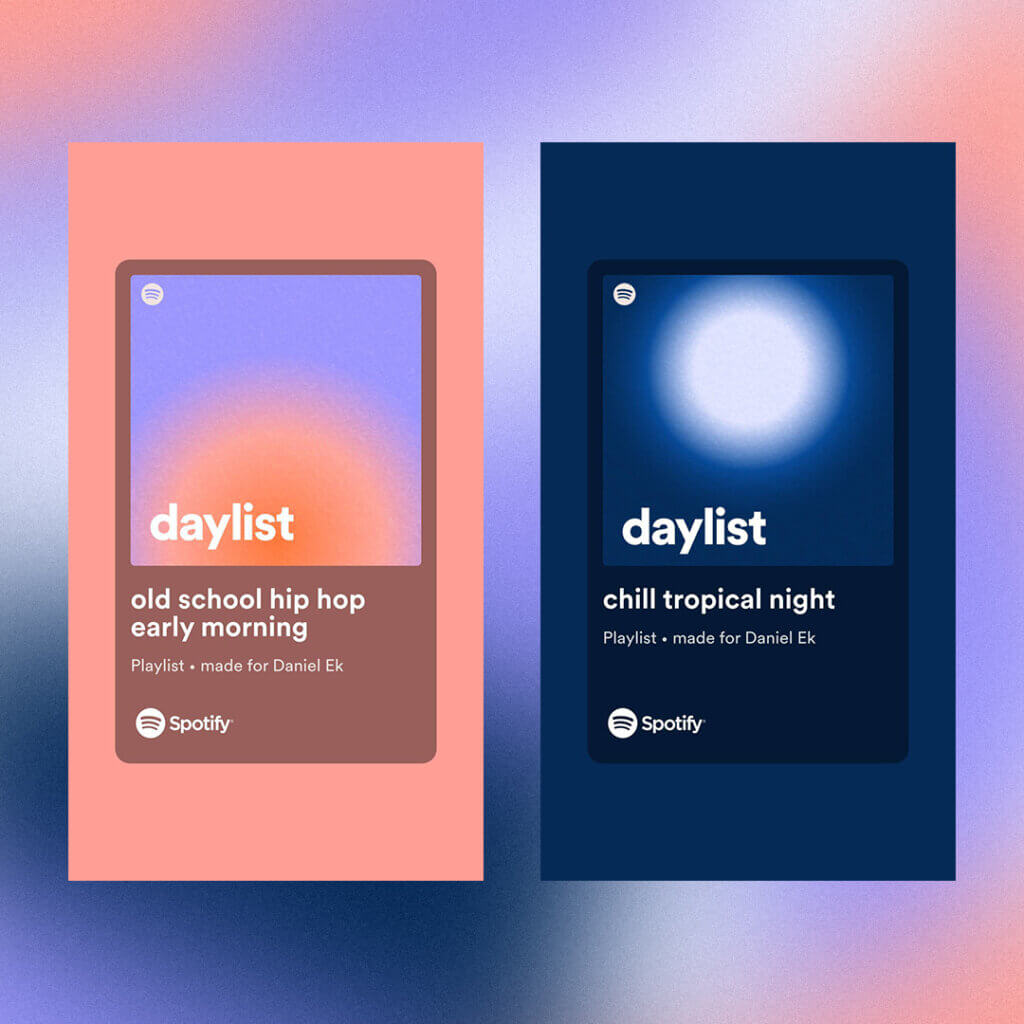

- Intro: As regular users will know, Spotify is relentlessly looking for ways to innovate their platform and find better ways to harness their data. The company recently introduced the ‘daylist’ feature, where users are given “hyper-personalised, dynamic and playful” playlists to match their mood at given times of the day or night. It’s a great example of how devising new and creative data solutions can help to position an organisation at the cutting edge of their field.
- Why it matters: The new daylist feature is just one creative way to think about how data can encourage habits or improve our day-to-day lives. Next up for Spotify will likely be geo lists, where access to the user’s location triggers tailored playlists, podcasts or song choices (think Waterloo Sunset on the commute home to South London, Across 110th Street on a jog through Central Park, and so on).
America is using up all its groundwater, like there’s no tomorrow by the New York Times
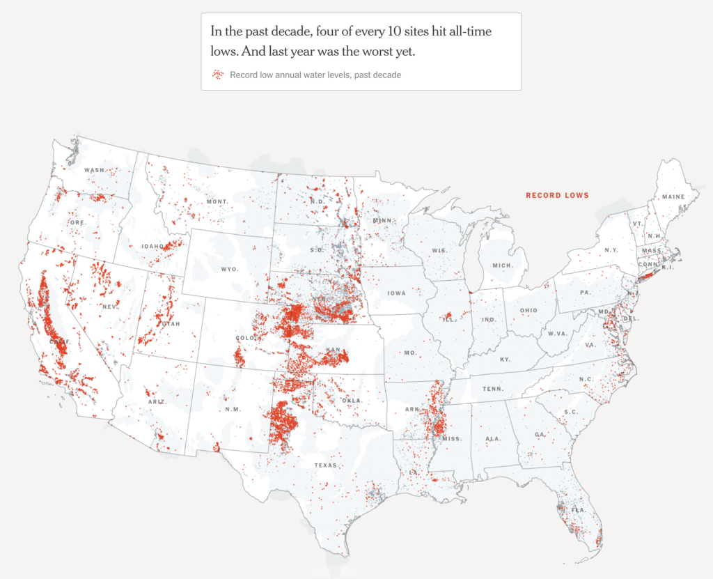

- Intro: Fresh off the back of our visuals on Earth Overshoot Day, highlighting that we are using more ecological resources than Earth can replenish over the course of a year, this piece from the New York Times investigates a major threat to American prosperity – diminishing groundwater supplies. And why are they diminishing? More water is being pumped out than can be replenished. According to Don Cline, the associate director for water resources at the United States Geological Survey: “There’s almost no way to convey how important it is.”
- Why it matters: Overpumping of aquifers in the US is causing issues in Kansas (reduced crop yields), New York (reduced availability of safe drinking water), Arizona (not enough water supplies to support new homes in Phoenix) and Texas, California and Utah, where roads are starting to buckle, foundations are beginning to crack and fissures are opening up in the ground. This article highlights first-of-its-kind research that evaluates the issues at a holistic nationwide level, and the visuals convey, in a very simple way, the depth and breadth of the challenge across America.
What is the climate impact of eating meat and dairy? by Carbon Brief
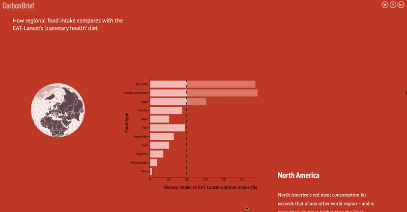

- Intro: Food production and climate is not a recent or new discussion. So what makes this article so interesting? Three reasons: 1) It answers relevant questions that we want to know (and questions I’ve asked myself). 2) It provides the facts in full rather than a biased snapshot. 3) It cuts through the noise using data visualisation to show the comparisons clearly and without complexity.
- Why it matters: We all need to do our part to help improve climate issues, but it’s a balancing act – for each person, what they can do is different. I’ve found myself unsure of what is best for my diet and the climate and how to weigh up the different factors. And I’ve often read food articles that have left me more confused than informed on the best course of action. This article provided just the right balance of education, insight and data to give readers a solid benchmark to either take action or build up their understanding about food-related climate impacts. In particular, the interactive global comparisons removed some of the complexity and added the engagement that made me explore the data further than the standalone static charts. Two surprises for me were that dark chocolate has the highest emission per 100g of protein and that, on average, the transport emission per kg accounts for a much smaller proportion overall than I expected.
Hand controls in maps by Ordnance Survey
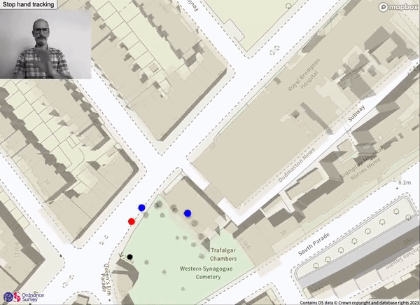

- Intro: We’re slowly stepping into the world where VR and AR will become a significant part of our everyday lives. Before that happens, one of the fundamental challenges is how we will interact with content in different spaces (AR, VR, holography, etc.). This technique by Ordnance Survey’s UX Practice Lead Steve Attewell uses hand tracking to move through a map of London, with added zoom functionality to show all the detail we expect from OS maps.
- Why it matters: Considering the challenge above, this particular technique is interesting since it may become one of the forerunners for future techniques of graphics exploration in 3D augmented reality spaces.
Searching the Women’s World Cup by Google/Polygraph
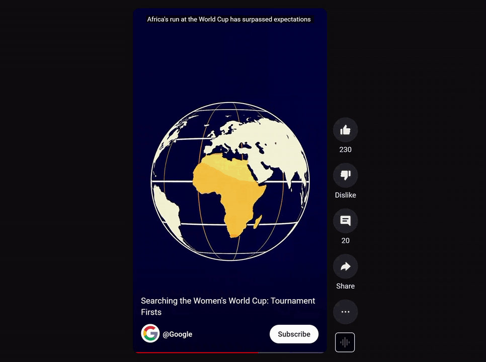

- Intro: While it may feel like the actions of one man have dominated the news this Women’s World Cup cycle, it’s worth remembering that the players on the pitch made their own (much more positive) headlines as well. This series of ‘data-vids’ by Google and The Pudding’s sister studio Polygraph recaps some of the women’s ground-breaking exploits down under.
- Why it matters: Sitting as infogr8 does at the intersection of data and creative technology, it’s fascinating to see one of the world’s tech giants go mobile-first and video-first with its data storytelling. The Google Trends data also throws up some interesting points from a social justice perspective, including the question of recalibrating representation of the football confederations based on search interest rather than money/influence.
It’s birthday season, according to the data by Mona Chalabi
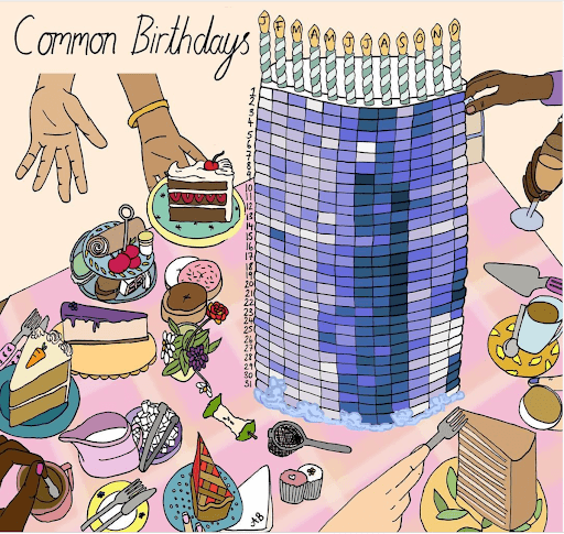

- Intro: Sorry to say it, but if you’re born on September 9th, you’re nothing special. But if you were born on Christmas Day or New Year’s Day, you‘re a relatively rare gem. As @monachalabi says, can you see the patterns in the data?
- Why it matters: The story goes that in World War II, military analysts were trying to figure out how to better armour their planes. The data began to show a clear pattern: most damage was to the wings and body of the plane. The solution to their problem was clear: increase the armour on the plane’s wings and body. But US statistician Abraham Wald intervened. These were the planes that had returned. What was happening to the planes that didn’t make it back? It was a missing part of the data. Wald’s insight led to a change to reinforce the areas where there were NO bullet holes on the returning planes. The result was greater success in the subsequent campaign. When data is transformed into visualisations, it has the power to unearth outliers. These outliers help us to find insight, patterns and observations that lead to positive outcomes, and which may otherwise have been missed.
Data Soap by Clarice (Tze Ching) Lam
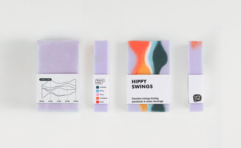

- Intro: The Information is Beautiful Awards’ longlist was announced earlier this month, and I always look forward to browsing the works submitted by the international community. What’s especially unique about these awards is the large volume of submissions from students, with some really interesting discoveries to be found. My pick for this month comes from Clarice who is enrolled at London College of Communication. Clarice created soaps to visualise the stories of household water usage from people she interviewed. The packaging also cleverly includes supplemental information such as water scarcity in Taiwan and shower patterns to put the individual stories into broader context.
- Why it matters: One of the reasons I enjoy looking at student work is because it’s usually experimental in nature. The outcomes aren’t restricted by client demands, which leaves room for creative expression. As a result, new solutions are created to solve existing problems. Communicating data around sustainability and the environment continues to be a challenge, and organisations are hungry for creative ways to reach audiences. Data Soap is one example of how we can do just that through an object that everyone uses on a daily basis. With its vibrant colours and vivid shapes, the soap presents another new opportunity for people to engage with data.