Best of Data for Everyone, October 2023: Infinity, invisibility and inside Airbnb
11 mins
Reading time
Reading time
all
Category
Category
Each month we share some of the best dataviz the world has to offer.
On the menu this month:
- Invisible Epidemic by The Pudding
- When I was your age by Caprice Carstensen
- De-weeding the data visualization landscape by Lisa Vissicheli
- 4D Gaussian splatting for real-time dynamic scene rendering by Guanjun Wu et al.
- Infinity by Dea Bankova
- Inside Airbnb
- Data Clocks by Russell Samora
Invisible Epidemic by The Pudding


- Intro: Drawing on data from the American Time Use Survey, Alvin Chang at The Pudding has created a beautiful data story, shining a light on the invisible epidemic of loneliness.The story takes us on a journey, looking at a day in the life of numerous people, in the style of an imaginary apartment block, getting a look through the windows of their lives.
- Why it matters: Not only does the data story take us on the journey throughout a day in the life of the subjects, it also takes us on a journey into the epidemic itself: showing us what people are doing throughout this day, who they’re spending time with, whether they’re with close friends or family, understanding how long they’re interacting with people, and how the individual feels about their life at this moment in time.It’s a truly fascinating, if not heartbreaking, read. One that stirs up empathy for the subjects and provokes deep self-reflection. In my experience, it’s rare to come across data visualisation that stirs such emotions, making this a masterpiece.
When I was your age by Caprice Carstensen


- Intro: This data visualisation project (and Information is Beautiful Awards entry) is a great example of data storytelling coupled with a very human and relatable narrative around the costs in spending habits for different generations. As a fast approaching 30 year-old (shhhh), I have to admit I often find myself chatting with different friends about my childhood – when a Freddo chocolate bar cost 10p on my walk home from school, or when the Friday night fish and chips for the family was under £10.
- Why it matters: How do you effortlessly combine interactive data visualisations, transitions, complex data, and narrative in a way that’s engaging, cool and that anyone can follow? Well, like this! I found myself delighted by the design, curious about the interactivity, and like I had my own friendly guide taking me through the story. With the cost-of-living crisis, the data itself is something we can all relate to, and it piqued my curiosity to find out more and explore beyond the visualisation itself.
De-weeding the data visualization landscape by Lisa Vissichelli
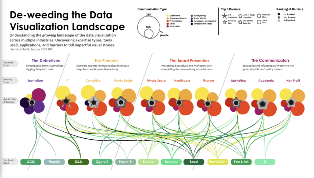

- Intro: This amazing data visualisation is about… data visualisation! It’s jam-packed with insights that would be virtually impossible to represent coherently in any other format, all while looking beautiful at the same time. Based on DVS research, the visualisation shows trends in expertise types, the tools used for which application, and incredibly the barriers too, across a whopping 10 industries.
- Why it matters: Looking at this from a healthcare perspective, it confirms what we already know to be true: access to data and sourcing credible data are two major barriers that the healthcare industry is struggling with. It’s also noteworthy that not all data visualisation experts are designers, with 25.4% lacking design expertise. But perhaps the best thing about this visualisation is that it’s an excellent demonstration of the need for the subject matter it is explaining, which in turn is itself? Is this the Penrose stairs of data visualisation?!
4D Gaussian splatting for real-time dynamic scene rendering by Guanjun Wu et al.


- Intro: Rendering 3D realistic dynamic scenes with motion has been a challenging task in the past. Any development in VR and AR technology would require a potential breakthrough in this area of 3D, and Gaussian splatting may actually be the answer. According to the researchers, this new technique achieves real-time rendering under high resolutions, 70 FPS at a 800*800 resolution on an RTX 3090 GPU, while maintaining comparable or higher quality than previous state-of-the-art methods.
- Why it matters: The possibilities of using 4D Gaussian splatting really are endless. You could create usable 3D scenes from old movies and watch them in VR glasses. You could even apply insane VFX effects. In theory, everyone would be able to create high-quality 3D scenes, which would challenge and disrupt today’s status quo of 2D images and videos.
Infinity by Dea Bankova


- Intro: Created as a personal project, Dea crafts a fun, colourful, and mesmerising ode to a mind-boggling concept: infinity. I’ll admit I had to re-read several sections because it’s been over a decade since I last studied maths, but when I visually saw how they worked, the concepts slowly started to click.
- Why it matters: Infinity is a testament that interactive visualisations can create experiences for any topic irregardless of the level of complexity; it all comes down to how it’s presented. This piece feels particularly nostalgic with its Bill Nye-like narration that enthusiastically guides you through complex concepts such as cardinality and natural numbers. Despite the topic being stereotypically viewed as difficult or intimidating, Dea manages to create a welcoming and lively user experience.
Inside Airbnb
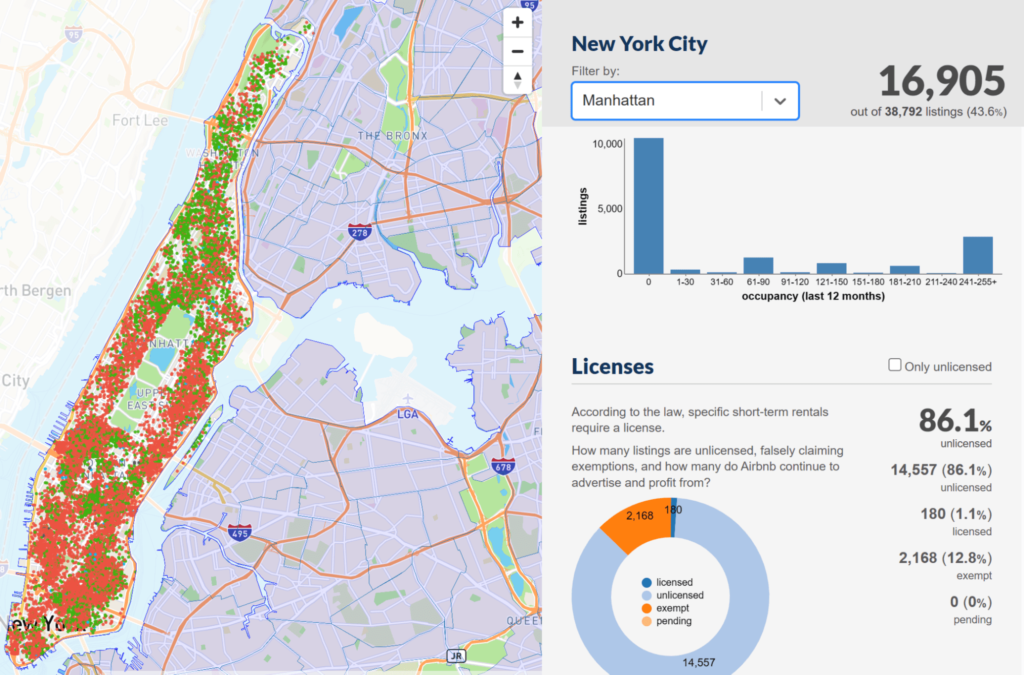

- Intro: Airbnb appears in many a slide deck as the archetypal disruptor, the startup that changed a long-established game. But much like the narrative surrounding Uber a few years ago, a backlash is rising from a social justice standpoint. Yes, travellers get more options for places to stay outside of traditional hospitality (and homeowners the chance to make some extra cash), but at what cost to local communities and housing provision? Inside AirBnB visualises the data from six cities in the UK, Europe and the US in an effort to tell the full story. Users can filter by borough or zoom right into street level, accompanied by a series of metrics on occupancy, licensing and multiple listings. In Manhattan, for example, one provider alone has over 600 properties for rental.
- Why it matters: The Airbnb controversy is likely to rumble on for some time, but it’s data that can add a level of clarity and validity to such a heated debate. The dashboard-style presentation also condenses a huge amount of information into one intuitive screen. For added transparency, the team at Inside Airbnb have made their datasets available to anyone, along with data from other countries including Australia, Germany and Canada.
Data Clocks by Russell Samora
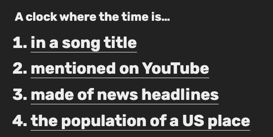

- Intro: Russell Samora has created a thoughtful piece for The Pudding, using time (specifically, the current time) as a prompt to think of the data around the world. Samora also recounts personal experience of taking creative computation classes, and sharing such prompts with students to see how they can transform them into visual outputs.
- Why it matters: When starting out, data storytelling can sometimes be intimidating. I know it was for me! I was never confident of what data to share or how to communicate it, and I had so many more questions. This work is a great reminder of how data and its stories are all around us, deeply interwoven into our everyday lives. What matters is finding the right prompt that will hook your audience into the story you are telling, and then they are with you for the journey.