Best of Data for Everyone, November 2023: Can data make us happy?
11 mins
Reading time
Reading time
all
Category
Category
Each month we share some of the best dataviz the world has to offer.
On the menu this month:
- Black Friday Cyber Monday Live Coverage by Shopify
- The Pay Raise People Say They Need to Be Happy by the Wall Street Journal
- Cars Evaluated Against Climate Targets by Carbon Counter
- Blackpool Illuminations Buses by Ito World
- Visualisation of π Being Irrational by Massimo
- Unsupervised by Refik Anadol
- Say “Cheese” with your Chart by Evie Huang and Webb Zhou
Black Friday Cyber Monday Live Coverage by Shopify


- Intro: Data visualisation is all around us and happening in real-time. The 2023 iteration of Shopify’s live map coverage has added impressive layers of form and function, from live order arcs to fireworks for a merchant’s first ever sale. At the city level, on Black Friday I watched London online stores racking up to £22,000 of sales per minute. That’s a lot of excited merchant cha-chings.
- Why it matters: It’s empowering to see global tech companies take a forward-thinking stance to their wealth of data and summarise it in more accessible ways. Shopify have been running this initiative for four years now, and each year it gets more enrapturing. As data visualisation consultants, I’d love to see how we can create more hero moments like this BFCM example
The Pay Raise People Say They Need to Be Happy by the Wall Street Journal
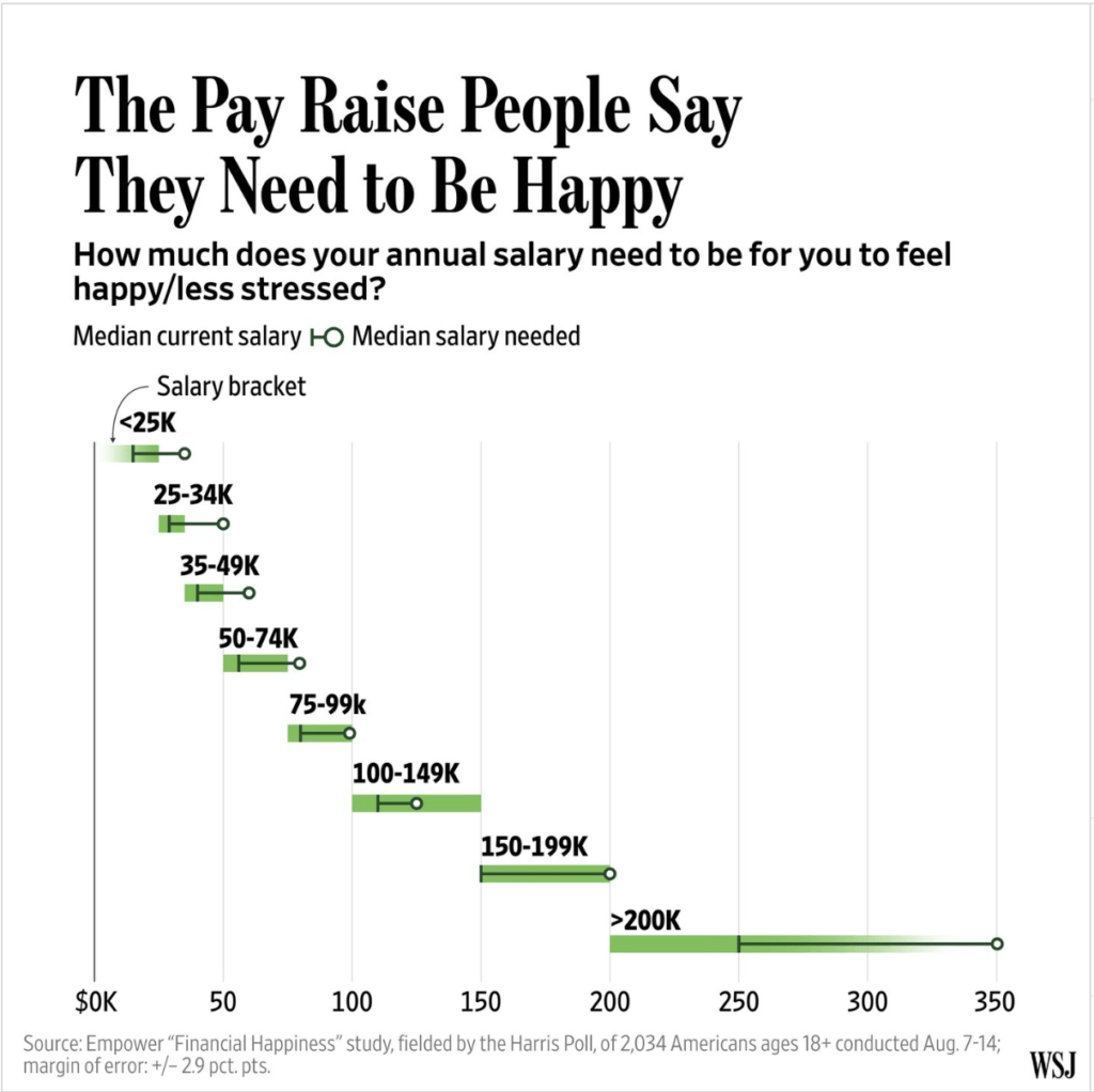

- Intro: They say more money means more problems. Well, not always. Higher levels of income generally lead to higher quality of life and happiness. But just how much more of an income jump would you need to be truly happy? Of 2,000 respondents to this recent survey in the US, those who had a median salary of $65,000 a year said a median of $95,000 would make them happy and less stressed. The highest earners, with a median income of $250,000, gave a median response of $350,000.
- Why it matters: The average pay increase in the US next year will be 4.9%. That’s just above levels of inflation. But this survey revealed that happy employees would need a pay rise of close to 50%. Our EdTech pod harnesses powerful and hyper relevant workforce analytics data in intuitive solutions that help users navigate the world of world. So if you’re looking for that 50% pay increase to make you happy, look to the data to inform you. Could you be earning more relative to the market rate? Or could you leverage your existing skills into a new position and secure the pay you deserve?
Cars evaluated against climate targets by Carbon Counter
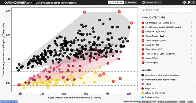

- Intro: Aimed at car owners and drivers in the US, this exploratory visualisation from Carbon Counter helps the user understand just how close (or far away) your model of car is from the emissions targets set by the US government for 2030 and 2040. Emphasis does need to be placed on ‘exploratory’, though, particularly when you open up the ‘Customise’ menu. You can tailor the tool to look at a multitude of scenarios of your choice, and even to focus in on your home state.
- Why it matters: While the government can impose emissions reductions targets on car manufacturers, ultimately it’s the consumer that will have to pay for the car, for maintenance and for fuel or charging. So the consumer needs to be brought along on this journey, and this tool is a great place to start, acting as a guide as we attempt to work out just how much we’ll have to pay to decarbonise our personal transportation. This tool allows you to compare emissions performance against monthly costs, and to factor in the various incentives already in place for EVs. It’s fascinating (although perhaps expected) to see Tesla fare so poorly on cost comparisons. As the great Carl Sagan once said, most initiatives aimed at reducing CO2 emissions offer benefits outside of carbon reduction. One of the arguments for EVs is their relatively lower costs, but that doesn’t really apply if you’re paying $70,000+ upfront…
Blackpool Illuminations Buses by Ito World
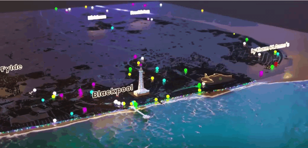

- Intro: Have you ever seen such an engaging bus timetable? Craig Taylor at Ito World has revamped his visualisation of the UK’s Bus Open Data Service (or BODS for short) to coincide with the famous Blackpool Illuminations, this time using innovative 3D mapping. Three things stood out to me here: (1) the modern presentation of the data nodes to cleverly ‘illuminate’ the topic; (2) the blend of highlighting what’s important to make the information easy to digest and subtle details to make the visuals pop; (3) the real-world 3D perspective to make the data more relatable and tangible.
- Why it matters: I’m always inspired by the way that Craig is able to take what can often be typically dense, dull and complex geographical data and make it tell a story in such an eye-catching and intriguing way. I can’t help but get involved – my brain is instantly stimulated and curious about the information. The upshot is a unique and powerful way to connect with the most everyday of audiences.
Visualisation of π being irrational by Massimo


- Intro: I’m a huge fan of visualising mathematical formulas, and this visualisation of pi as an irrational number has been very interesting to observe from this standpoint. Watch what happens as the spirograph chooses not to follow the expected path…
- Why it matters: Mathematical terms can often be difficult to comprehend on paper. Accompanying these terms with visualisations like this 90-second video could definitely help young people to grasp the concept better than any textbook, while also getting them excited by the intricacies and complexities of maths along the way.
Unsupervised by Refik Anadol

- Intro: With the rise of the likes of AI-powered image creation tools like Midjourney and Craiyon, the lines between automation, data and art are becoming increasingly blurred. Or, in the case of Turkish artist Refik Anadol, beautiful.Unsupervised is a digital installation that uses machine learning to profile and present abstract visualisations of over 200 years’ worth of art at the world-renowned Museum of Modern Art in New York City. The installation is even adaptive, taking prompts from its environment in one of the museum’s main public areas and factoring them into its latest series of ‘machine hallucinations’.
- Why it matters: Because information really is beautiful. Anadol’s exhibition at MoMA may have come to an end, but it perfectly captures the ongoing debate around technology, data and art when the shackles are thrown off. It also hints at the exciting potential of this form of hyper-adaptive data installation in other public arenas, from exhibition stands to billboard advertising.
Say “Cheese” with your Chart by Evie Huang and Webb Zhou


- Intro: Based on the Financial Times Visual Vocabulary, this Information is Beautiful Awards gold-winning project playfully organises 74 charts into a book inspired by the concept of cheese – specifically how we prompt people to say ‘cheese’ before taking a photo. The book aims to help readers feel good about their chart choices while serving as an accessible format for people to develop their data literacy skills.
- Why it matters: Say “Cheese” with Your Chart is a reminder to have fun with data visualisations that delight and inspire. Although it’s important to create functional and useful data visualisation products, let’s not forget about delivering experiences that consider how users feel. Data visualisations should spark dialogue and advocacy, but the best of them can spark some joy, too.