Best of Data for Everyone, May 2024: What really happens to recycled plastic? ♻️
8 mins
Reading time
Reading time
all
Category
Category
Each month we share some of the best dataviz the world has to offer.
On the menu this month:
- Tableau 2024.2 beta release by Tableau
- Dumped: The Truth About Europe’s Plastic ‘Recycling’
- A year of record breaking ocean temperatures by BBC News
- Tracking the world’s biggest iceberg as it drifts towards oblivion by BBC News
- Zeus’s Affairs by Willemijn van Dijk
- NatureScore by NatureQuant
Tableau 2024.2 beta release by Tableau
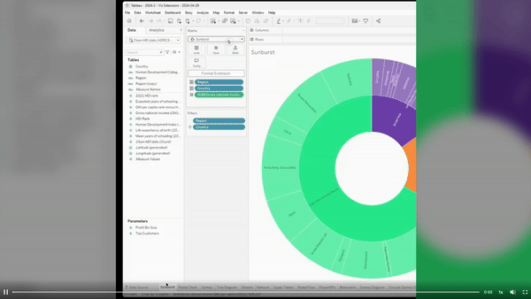

- Intro: My choice is a little different today: this is not a project but a big opportunity I read about from Marc Reid. Tableau has introduced new Viz Extensions functionalities. Now you can experiment around sankey, sunburst, chord and more. You have no more excuses! The new feature makes it easier to create these charts in Tableau, empowering your visualisations.
- Why it matters: As an information designer, what I feel creates a gap between me and people from the analytics is creativity: sometimes it’s considered as something not necessary, closer to aesthetics than function in the visualisation process. Implementing more creative possibilities in tools like Tableau makes creativity visible and accessible to a wider audience, not only designers. I think this is a specific direction for us, an invitation to let our data be something more, with a focus on data storytelling and, why not, even visual complexity.
Dumped: The Truth About Europe’s Plastic ‘Recycling’ by Annabelle Vuille
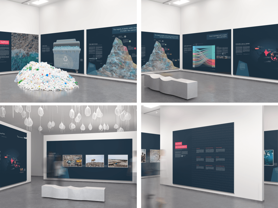

- Intro: This data-driven art exhibition by Annabelle Vuille explores what really happens to all the plastic we think we’ve ‘recycled’.
- Why it matters: Having worked in the waste sector for many years, I’ve rarely come across visual content that shows and explains the impact of our waste (and the many frustrations of where it goes) in such an engaging and effective way. I was excited to come across this piece by Annabelle: brilliant storytelling full of facts, educating readers of differing environmental literacy. And it works wonderfully as both a physical exhibition and standalone visuals.
A year of record breaking ocean temperatures by BBC News
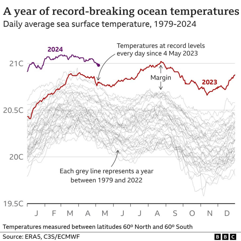

- Intro: Ed Hawkins teamed up with the BBC science news to bring us a very polished and digestible view of the shocking sea surface temperatures of this and the past year in context.
- Why it matters: The past year was off the charts for sea surface temperatures, reaching an unbelievable 5.9 standard deviations away from the 1982-2011 averages. This year has been even more unnerving, rising to 6.24 deviations. It’s hard to overstate how shocking and scary this is. These measurements could be an indication that we are triggering catastrophic tipping points and are about to face unprecedented levels of system change.
Tracking the world’s biggest iceberg as it drifts towards oblivion by BBC News
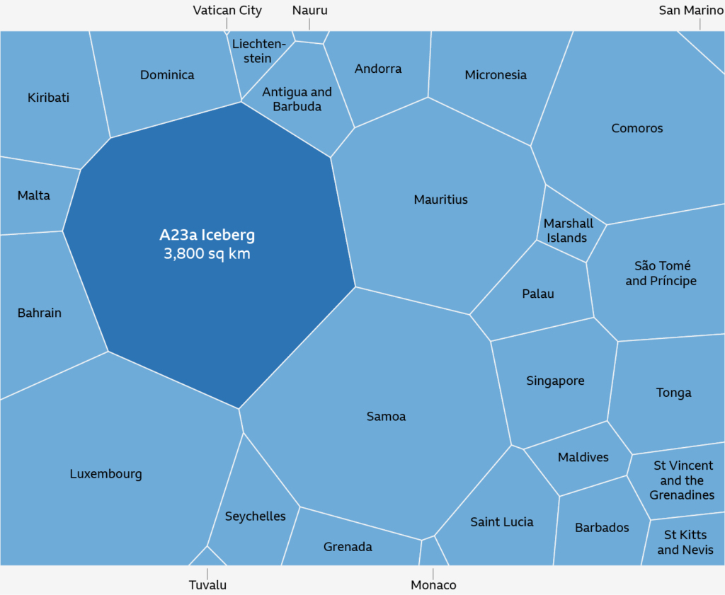

- Intro: The world’s biggest iceberg – more than twice the size of Greater London – is on the move. After a few weeks loitering on the fringes of Antarctica, it’s begun to drift at pace once more. This deep-dive storytelling from the BBC draws you in as a reader through its combination of journalism, data visualisation and animated transitions.
- Why it matters: If this Iceberg were an island, it would be bigger than Luxembourg or Mauritius. It’s tall too, standing at 280m high (for reference, the Shard in London is 310m). This isn’t just a story of climate change, though; the story and the truth has much more nuance. What happens when icebergs ‘die’? Is it because of climate change? Is it all bad news? (Hint: icebergs contain 100,000 year-old mineral dust that gives life to the sea, from great whales to plankton)
Zeus’s Affairs by Willemijn van Dijk
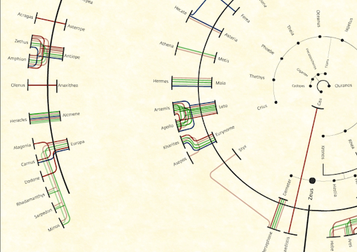

- Intro: The Greek god Zeus was known for his love affairs – just think about how many movies with Greek characters have a son or daughter of Zeus in them. This beautifully designed and intricate piece masterfully visualises all those relationships.
- Why it matters: Visualisations of relationships have always been a source of fascination for me, as has Greek mythology. The design is striking yet simple, too: the inner ring shows goddesses, the outer ring shows humans; the inner side of each arc shows lovers, the outer side shows children. And the connected lines even show mentions of the characters by various authors throughout (human) history.
NatureScore by NatureQuant
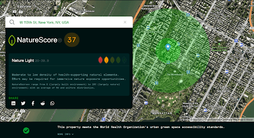

- Intro: The practice of shinrin-yoku, or forest bathing, has been available on prescription in the Japanese healthcare system since the early 1980s. It makes a lot of sense: reconnecting with nature is good for us, but it’s hard to do in our rapidly urbanised and digitised world. This data mapping tool by NatureQuant allows users in the US to gauge the level of ‘health-supporting natural elements’ in their neighbourhood – I plugged in my old address in NYC and wasn’t surprised to see a pretty low score.
- Why it matters: NatureScore is a great example of data creatively used to inform genuine action. I wish I’d had it when I found out I was moving to Manhattan – I struggled to adapt to the lack of natural light where I lived due to all the tall buildings, and Central Park became a very necessary haven. NatureQuant are also working on an app called NatureDose (now in beta), which it calls “a personalised nature prescription tracker that monitors your aggregate time inside, outside, and exposed to nature”. For desk-trapped freelancers like me, it could be a real find.