Best of Data for Everyone, May 2023: Turbines, Megacities and Tears of the Kingdom
10 mins
Reading time
Reading time
all
Category
Category
Each month we share some of the best dataviz the world has to offer.
On the menu this month:
- Migration in Search by Mohamad Waked
- GB Renewables Map by Robin Hawkes
- The Color Printer by Nicholas Rougeux
- Game Ratings: 7266 Games Over 30 Years by Roman Bunin
- The Lights Go Out at the Nuclear Power Plants by Berliner Morgenpost
- Stylized Visualisations
- These Will Be The World’s Next Megacities by Statista
Migration in Search by Mohamad Waked
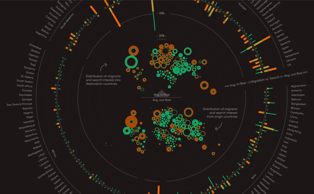

- Intro: This project by dataviz designer Mohamad Waked was launched only this week, and it’s a beauty. Looking at migration patterns around the world, it profiles the discord between migrants’ search interests and the realities they encounter upon reaching their destination. To see this blend of vibrant visualisations and powerful written text is a rare and lovely thing. Visual storytelling at its finest.
- Why it matters: One in 30 of the world’s population is a migrant. Using data from the UN and Google Trends, this dataviz paints a more accurate, data-driven picture of migration than the various media narratives that we’re so often exposed to.
GB Renewables Map by Robin Hawkes
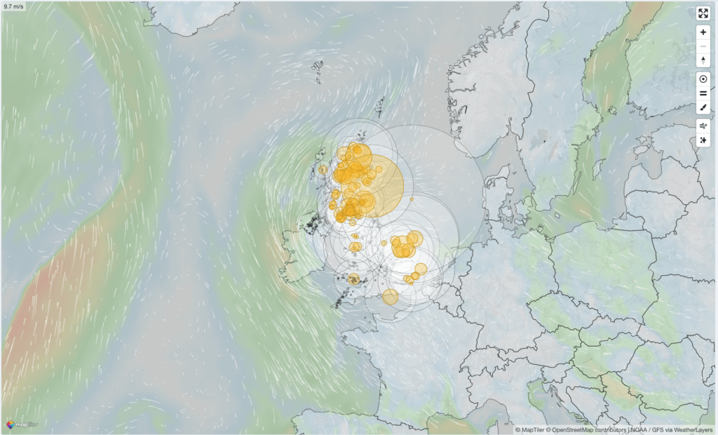

- Intro: This real-time map of the UK shows renewable power generation as a proportion of total power generation, as well as identifying exactly where in the country this power is being generated. It’s a work in progress (for now, the visualisation only includes wind farm locations), but as more and more data becomes publicly available, we’ll be able to track solar and hydro generation. We’re excited to see how this personal project develops in the future!
- Why it matters: If we are to progress towards our net-zero goals, and also towards our other ESG related goals, we need to be able to access, interpret and visualise more timely data. It’s a classic challenge within carbon management: carbon data only comes around once a year, and by then there are missed opportunities to act. Visualisations like this show how real-time data can be visualised in attractive but incredibly useful ways. We can see generation as it is now, but also over the past week and months, and we can begin to draw comparisons too. These are all vital tools in our climate action utility belt.
The Color Printer by Nicholas Rougeux

- Intro: Nicholas Rougeux is a data artist who occasionally digitises old books and encyclopaedias. In his latest work, he invites us to take an in-depth look at The Color Printer, a book from 1882 that helped create colour combinations in the age of printing. Going through the different mixes and combinations in a vintage style feels refreshing in the age of pins and cards!
- Why it matters: Beyond the beauty, this book reminds us of the importance of using colour when creating visual works – and data visualisations. Choosing complementary colours, emphasising contrasts and remaining accessible to all on all platforms is always a challenge. Today, there are many tools on the web, and it can be difficult to know where to start. A little history is a nice and useful way to keep all the elements in mind!
Game Ratings: 7266 Games Over 30 Years by Roman Bunin
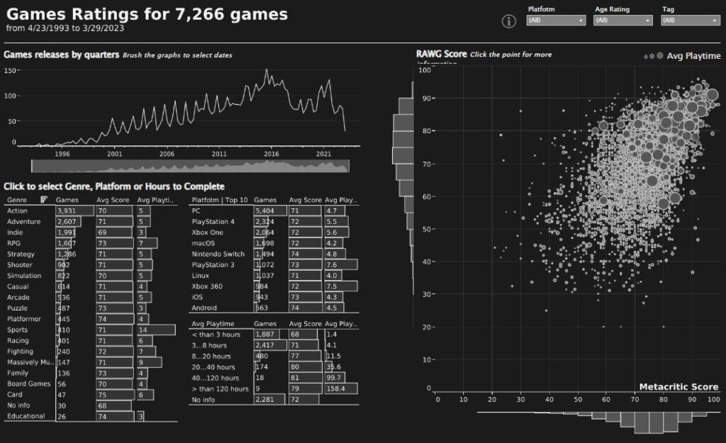

- Intro: I’ve been eagerly awaiting the release of The Legend of Zelda: Tears of the Kingdom this month, so I thought it was timely to choose a dashboard all about gaming.Power BI engineer Roman Bunin has visualised data from over 7,000 video games released over the past three decades, allowing you to explore gaming history while filtering games by release date, genre, rating, platform and even average playtime.
- Why it matters: Dashboards are extremely powerful tools for creating exploratory dataviz. They allow us to ask open-ended questions and identify interesting trends. Tools like these provide a strong foundation for market research.For example, we can see a huge spike of games released during Q4 each year, which is also when holiday gift-spending is most rampant. It’s also cool to see the rising popularity of indie games (including the likes of Hades, Stardew Valley and Undertale), placing third after Action and Adventure in terms of popularity.If you play games and wonder how your favourite fares, take a look at the dashboard and play around with the data.
The Lights Go Out at the Nuclear Power Plants by Berliner Morgenpost
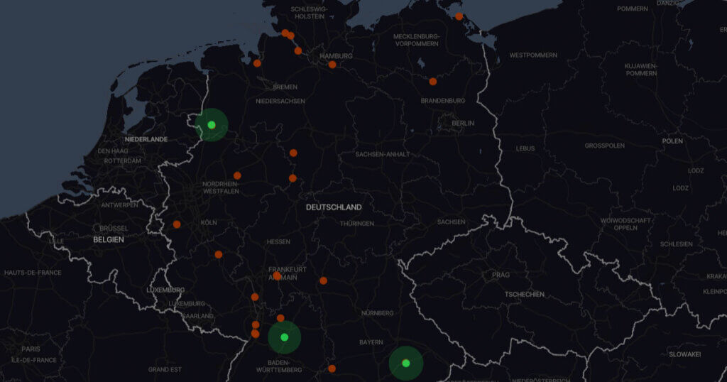

- Intro: My pick this month is an interactive map and story about the decommissioning of nuclear energy in Germany, produced by the Berliner Morgenpost. The visualisation tells the story of Germany’s transition to renewable energy, from 19 nuclear reactors in 2000 to just 3 in 2023.
- Why it matters: As more climate commitments are made and their credibility increasingly comes into question, it’s important that the facts are communicated clearly and simply. This piece does just that with a cleverly thought-out user experience, which makes the reader feel comfortable exploring what could be considered complex technical information.
Stylized Visualisations
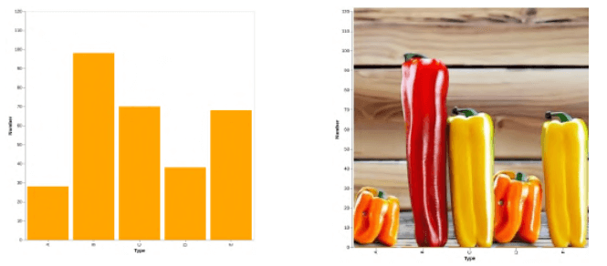

- Intro: My pick for this month is kind of different from past visualisation picks. It’s not a specific visualisation but a technique to convert existing visualisation into stylized images, while still conveying the data.
- Why it matters: Large language models and generative machine learning are already here to stay, and the tech just keeps getting better. This is just one specific example of how we can utilise ML to drastically reduce the time taken to create something from a matter of days to a matter of seconds!
These Will Be The World’s Next Megacities by Statista
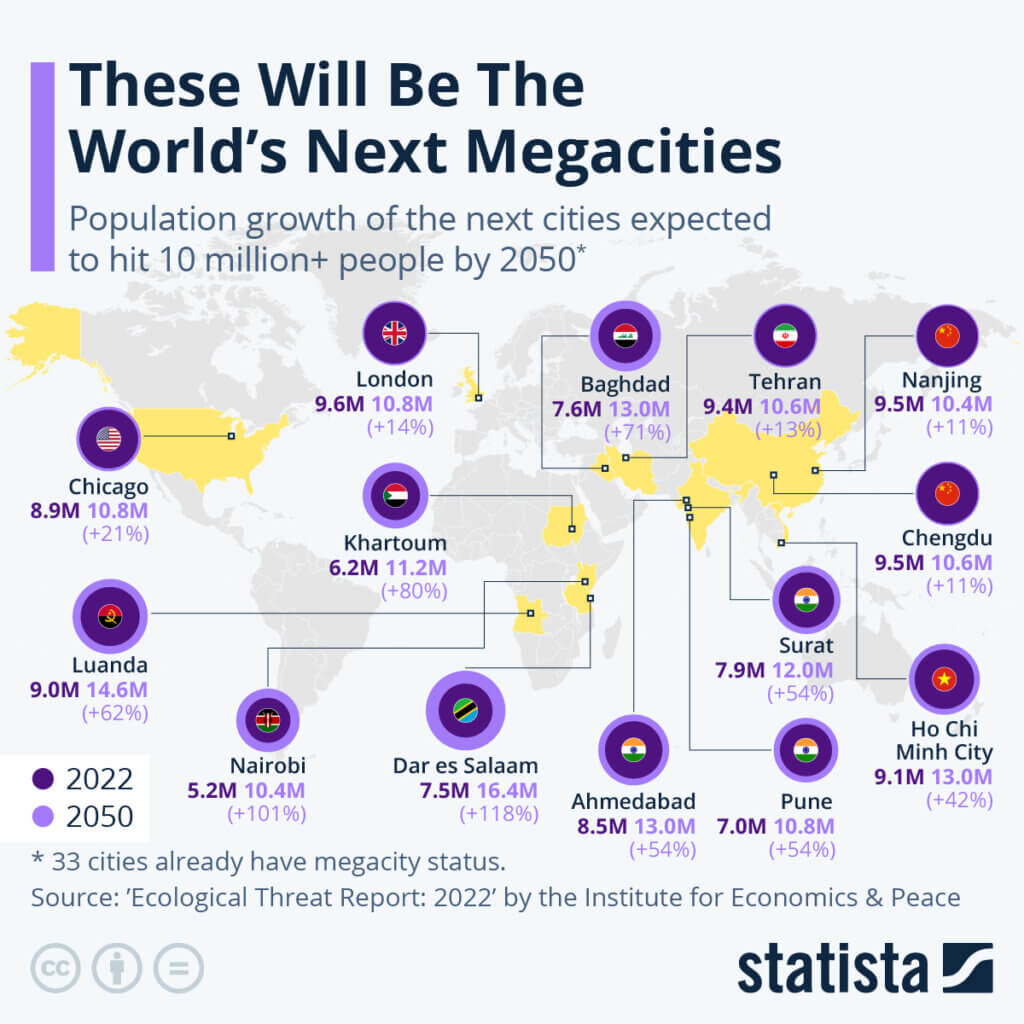

- Intro: Because Mega-City One isn’t just a Judge Dredd reference. Statista pulled the data from the Institute for Economics & Peace’s 2022 Ecological Threat Report and visualised the predicted next world cities to hit population growth beyond 10 million by 2050.The map also highlights the disproportionate acceleration of African cities like Nairobi (Kenya) and Dar es Salaam (Tanzania), which are expected to more than double in size within the next 30 years.
- Why it matters: Megacities are a signal of economic growth, pulling people into urban areas through job creation. But this trend also places huge strain on city infrastructure and public amenities, and rapid urbanisation does not sit well with sustainability (think cheap housing, water stress, food insecurity, and the impact of extreme climate events). In response, urban planners face a difficult balancing act of keeping pace with population growth while ensuring the safety of citizens and the natural environments in which they live.Neat segue: One of our recent FutureFridays experiments looked at the idea of displaying climate action progress by local authorities in one all-encompassing dashboard. Check it out here.Bonus brain-teaser: There are currently 33 megacities worldwide. How many of them can you name? Clue: 3 are in Africa, 21 in Asia, 2 in Europe, 3 in North America, and 4 in South America (Answers down below.)
Megacities x 33 = Bangalore, Bangkok, Beijing, Buenos Aires, Cairo, Chennai, Chongqing, Delhi, Dhaka, Guangzhou, Hyderabad, Istanbul, Jakarta, Karachi, Kinshasa, Kolkata, Lagos, Lahore, Lima, Los Angeles, Manila, Mexico City, Moscow, Mumbai, New York City, Osaka, Paris, Rio de Janeiro, Sao Paulo, Shanghai, Shenzhen, Tianjin, Tokyo.