Best of Data for Everyone, March 2023: Night trains, honey bees, and the tooth fairy
9 mins
Reading time
Reading time
all
Category
Category
Each month we share some of the best dataviz the world has to offer.
On the menu this month:
- Take the night train across Europe
- The deaths Putin wants to keep quiet
- Over 100 years of global warming by latitude
- Mapping YouTube popularity
- China: Emissions Enemy No 1?
- The return of bees
- Inflation and the tooth fairy
Night Train Map by Back On Track


- Intro: My pick is a beautiful new schematic map showing night train routes across Europe, put together by rail advocacy group Back On Track.It shows route frequency, operators and interchange locations, all in the familiar style of a subway map. The map makes it quick and easy to plan rail trips across the continent, and – best of all – it’s freely licensed so others can adapt and remix it for their own purposes.
- Why it matters: With the rapid decarbonisation of Europe’s energy sector, transportation is now the EU’s biggest emissions problem. Trains are the most sustainable way to travel long distances, and taking a night train means saving money on hotels and getting to spend more time at your destination.Want to travel more sustainably but struggling to fit it into your work holiday allowance? Persuade your company to sign up to the Climate Perks scheme, where employers offer additional ‘travel days’ for low-carbon holidays.
The Deaths Putin is Seeking to Keep Quiet
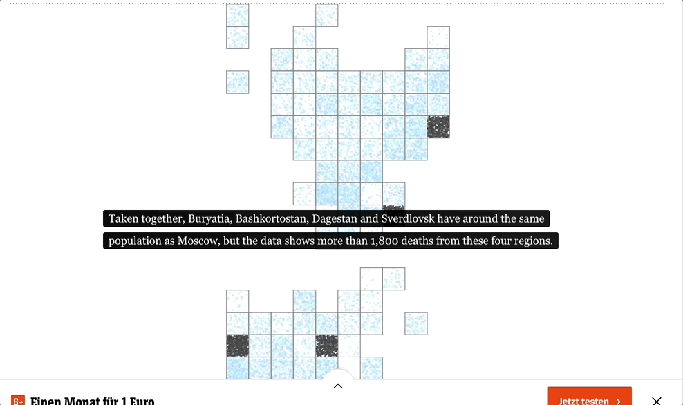

- Intro: infogr8 alumnus Matthias Stahl is doing tremendous work on the newsdesk at Der Spiegel: leading a team of talented journalists, designers and developers who use data to uncover important stories in the news.
- Why it matters: Putin’s abhorrent war against Ukraine is turning out to be a huge defeat, strategically, militarily and fiscally. The use of data in this example carefully uncovers what Putin’s propaganda machine tries to cover up: the true extent of Russia’s losses. Do the Russian people know the number of casualties? And if they did, would public support in Russia wane faster?
Global Warming Broken Down by Latitude Zone (1880-2022)


- Intro: This video from NASA’s Scientific Visualization Studio delves deeper into the regional realities of ‘global’ warming. It highlights the environmental impact of ‘anomalies’ (read: humans) by latitude zones from Victorian times through to 2022.Running the animation clearly shows that the Arctic is warming at a much faster rate than elsewhere. Perhaps no surprise as you trace the impact of the industrial revolution on the northern hemisphere. But the southern hemisphere starts to see anomalies of its own come the 1960s/1970s, which just happens to be when the large-scale deforestation of the Amazon began.
- Why it matters: The best dataviz takes complex subject matter and makes its significance instantly clear to any reader/viewer. Sustainability is no exception. This NASA example takes the multifaceted day-to-day of our sustainability challenges and lays bare the realities of our climate impact, in one place and in just 30 seconds, for all to see.
Most Subscribed YouTube Channels
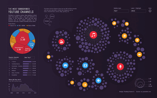

- Intro: My pick is a Tableau visualisation built by Pradeep Kumar G. It shows the world’s most subscribed YouTube channels and their categories, along with a summary treemap.
- Why it matters: Hierarchical network visualisations like this one have some strong characteristics that can be utilised to solve various data challenges. They include colours, shape sizes, multiple relationships, and weighted relationships. On top of this, they can usually be animated and moved around with drag-and-drop, which attracts user interest and makes them more invested.Another benefit is that they do not look like standard visualisations, so while it may be harder to understand them at first glance, there is a far greater chance that they won’t get overlooked.
“The US has caused the most global warming. When will China pass it?”


- Intro: Harry Stevens, a graphics reporter at the Washington Post, has created a racing line chart that visualises the state of CO2 in different countries, with a particular focus on when China is projected to become history’s biggest CO2 emitter.
- Why it matters: CO2 emissions are important in many ways and play a big part in the climate change discussion, but this particular article highlights the impacts of the associated ‘costs’ of CO2. These may be the costs to our health, the costs borne by poorer countries, or the costs involved in the political complexities of developed and developing nations.From a data visualisation perspective, I think the visual is really effective at clearly presenting the data within the story over time, both as a static image and as an animation. It encourages the audience to engage by adding a more interactive lens to what is usually a traditional chart type. The Q&A quiz is a great hook, too.
Bee Population Health


-
- Intro: Ann Pregler has created a visualisation in Tableau about bee colony health in the US. She explores the threats bees are facing, their overall population health, and how they fare by individual state. A fun visual component is the use of a beeswarm, which is bee-fitting for the subject.
- Why it matters: This visualisation presents an optimistic outlook for the American bee population. Despite the threats bees have to deal with, they are in a better place today than in previous years.I particularly like the simple call-to-action that Pregler lists at the base of her visualisation, which presents recommendations for anyone to follow to help keep bee populations healthy.
The Original Tooth Fairy Poll


- Intro: At the risk of sounding like one of Monty Python’s Four Yorkshiremen, when I was a lad I got a £1 coin under my pillow for a lost tooth, and I was lucky.Over in the States, Delta Dental have been tracking parental payouts per tooth since 1998. 25 years on, the average is now a teeth-chattering $6.23. At the current rate, we’ll be leaving not one but three crisp $10 bills under little Jimmy’s noggin come 2048. Talk about a kick in the teeth.Historically, too, it’s interesting to see how tooth bounty has tracked the S&P 500. A key exception is this past year: while the value of a lost tooth has risen by 16%, the US’s top 500 companies experienced an 11% decline.
- Why it matters: As well as a cute marketing gimmick and lead magnet for a healthcare provider, this index is another sign of inflation biting at the purse-strings of everyday folks and their families, and how even the most mythical of activities can mirror the wider economy.