Each month we share some of the best dataviz the world has to offer.
On the menu this month:
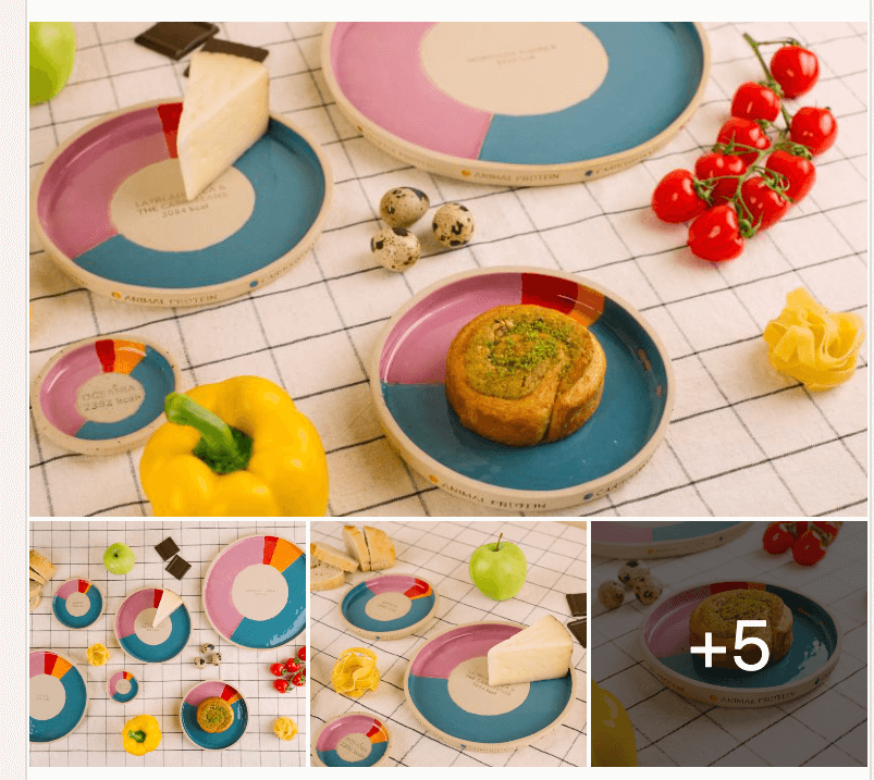

- Intro: Ever since I got into dataviz 10+ years ago, I’ve always been fascinated by the idea of visualisations appearing in ‘real-world’ locations and scenarios (not just behind a screen). As a regular collaborator with infogr8, we’re familiar with Razvan’s approach to his work, and this ‘physicalization’ is a masterpiece. It’s easy to focus solely on how visually appealing the pottery is, looking like something out of a high-quality food magazine, but what this piece highlights more than anything for me is the variety of talents at Razvan’s disposal – the ability to analyse novel datasets, to understand what’s going on, to unearth the stories within the data, and to create beautiful visualisations that transcend our field.
- Why it matters: This piece matters for two reasons. First, it effortlessly links the digital with the physical. The plates give you enough insight to want to know more and hook you in, making you want to go deeper than continent level. It shows how we can be playful with data yet still land a serious message. Second, the subject matter at hand – the dietary disparities between continents are remarkable and unexpected. After looking at this piece, I want to read more. I want to understand why North America is producing double the amount of calories required, and question where all those excess calories go, how much is being consumed, and how much is being wasted (and contributing to climate change). The piece also challenges perceptions, perhaps lazy ones, such as Africa as a continent producing more calories than the minimum required. Where are the production hotspots globally, and how can we distribute food to those countries where hunger is an issue?
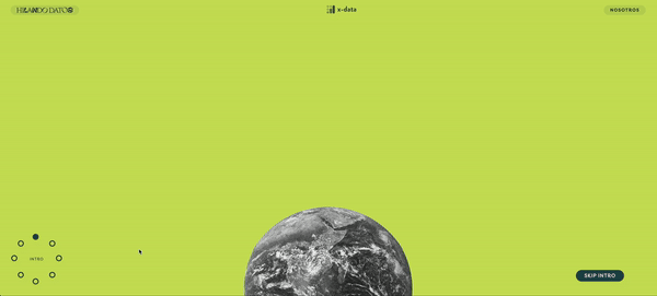

- Intro: Hilando Datos is an innovative data visualisation project by X-DATA that explores the textile industry. This initiative uses scrollytelling to transform complex data into engaging, narrative-driven visual stories. The visualisations cover various aspects of the textile industry, from production processes and economic impact to sustainability practices and market trends.
- Why it matters: Hilando Datos means “Spinning Data”, and this project skilfully weaves together diverse data points into coherent and insightful narratives. Utilising the scrollytelling format, it allows users to interact with the data dynamically as they scroll, creating a seamless and immersive experience. The real strength of Hilando Datos lies in its ability to humanise data through creativity and emotional engagement: it not only enhances data literacy but also fosters a deeper appreciation for the stories behind the numbers, empowering individuals and organisations to make more informed decisions about the textile industry.
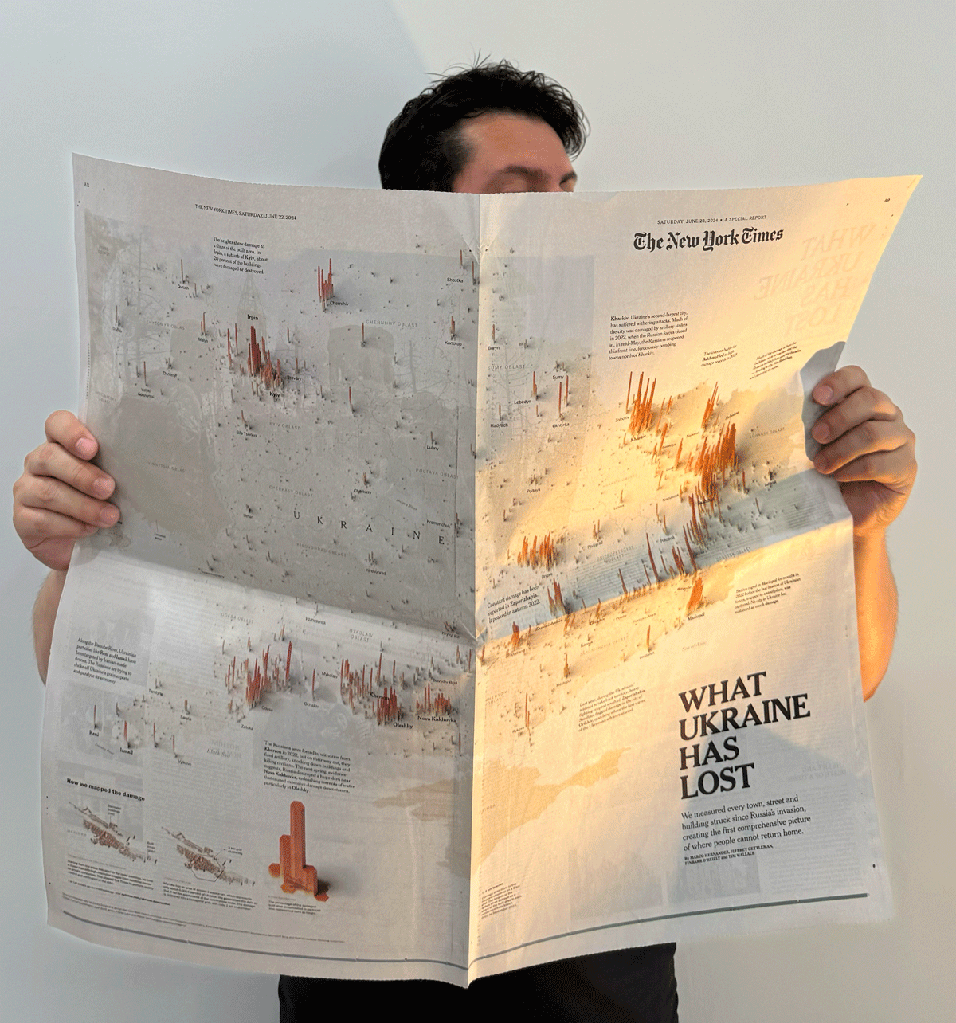

- Intro: A year in the making, this detailed visual data story recounts the horrors unfolding in Ukraine by the Russian state.
- Why it matters: It’s hard to include such a piece in a ‘top dataviz picks’ given the subject matter. If we try and leave that to one side for a moment, the value of this pick is twofold. At first, we have a deep-dive piece that’s been published in the New York Times. Then, Marco Hernandez has brilliantly captured the year-long process of ingesting multiple data sources and mapping it all out, then cross-referencing to images and accounts on the ground.
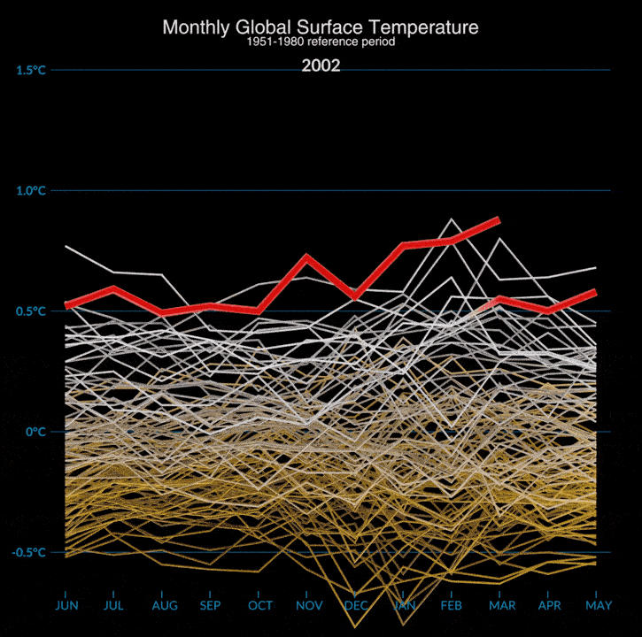

- Intro: A monthly temperature anomaly viz from NASA’s Scientific Visualization Studio that flips at the end and turns very gracefully into an annual plot.
- Why it matters: Apart from the fact that it showcases how we are shifting into totally uncharted territory, this dataviz is interesting in the way it deals with the complexity of multi-dimensional data, which can often be hard for people when thinking about climate.
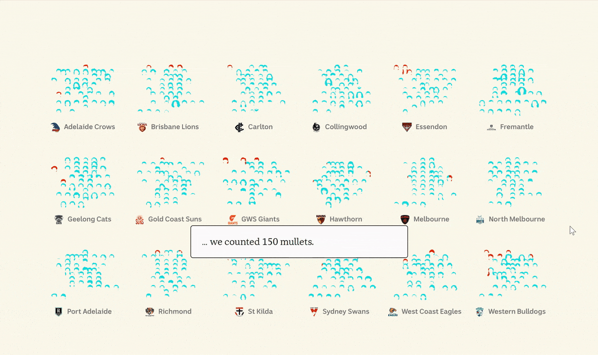

- Intro: Aussie Aussie Aussie! This interactive scrolling story by the ABC takes a fun look at the numbers behind Aussie Rules football’s most infamous and controversial hairstyle: the mullet.
- Why it matters: This scrolly story has it all: the fun combination of sports culture and gorgeous data visualisation, the creative ‘hairstyle’ visuals with seamless transitions, the engaging narrative that makes the wealth of mullet-related data easy to digest. And to top it all off, a neat interactive to allow users to self-explore.
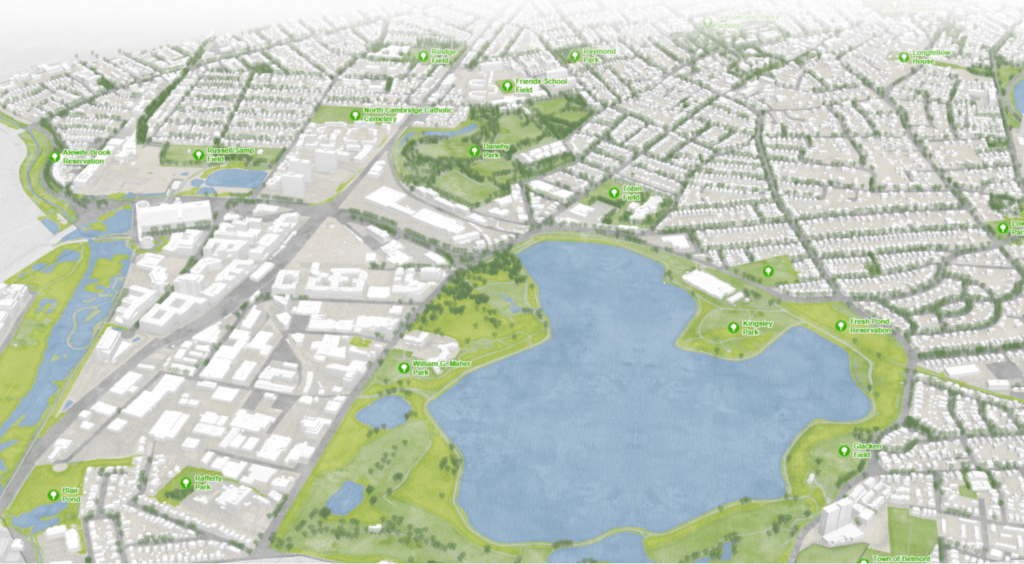

- Intro: Raluca Nicola describes how we can achieve a watercolour base map effect in 3D web maps using the Arcgis JS API.
- Why it matters: As Raluca points out, everybody loves watercolours. They’re beautiful to look at, and they give out a warm feeling. In this specific example, we not only see a striking visualisation of morning runs and afternoon dog walks, but also instructions on how everyone can achieve these lovely watercolour effects in the interactive web maps.
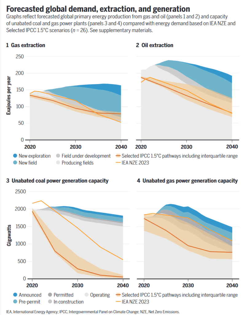

- Intro: Published in Science’s Policy Forum, this study calls for a new ‘social-moral norm’ where, in an attempt to hit climate action goals, no new fossil fuel projects get green-lit. Not one. The graphs here show the disjoint between the energy demand predicted from a range of 1.5℃ scenarios and forecasted expansion in oil, gas and coal.
- Why it matters: This level of social-moral change may seem insurmountable at first. That said, the study highlights how “activities that were once profitable for powerful firms or geostrategically valuable for powerful states – such as trading in slaves or testing nuclear weapons – can become taboo”. Maybe one day we’ll look back on fracking and the like in exactly the same way as colonialism and other dark seams from the past