Best of Data for Everyone, June 2023: Dark Patterns, Home Runs, and Decoding EEAAO
11 mins
Reading time
Reading time
all
Category
Category
Each month we share some of the best dataviz the world has to offer.
On the menu this month:
- How Companies Use Dark Patterns to Keep You Subscribed by The Pudding
- The 20 Most Air-Polluted Cities on Earth by Visual Capitalist
- Decoding Everything Everywhere All At Once by Angelica Hom
- Home Run Report by Major League Baseball
- How Important is Vegetation for Cities? by Felix Palmer
- Is Your Area a Good Place to be LGBTQIIA+? by Axios
- A Picture is Worth a Thousand Words by Ferdio
How Companies Use Dark Patterns to Keep You Subscribed by The Pudding


- Intro: You know the drill. You’re enticed into yet another online subscription service, be it Canva or craft beer). You diligently mark your calendar for when your free trial runs out so you don’t get charged full-whack. Surely there’ll be a simple ‘Cancel My Subscription’ on your account dashboard….This 8-bit-themed scrolly story from The Pudding reveals one journalist’s journey through the mire of ‘dark patterns’ – the shady tactics that subscription providers use to keep us paying.
- Why it matters: Dark patterns work by intentionally adding layers of complexity, friction and un-intuitive processes to throw users into a tailspin. On the flipside, visual storytelling like this brings clarity to the end user and holds the culprits to more effective account.Dark patterns are the digital equivalent of Las Vegas casinos laying out their floorplans so you never have a clear line of sight to an exit. The longer you stay, the more you pay. This scrollytelling approach adds humour and approachability to a great piece of investigative journalism, making it all the more memorable and hopefully saving readers some $$$ in the process.
The 20 Most Air-Polluted Cities on Earth by Visual Capitalist
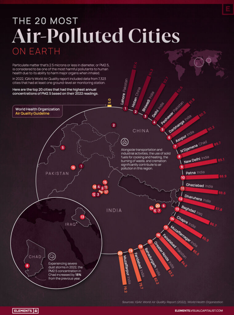

- Intro: This visualisation immediately caught my eye. First, I must confess: I love maps, and I love circular visualisation. But above and beyond my own personal biases, this is a brilliant piece, packing in so much insight without ever feeling overwhelming.We get some context in the form of the WHO’s air quality guideline, and then we get the comparison with pollution across these cities. We also see just how close together so many of these cities are, with a giant cluster forming around the Delhi area in India.
- Why it matters: As anyone who lives in New York or Toronto can attest to, air pollution matters. Uncontrolled wildfires in Canada are having a surreal impact on the air quality in NYC, with images emerging of what looks like a dystopian post-apocalyptic landscape.The thing is, as climate change accelerates, these almost other-worldly extreme events are only going to become more and more frequent. And if we don’t take urgent action, we’re going to have to get used to expecting the unexpected – and seeing just how everything on our planet really is interconnected.
Decoding Everything Everywhere All At Once by Angelica Hom


- Intro: As part of her thesis project, Angelica Hom created an insanely in-depth analysis of the award-winning movie, Everything Everywhere All At Once. Her visualisation presents a data experience that walks you through the movie’s themes and characters.
- Why it matters: If you’ve watched the movie, you know that it’s a lot to take in. There is A LOT of information thrown at you, and sometimes it feels like complete chaos. This is where data visualisation shines: it can derive meaning out of complexity through visual representation. Angelica does an amazing job of mixing interactivity and video to help you understand character development and multi-layered themes in the Oscars’ favourite movie of the year. Crucially, it would be nearly impossible to effectively convey, compare and see patterns in the information like Angelica does in any other way.
Home Run Report by Major League Baseball


- Intro: The Home Run Report by Major League Baseball puts out an animated visualisation at the end of each day detailing all of the home runs hit that day. The June 9th version includes 38 home runs and shows one-by-one the batter, hit velocity, distance, trajectory, and the outfield wall of the respective park. Then, the visualisation transitions to a summary view, revealing the landing position of the ball (left field, right field, etc.). I love how each time I watched it I noticed more and more details.
- Why it matters: This visualisation shows that 3D and animation can be a powerful combination to tell a story and encode multiple variables at once. It also drives home (no pun intended) that data-rich information can be presented in a fun and digestible way.Animating the full 3D trajectory of a home run adds information beyond just where the ball landed and mimics how the viewer would experience a home run at the ballpark. 3D also allows for small details to be added in a realistic yet non-imposing way, including the ability to see the height and width of the wall the home run cleared. Walking through each home run one by one adds a touch of personalization to the story, reminding us that there is a person behind each data point.
How Important is Vegetation for Cities? by Felix Palmer
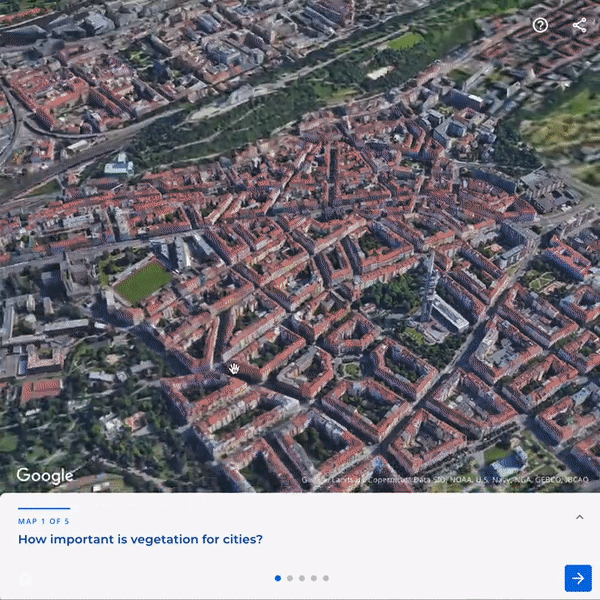

- Intro: Google has recently made it possible for data developers to easily integrate its Photorealistic 3D Tiles function from the Google Maps platform with other mapping libraries, including Mapbox, Carto and Deck.gl. This has opened up a whole new world for innovative 3D realistic applications of over 2,500 cities in 49 cities, like this interactive story map by Felix Palmer.
- Why it matters: From a single city block to city-wide, this is just one example of what’s possible with Photorealistic 3D Tiles. I’m excited to see what creators in the data design and engineering space do with this rich new source of visual data.
Is Your Area a Good Place to be LGBTQIIA+? by Axios
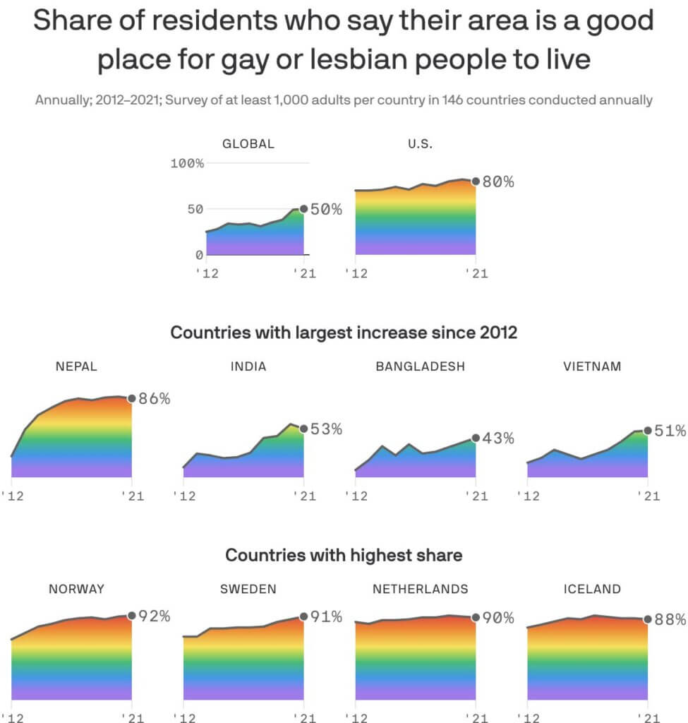

- Intro: June marks the start of Pride month. Staggeringly, 64 countries in the world still criminalise homosexuality, with some even serving the death penalty. So yes, we do still need Pride. Thankfully, data visualisation can help us lift the lid on progress being made across the world. This example from the Axios news desk shows the share of residents who say their area is a good place for gay or lesbian people to live, based on a 10-year study from 2012 to 2021.
- Why it matters: In a world of doom-scrolling and a constant feeling of one step forward and two steps back, this visualisation – with appropriate rainbow colours (yes, this is an example of when rainbow colour charts are appropriate) – paints a picture of a world that is satisfyingly moving in the the right direction.
A Picture is Worth a Thousand Words by Ferdio


- Intro: Is data visualisation only graphs and charts? Absolutely not! We can communicate data stories in many ways – the best option is sometimes simple, while other times out-of-the-box thinking is needed to strike a chord with the audience. These series of photo-based visualisations by Ferdio are great examples of how this technique done correctly can help audiences to understand the context of the compelling stories quickly, all while maintaining the clarity of the data itself.
- Why it matters: Big numbers can be a challenge to understand without having to really wrack your brain and do some maths. Highly technical topics can also seem inaccessible to the masses. Climate change fits in both these categories. When done right, photography can be used to add universal familiarity to this global issue, as well as show the scale of the problem when a plain written number is hard to comprehend. In the right use cases, it can truly help reach a wider audience and encourage a change in behaviour by showing a problem’s true relevance.