Each month we share some of the best dataviz the world has to offer.
On the menu this month:
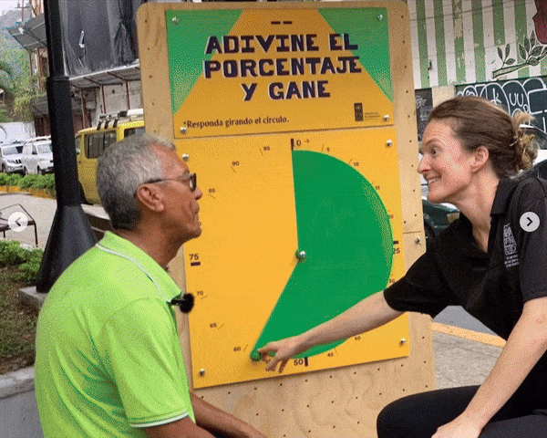

- Intro: I’ve just come back from the 2Co Conference in Barcelona, and among all the incredible talks, the one by Jose Duarte stayed in my heart: the EasyDataViz project.Today, software development, a load of numbers and complex programming are immediately associated with data visualisation. This project wants to remind visualisation specialists that information design is not about making information visualisation. It’s about making information visible: making ideas clear, clarifying concepts, and changing minds.The EasyDataViz project believes that you don’t need a computer to make a great visualisation. You just need your head and your hands. Especially in countries where digitalisation is not commonly accessible, they’ve decided to communicate with people in the streets, to make data visible and accessible for anyone, in their daily lives. This way, data becomes a playful, joyful conversation.
- Why it matters: Every time a student asks me “How do you do it? What are the tools you prefer?”, my first answer is: ”Just sketch it first. Think simple.” To me, it means understanding that design is about communicating with people, and that even the most complex works can be resized into main concepts and shapes.I love to introduce a playful approach in my works, because I believe that we need to bring people into data without scaring them. When I look at these works, I feel that even if the design and the tools are simple, the effect is big. They are talking to people, asking them to dive into the data, to make them real and useful. Using physicalisation, “it’s important to materialise information because the experience is maximised and more critical when you can touch it.”
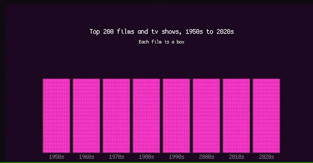

- Intro: Another masterpiece from Alvin Chang at The Pudding, this time delving into the weird, wonderful and often sidelined world of science fiction. As Alvin so eloquently points out in the story, the genre is often a barometer for how society at large feels, and since the 1950s, sci-fi has changed a lot.The piece looks deep into the current structure of sci-fi movie plots and why they’re shaped the way they are, before posing some thought-provoking ‘what if’ questions: What if we could imagine a better world, a more equitable one, where climate change was somehow solved?
- Why it matters: This kind of thinking breaks the current mould set within the media, by social media algorithms and search providers. We are routinely shown the absolute worst case scenarios, awful events happening across the globe, and bleak futures for humanity. Our thinking ought not to be binary, though. The future doesn’t have to be either dystopian or utopian; there’s a huge big gap in the middle for our imaginations to play within.That means we should be able to imagine a future where some of, or all of, the big challenges we face today are overcome, that the causes we’re fighting today will be worth it tomorrow. But it also means acknowledging that it might be difficult, that it might not be a silver bullet.A lot of resistance to climate action seems to come from the angle of ‘it’s too hard, it hits our profits too hard today, it costs too much, who’s gonna pay for it’, but actually, nothing good is ever easy anyway. Maybe a Hollywood writer will stumble across Alvin’s piece and think ‘yeah, let’s do something here.’
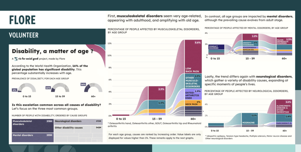

- Intro: Four volunteers at Viz for Social Good worked with the World Health Organization to show the data of how people with disabilities make up communities across the globe and contribute to our society. Flore, Rob, Shivam and Eugenia have created this engaging 4-pager full of engaging and creative data stories looking at disability through the lens of age, risk, prevalence and gender
- Why it matters: I like the variety and uniqueness each volunteer has brought to their piece, whether its colourful alluvials, metaphors, imagery within charts, or interesting iconography. Together they form an informative and engaging snapshot on a very important topic, while each working effectively as an individual piece. This month we collaborated with VFSG on our Future Fridays initiative, and it was great to get creative together (along with the DVS) and meet even more of the brilliant people within the community.
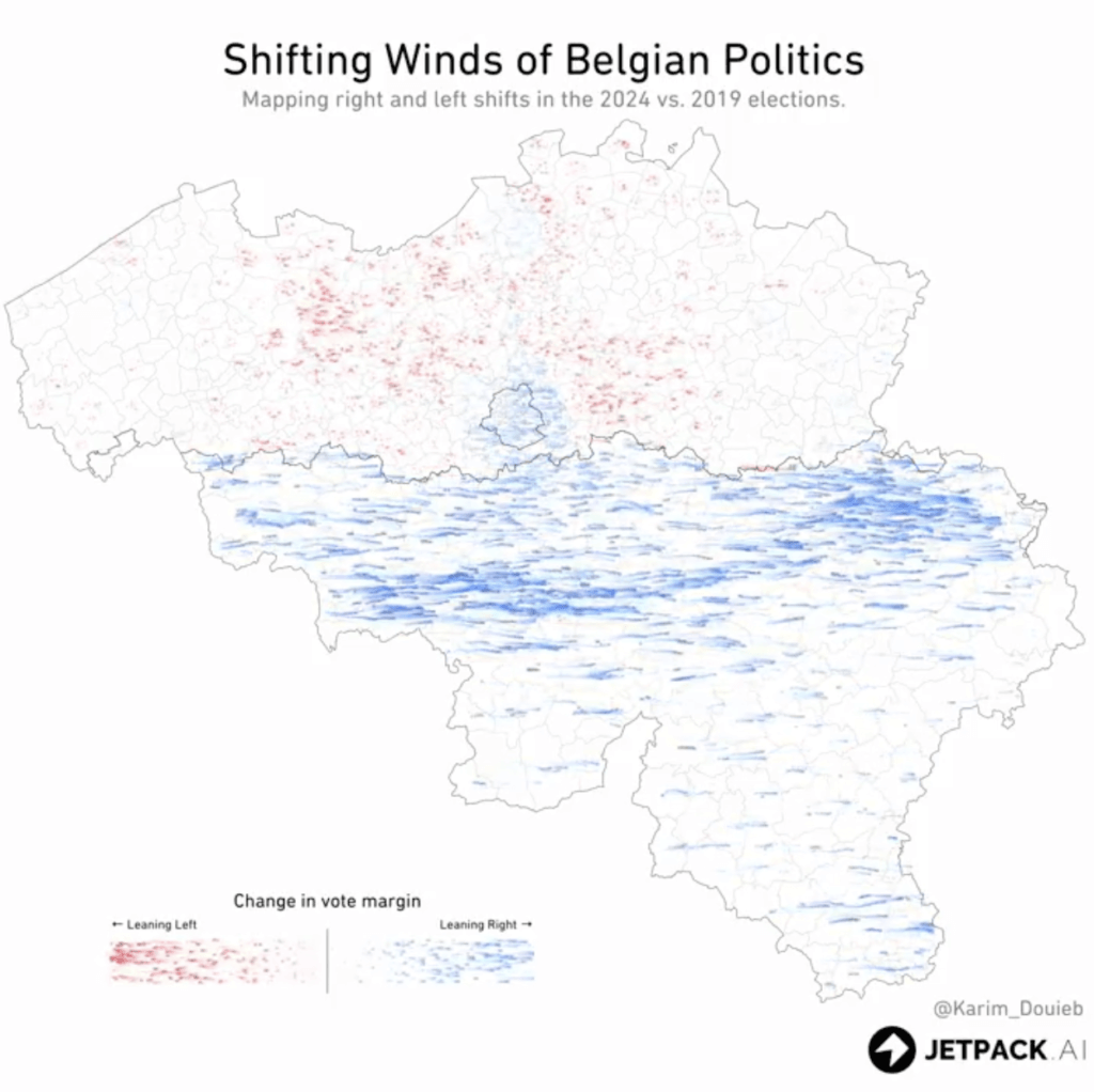

- Intro: This is an interesting piece that highlights shifts in politics in relation to geographic areas in a dynamic, interactive and attention-catching way. It highlights the ‘winds of change’ as voting patterns shifted between the 2019 and 2024 elections.
- Why it matters: This type of data visualisation helps us to better understand trends and dynamics and contributes to deeper understanding of political behaviours. The ‘wind speed’ animation is also a clever technique for showing the intensity of the political shifts taking place.
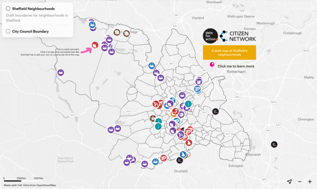

- Intro: We’ve just had a general election here in the UK, and mass-scale voting often brings up the question of constituencies and the way our local areas are carved up on our behalf. It’s also a controversial topic, with the lines often redrawn by the party in power to consolidate and extend their base.But what if those lines were laid down by the people who live there? This new project in Sheffield, funded by the NHS, set out to crowdsource a map of the city’s true neighbourhoods, right down to street level. The project is ongoing, and you can follow the story so far over on its Notion site.
- Why it matters: This is a fascinating experiment in how data can be done by the people involved, rather than it being done to them by some anonymous central authority like a city hall. It also signals the potential of data to support devolution of power to the hyper-local level.