Best of Data for Everyone, July 2023: A flying dragon and TikTok under fire
9 mins
Reading time
Reading time
all
Category
Category
Each month we share some of the best dataviz the world has to offer.
On the menu this month:
- Scented Connections – Visualising Fragrances by Tiziana Alocci
- Visiting Card by Loris Mattioni
- Car thefts are rising. Is a TikTok challenge to blame? by USA Facts
- X & Y Axis Rubber Print Stamp by Present & Correct
- Real-life Large-scale Visualisations
- Product Chart by Marek Gibney
- Global Art Trade Paths by Tanya Lomskaya
Scented Connections – Visualising Fragrances by Tiziana Alocci


- Intro: I’ve gone for something a little different this month. The reason I got into data visualisation in the first place was to represent data in ways that inspire or make a difference. And Visualising Fragrances by Tiziana Alocci certainly does just that – the fragrances literally leap off the page!
- Why it matters: It’s very easy to think of data visualisation as just ‘dashboards and charts’, but this piece of work shows that there’s so much more to it than that. It involves thinking about things in new ways, and looking at everything through a very human lens, connecting data to human experiences. Tiziana has produced such a unique way of thinking about fragrances – about all of the connections between the various ingredients that go into one, and about data in general. I want to see this piece in a gallery and smell each perfume as I’m looking at its visualisation, seeing how the art on the page matches up to the art in the bottle.
Visiting Card by Loris Mattioni

- Intro: I’ve been looking for a 3D data visualisation that can be applied to Electronic Health Record (EHR) data, and this design by Loris is an excellent place to start.
- Why it matters: The visualisation in this example is generative, so every time the visitor comes to the app, they experience something completely different. In a healthcare setting, it’s important to have a 3D visualisation that is not only beautiful but also generative, as the data being visualised is itself being generated through AI / machine learning algorithms from real-world EHR data. We’re hard at work on just such a tool to visualise patients who have been stratified for risk of uncontrolled epilepsy. The final proof of concept will be ready in August, so watch this space!
Car thefts are rising. Is a TikTok challenge to blame? by USA Facts
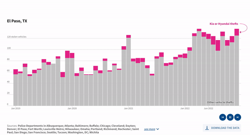

- Intro: TikTok has been under fire recently for a string of dangerous challenges, including the Blackout Challenge and the Benadryl Challenge. This story from USA Facts covers the link between car thefts and a TikTok video that shows you how to start certain Hyundais and Kias with just a USB charger. The chart flips through data from different American cities and cleverly highlights a subset of the data to show the proportion of Hyundais and Kias stolen.
- Why it matters: My immediate instinct when I open a new page is to start scrolling and to get an overview of its content. However, when I opened this story, I scrolled down a little bit and quickly bounced back up because the animated chart above the fold caught my attention. The animated visualisation with a specific focus is an interesting avenue to engage readers and encourage them to continue exploring the data.
X & Y Axis Rubber Print Stamp by Present & Correct


- Intro: Something a little different for my entry this month. I came across this X & Y axis portable graph stamp in Present & Correct, an amazing stationery shop in central London. As P&C say, its applications are limitless over the summer months – you could plot anything from how many ice creams you eat to how many bottles of nice things you have confiscated at airport security…
- Why it matters: I love the idea of bringing the digital into the physical while being playful. This physical implement exemplifies this, and it’s well suited to our own Data for Everyone promise.
Real-life Large-scale Visualisations


- Intro: This time I’ve chosen technique again rather than a specific visualisation. Real-life large-size visualisations are one of the directions I’m fascinated by at the moment. The example above comes from the Dragon Boat Festival in Shenzhen Longhua Park, with unmanned drones used to light up the night sky in spectacular formations. Another example is the MSG Sphere, the world’s largest LED screen in Las Vegas,
- Why it matters: This sort of night-sky installation has amazing characteristics for data visualisation. It easily catches viewers’ eyes and makes crowds or even entire cities curious, and it can be used to animate real data in awe-inspiring ways.
Product Chart by Marek Gibney
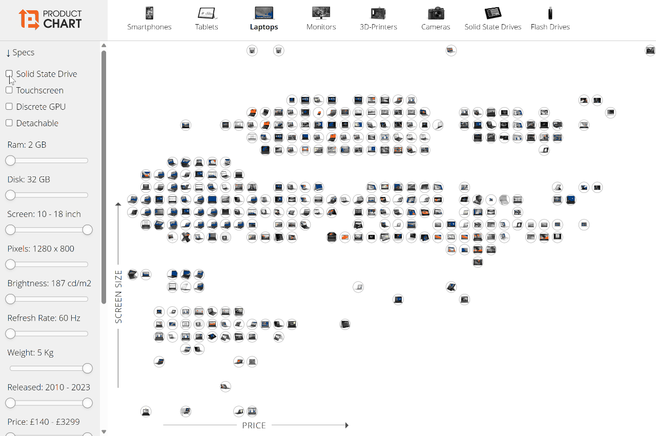

- Intro: Online retail went supernova in the wake of Covid, but it still feels like the digital customer experience is playing catch-up. When it comes to product comparison, not much has really changed. We still really only have two options: use clunky native side-by-side comparison tools (usually with limits on the number of products selected), or resort to opening new tabs ad nauseam. Product Chart by Marek Gibney disrupts this norm by presenting best-selling products in various tech marketplaces (laptops, smartphones, even 3D printers) all in one interactive visual.
- Why it matters: A new laptop is a big investment, with complex requirements that will vary for almost every individual. But laptop OEM websites are especially terrible at laying out their product ranges in a clear customer experience. Instead, the elegant filtering system used here means users can whittle down the options that suit them best in seconds. Manufacturers, take note!
Global Trade Paths by Tanya Lomskaya


- Intro: Art serves as a vital driver of creativity, not only for data viz professionals but also for all other creatives. But only a few visuals have delved into the art world itself. How has this industry fared over time, and which countries are the key drivers of art trade? Tanya Lomskaya’s bright and concise network graph beautifully visualises the global trade flow of artworks. Her work stands among those rare gems that breathe life into a theme through captivating visuals that exude colour and artistry.
- Why it matters: Just like art, data visualisation captures the essence of human experiences, social issues, and cultural movements, infusing vibrant hues into our lives in unparalleled ways. To further advance in data visualisation, we rely on a plethora of inspirations, with art standing out as one of our most enduring sources, and that’s why it’s so refreshing to see these two worlds collide here.