Each month we share some of the best dataviz the world has to offer.
On the menu this month:
- Understanding life satisfaction in Catalonia by OneTandem
- The Circle by Luca Locatelli & Federica Fragapane
- Geelong Data Exchange by the City of Greater Geelong
- Atlas of Intangibles by Priti Pandurangan
- T.Hanks for the Movies by Lisa Trescott
- Joyless Plot by BBC News
- YouTube is King by The Hustle
- DataMapPlot by the Tutte Institute for Mathematics and Computing
Understanding life satisfaction in Catalonia by OneTandem
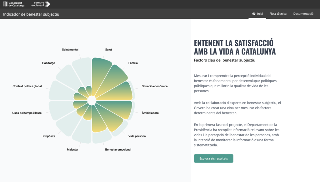

- Intro: Measuring and understanding individual perceptions of well-being is fundamental to developing public policies that improve people’s quality of life. Here, Catalonia’s Department of the Presidency has collected relevant information on people’s lives and perceptions of well-being to monitor this information in a systematised way. With the collaboration of experts in subjective well-being, the local government has created a tool for measuring the determinants of well-being. The platform includes data and information about various metrics, such as health, education, and social indicators, specific to the Catalonia region. Users can then gain insights into overall quality of life and societal progress through appealing storytelling and eye-catching interactive data visualisations.
- Why it matters: I think one of the fundamental roles of dataviz is to visually translate and to make people informed by and engaged in the data, especially when it affects them personally. This data storytelling platform empowers individuals to understand the nuances of well-being indicators in Catalonia, transforming data from an intimidating concept to a tool for self-awareness.The platform’s emphasis on custom data visualisation while maintaining simplicity is particularly noteworthy. By steering away from conventional charts and graphs, it invites users to engage with the data on a more personal level, ensuring that the audience remains captivated and curious. The more the user dives deeper into the story, the more complex the visualisations. Also, the playful interactions add an element of enjoyment to the exploration of well-being metrics, fostering a positive relationship with data throughout.
The Circle by Luca Locatelli & Federica Fragapane


- Intro: The circular economy is defined by the EU as “a production and consumption model that involves sharing, lending, reusing, repairing, reconditioning and recycling existing materials and products for as long as possible”. So it was to my delight to see ‘The Circle’, an exhibition at Turin’s Gallerie d’Italia, last weekend. Luca Locatelli takes the viewer through some of the most innovative progress being made in the EU back towards a circular consumer model. It’s a fascinating, uplifting and beautiful space. To match the beauty, at the end of each section, I spotted some intricate and detailed data visualisations. The style looked familiar, that of luminary Federica Fragapane, I quickly checked Instagram, and lo and behold: it was Federica’s work.
- Why it matters: The exhibition is a fusion of all the things I love. Beautiful, custom data visualisation, a subject that matters, and a physical space to see everything up close. If you’re in Turin, I really recommend paying a visit (ends 18 February 2024).
Geelong Data Exchange by the City of Greater Geelong
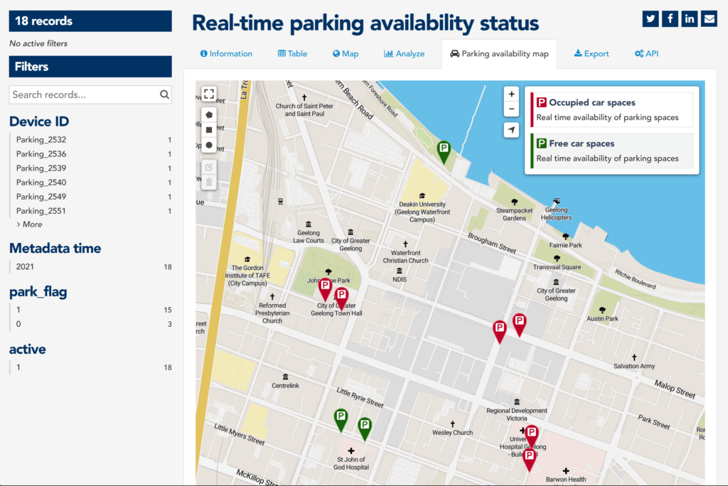

- Intro: Data from Exploding Topics shows that online searches for “data democratisation” have increased by 117% over the last five years. Just as consumers are seeking greater transparency around where products like clothing or chocolate come from, citizens are wanting to get under the hood of where they live and how their cities can become smarter and more sustainable. As a prime example, the Australian city of Greater Geelong has created its own Data Exchange, open-sourcing 155 datasets to anyone wishing to explore the local authority’s initiatives, progress and impact more closely.
- Why it matters: At the local authority level, adding tools like a keyword search and map- and chart-builders to a city’s data shifts the focus away from passive PDF-based reporting and proactively involves its inhabitants in its future. It’s a great example of data for everyone: empowering people in such a way that they can feel like city-wide action is being done by them rather than done to them by those in charge.
Atlas of Intangibles by Priti Pandurangan
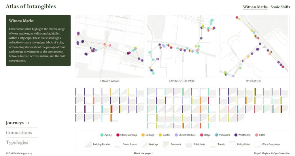

- Intro: The Atlas of Intangibles is an exploratory visualisation that documents the mundane sights and sounds captured by designer Priti Pandurangan on walks in different parts of London. From graffiti to the sound of the neighbourhood dog barking, there’s no doubt that going beyond sight gives us a better sense of what these places feel like.
- Why it matters: Data visualisation as a field continues to evolve as its boundaries are tested and expanded upon. I was immediately drawn to this project with the first few words on the homepage: “A data experience designed…”. There’s certainly a growing trend for data visualisation to be more experience-driven – something that everyone can enjoy, rather than being mined for insights. Imagine if AirBnB adopted something similar for hosts to create their favourite walks or hikes, allowing them to share anecdotes of their observations and memories; it would provide guests with an unmatched experience as they plan their itineraries.I also want to highlight the way the multi-layered data was organised. At the top of the hierarchy, you can filter by witness marks (visuals) or sonic shifts (audio). You can then view the data as part of a journey (map), a group of connections (shared characteristic), or by their typologies (combination of various traits). Experiences are complex, and it isn’t always easy to put them into a neat little legend for us to understand. Although the mantra in dataviz is to simplify so it’s easier to read, we should embrace the other direction to honour the multifaceted nature of how humans experience the world.
T.Hanks for the Movies by Lisa Trescott
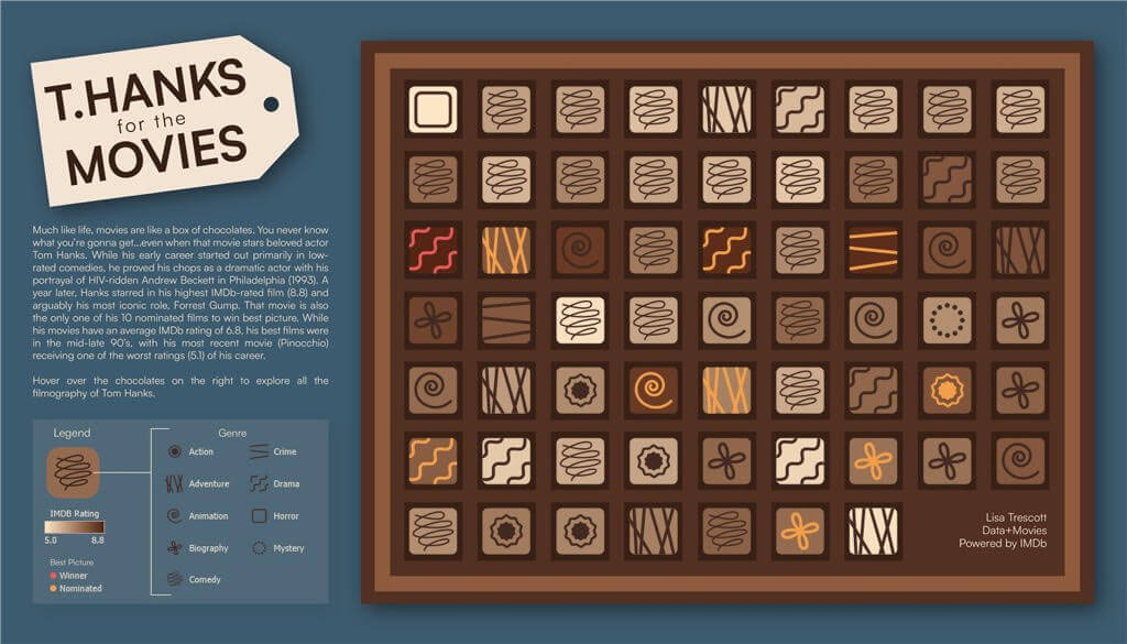

- Intro: I love this example of a data art style visualisation, visualising each one of Tom Hanks’ films individually in glyph style to create a box of chocolates. The design choice of each movie representing a different chocolate in a box of Tom Hanks movies seems simple, but it’s so well done. It’s genius, I love it!It’s also a great example of disaggregating data to show differences and similarities across each individual data point. The eye-catching design works well as a static dataviz, which would lend itself perfectly to a poster format, drawing in the reader to explore and understand the symbols behind each chocolate. Going deeper, the online Tableau version offers tooltips containing further information about each film.
- Why it matters: This is one of many visualisations in Tableau’s current #dataplusmovies campaign, showcasing the ability of data visualisation using a leading BI tool to explore popular culture subjects such as movies. It’s this kind of approach that widens the appeal of data visualisation and can inspire creativity, attracting potential designers and analysts from a wide range of skills and disciplines.
Joyless Plot by BBC News
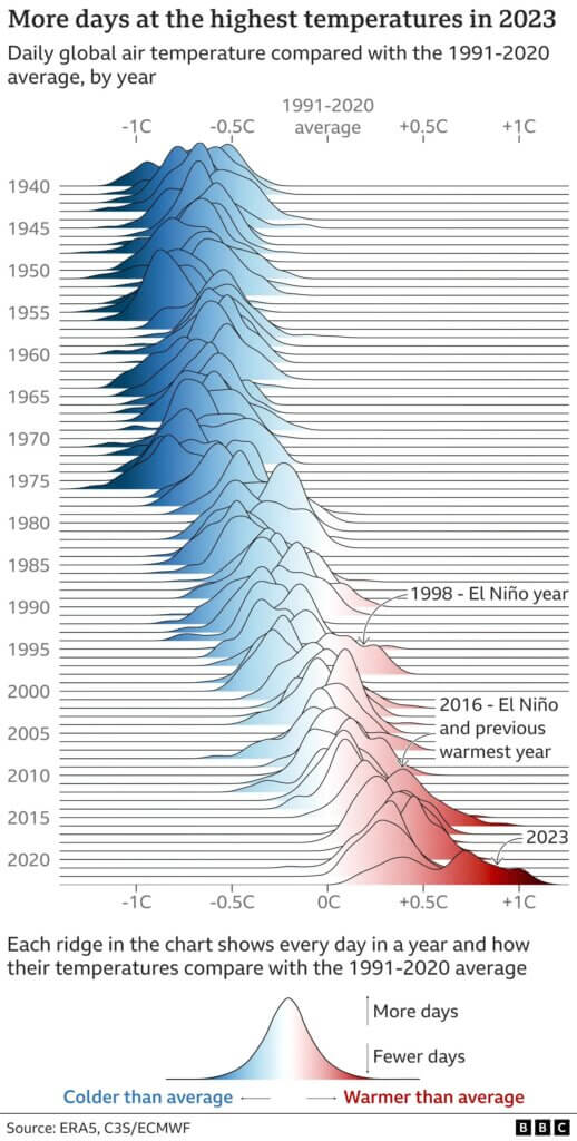

- Intro: As a piece of dataviz, this chart is fantastic on many levels. First up, it’s a joy plot. Joy plots owe their name to the cover of Joy Division’s 1979 album Unknown Pleasures, which is well worth a listen to if you have an hour spare.I’ve never used a joy plot myself, having never really had the data or the skill level required, and this one is masterful. The data is perfect for it, and I can’t really imagine a better way of showing the variation in trend over time across two dimensions. Of course, the topic itself is focused on 2023 being the hottest year on record. The data is clear; this is objectively true, and the chart shows you in the clearest terms what’s been happening.
- Why it matters: Not only is this an imaginative way to visualise the data, it’s also incredibly clear from a directional/trend point of view. The trend is immediately obvious: we’re heading from cooler to hotter, from left to right, from blue to red. Technically speaking, this is excellent at conveying the intended message.The message itself is also pretty thought-provoking, and perhaps not in the way intended. My initial reaction to this chart was ‘oh great, another doom-laden climate chart’. Admittedly, it’s difficult to create positive climate change related charts, because as a species, we’re not really doing a very good job of heading it off. But just because it’s difficult doesn’t mean we shouldn’t try.
YouTube is King by The Hustle
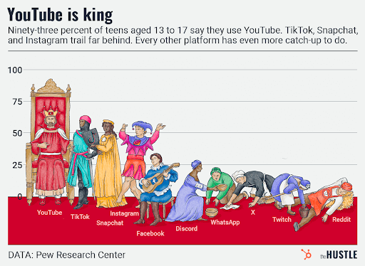

- Intro: This chart visualises the supremacy of YouTube among teenagers based on 2023 survey data by the Pew Research Center. The data shows that 93% of teens use YouTube, with 71% visiting the site daily.
- Why it matters: I often find myself in a conundrum around social media. As someone who likes to learn, explore new things and keep up-to-date with world affairs, there’s an appeal to getting a quick and easy info dump and avoiding the FOMO on opportunities. But recently my higher priority (and New Year goal) has been getting out for fresh air and exercise, and I’ve seen many in my own generational bracket shift away from ‘the screen.’ Let’s also mention the big win in this visualisation: the Tudor household is a fun and illustrative way to show this information and it certainly piques curiosity compared to the standard chart format.
DataMapPlot by the Tutte Institute for Mathematics and Computing
![]()

- Intro: DataMapPlot is a small library designed to help make beautiful data map plots for presentations, posters and research papers. The focus is on producing static plots that are great-looking with as little work as possible required by the user.
- Why it matters: With a 2D representation of your data and labelled clusters, DataMapPlot can produce beautiful presentation-ready plots that we can easily style to our needs as data designers. Work like this, especially when based on real data, increases the appeal of evidence-based presentations and scientific papers, which otherwise tend to be very dry for the reader.