Best of Data for Everyone, February 2023: LeBron James, Voronoi treemaps, and ChatGPT
11 mins
Reading time
Reading time
all
Category
Category
Each month we share some of the best dataviz the world has to offer. For February’s edition, we even invited ChatGPT to have a go!
On the menu this month:
- The top global risks in 2023
- A long-term timeline of technological innovations
- LeBron James’s record-breaking points tally
- Voronoi treemaps for Fortune 500 companies
- Which countries have the highest environmental taxes?
- How much is your nearest Big Mac?
- ChatGPT picks Climate Stripes
The Top Global Risks in 2023
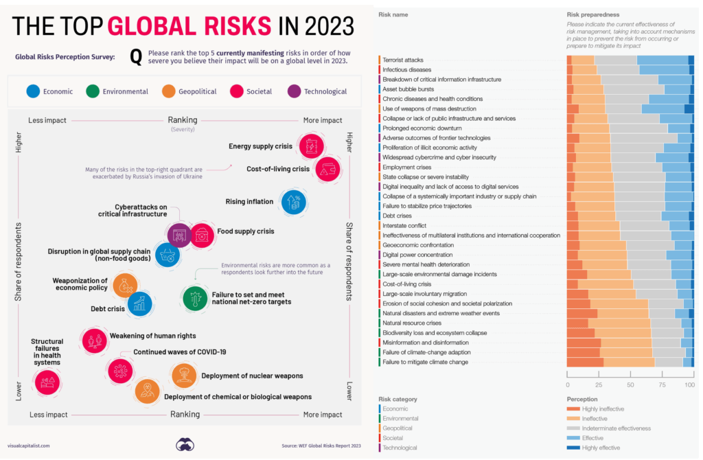

- Intro: My pick this month is from the creatives at Visual Capitalist, with two visualisations that look at the top global risks in 2023. The findings are based on the recent Global Risks Report produced by the World Economic Forum.
- Why it matters: Not only are the visuals clear and engaging, I particularly like that the themes presented are diverse and worldly relevant. This means everyone can relate and have an opinion on where their own interests and concerns lie and whether they agree or disagree with the general placing and ranking. If something isn’t where you thought, it inspires curiosity to find out why.The findings present a clear story, yet I imagine each individual will have their own slightly different take-away from feeding in their own perspectives. For me, to see concerns around net-zero targets on the ranking is good, as it indicates that environmental concerns are being considered more seriously. However, I would also consider that the more severe risks around energy supply and food supply are also in part environmentally related, especially for the future.While the first visual shows the perception around risks, the second visual assesses how prepared we actually are. Unsurprisingly, risk preparedness is the worst for environmental risks. This really highlights the need for more climate action today, rather than feeling comfortable perceiving the environment through a far-off lens.
A Long-term Timeline of Technological Innovations
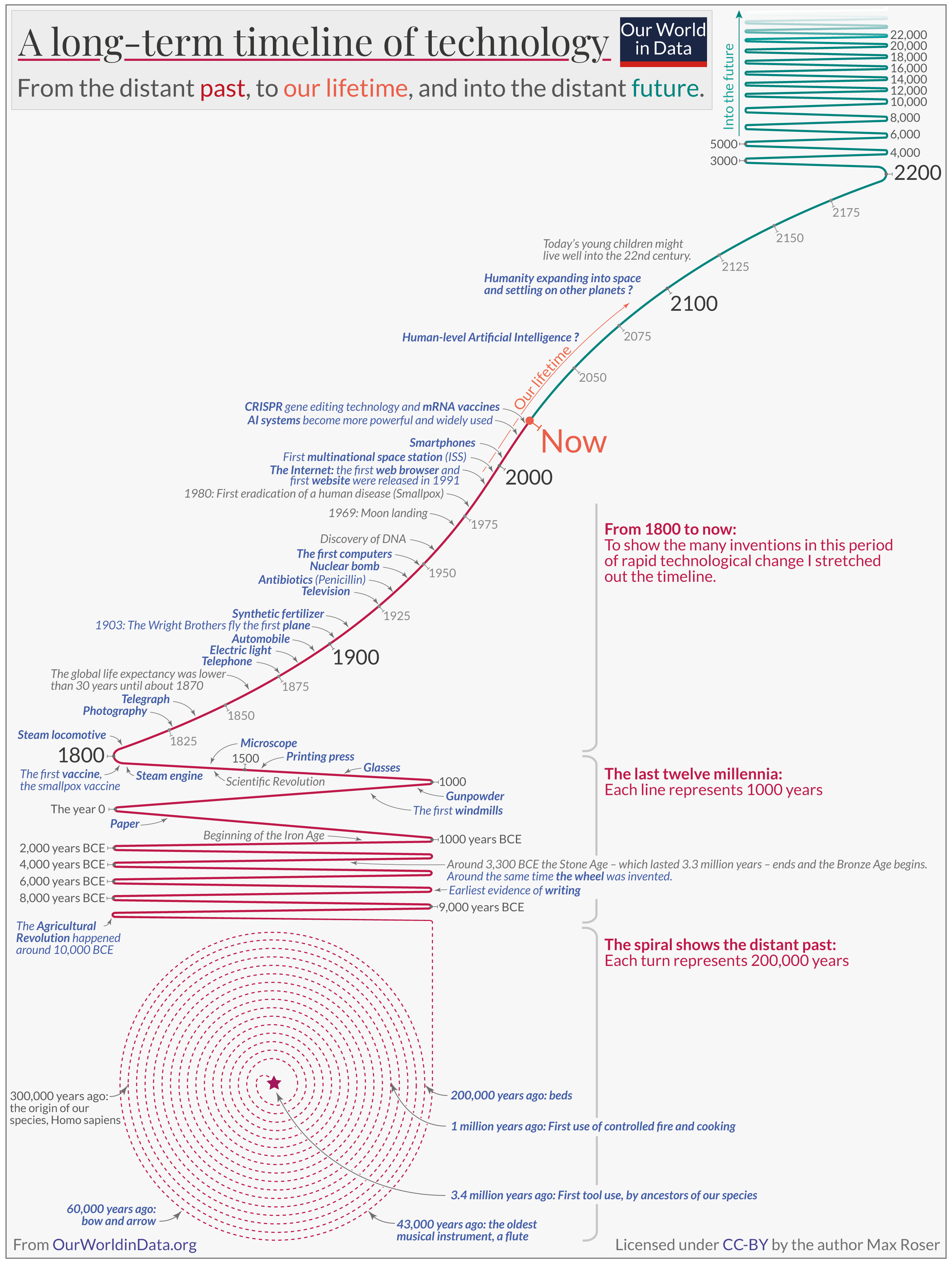

- Intro: My pick for February is this wonderfully simple infographic from Max Roser at Our World in Data, looking at how technology can rapidly evolve over time. With ChatGPT such a hot topic lately, it puts this into sharp focus.As of December 2022, AI chatbots were viewed as largely useless, unable to engage with humans in any kind of meaningful way. Now, it’s a case of when, not if, they take over the world of work and revolutionise the way we do things. Whether this is true or not, of course, is still up for debate.I love this actual visualisation though, because it’s in tune with my own thinking. It looks back at 12,000 years of human history, of which I will only be around for a small portion, and it calls out actual game-changing innovations before looking out into the distant future.Could a person wandering around in 8,000BC have imagined where humanity would be 10,000 years later? Can we imagine where humanity will be in the year 12,023?
- Why it matters: Linking this back to climate change, climate action and sustainability, it shows that technological advances can happen very suddenly and make a great impact.On a philosophical level, it shows that humans have been around for quite some time, and projects that will be around for a lot longer yet. Some 3.4 million years ago, the first tools were used by our ancestors, but the Earth was here for billions of years before that, and it will be for billions of years beyond the scale of this infographic.Perhaps the communications message around climate change should be around saving humanity, rather than saving our planet?
LeBron James’s Record-Breaking Points Tally
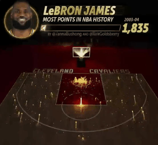

- Intro: My pick this month is from NBA analyst Kirk Goldsberry. This animated visualisation shows all the shots Lebron James made from 2003 to 2023.
- Why it matters: This visualisation demonstrates that animations can create unique experiences. In this case, you can experience Lebron’s two decades of NBA dominance in just 45 seconds. It’s also visually interesting to look at, as you observe where the shots were made on the court.What’s particularly interesting is how the frame shifts to show outliers, illustrating some of Lebron’s insane 3-point shots.There is still a lot of unexplored potential in animated data viz. We have a tremendous opportunity ahead of us to explore new mediums to tell meaningful stories with data.
Which Countries Have the Highest Environmental Taxes?
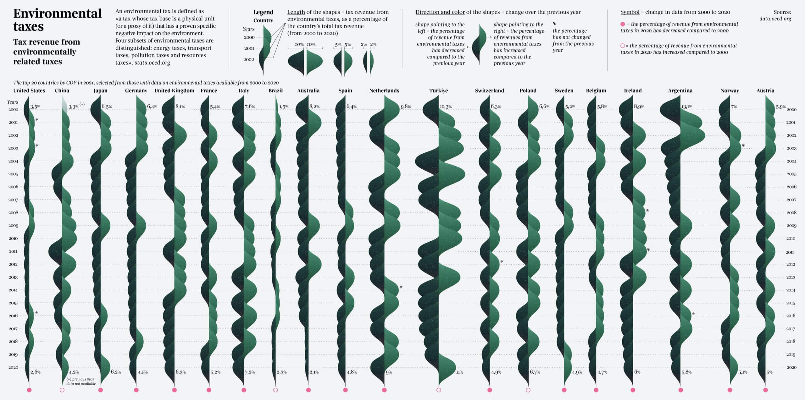

- Intro: My pick for February could be any of Federica Fragapane’s works, but the pieces found in Italian newspaper Corriere Della Sera are both mesmerising and packed full of insight.This latest piece, stepping on Stewart’s toes (see Sustainability pod), is centred around environmental taxes and illuminates which countries have the highest rates over the years.
- Why it matters: In a world of fast news and AI-generated writing, compelling data visualisations like these bring greater context and help build a more powerful narrative around climate action and social justice.
Voronoi Treemaps for Fortune 500 companies
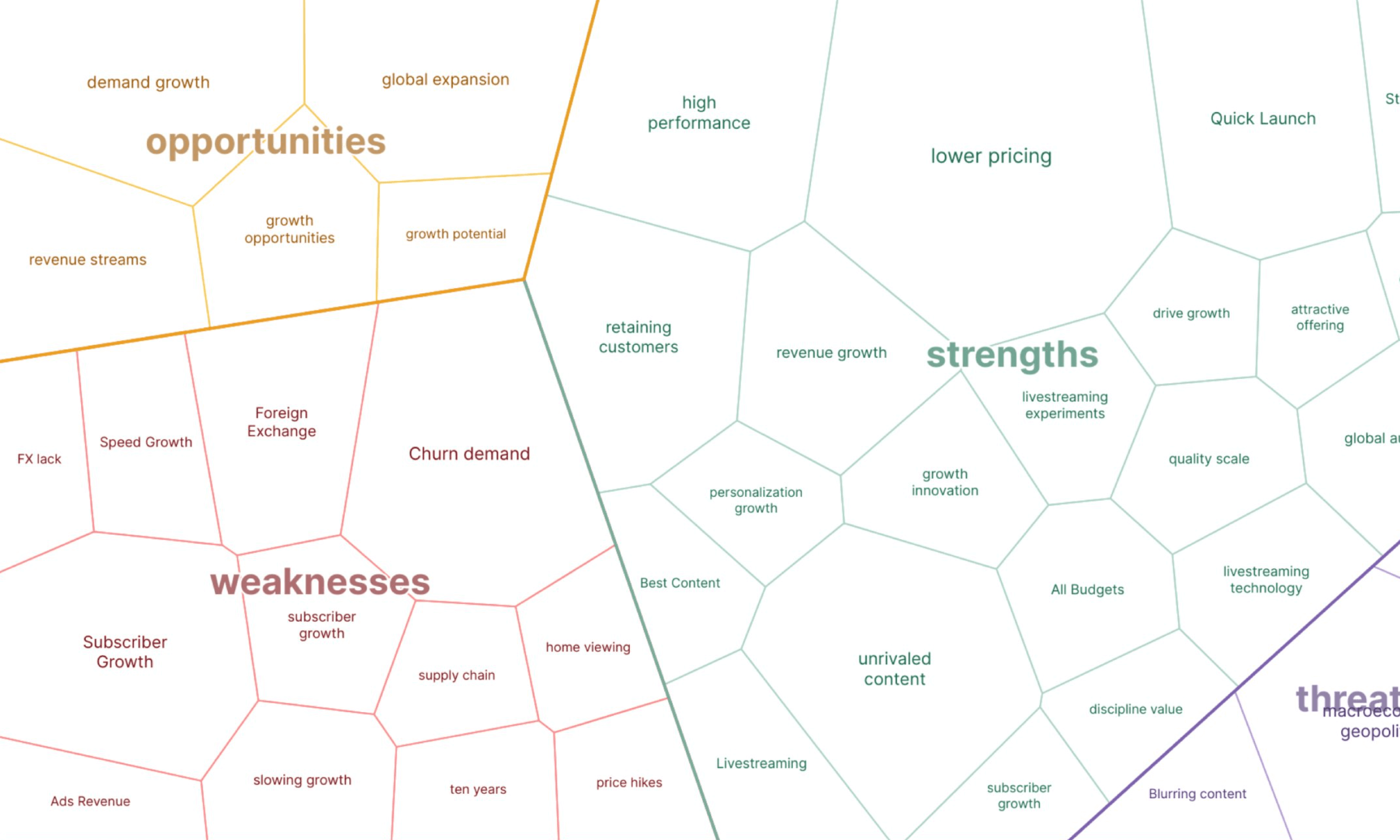

- Intro: My pick for this month is a swotbot from Moritz Stefaner, which generates Voronoi treemaps based on SWOT metrics for Fortune 500 companies.
- Why it matters: Voronoi treemaps have always been a particular interest of mine. They have some great characteristics when it comes to dataviz.First, they can fit into any figure; it could be a circle, polygon or even different logo shapes. Second, changes can be made easily with the animation, which is particularly useful in dynamic and interactive applications. Third, if we add labels, they can be easily understood and always attract interest from the user.Considering these characteristics, it’s not a surprise that this particular choice of visualisation works so well in this context. We can easily see and understand what the strengths, weaknesses, opportunities and threats of each company are, which makes this tool ideal for market research and/or competitor analysis.
McCheapest: How Much is Your Nearest Big Mac?
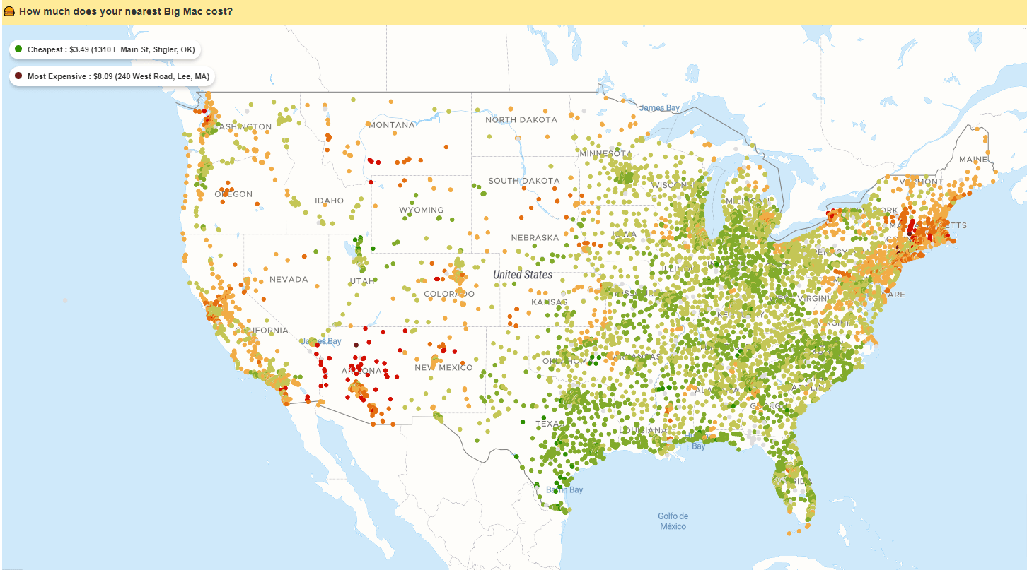

- Intro: It’s the epitome of mass consumerism, so a Big Mac should cost the same wherever it’s sold, right? Apparently not. This map visualises McPrice differences across the US, with prices varying as much as a whopping 77%.Up by the Canadian border, you’re looking at $6.89 for a Big Mac on the outskirts of Buffalo, but drive an hour east to Rochester (also in NY) and the price drops to $4.49.And why are Big Macs so expensive in Arizona? Is there a gherkin shortage in the desert?
- Why it matters: Joking aside, this is a compelling showcase of the impact of food miles and cheap labour that come with globalisation and mass product proliferation.
ChatGPT’s pick (because we had to): Climate Stripes
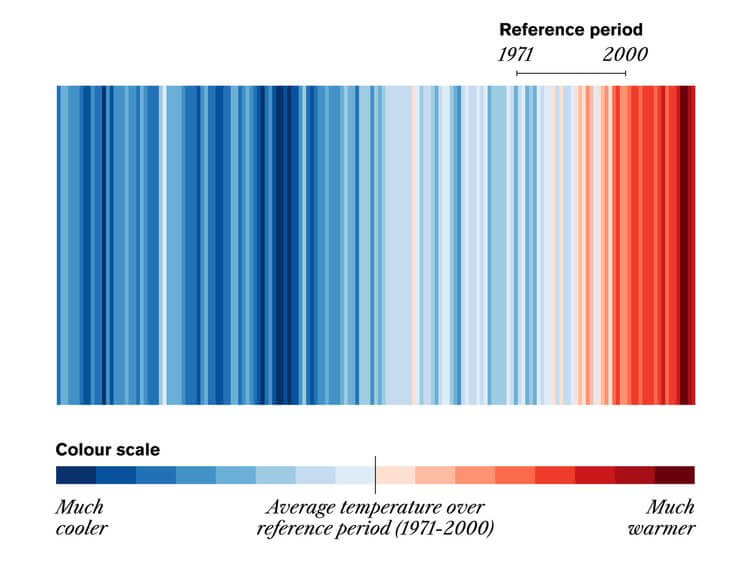
- Intro: The Climate Stripes graphic presents long-term temperature trends in a simple, visually appealing way. The overall effect is a visual representation of how temperatures have changed over time, with warming trends appearing as increasingly thick bands of red. The graphic is highly customizable, allowing users to create Climate Stripes for different locations and time periods.
- Why it matters: Climate change is a complex and multifaceted issue, but temperature trends are one of the most important indicators of its impact.Overall, the Climate Stripes visualisation matters because it helps to communicate the urgency and scale of the problem of global warming, and it provides a powerful tool for raising awareness and inspiring action to address the issue.
(This text was generated by ChatGPT. Climate Stripes was built by real humans at the University of Reading.)