Best of Data for Everyone, August 2024: From board games to the Olympic Games 🥇
9 mins
Reading time
Reading time
all
Category
Category
Each month we share some of the best dataviz the world has to offer.
On the menu this month:
- The Employee Unhappiness Survey by Working Not Working
- The moments before Trump was almost assassinated by Der Spiegel
- Everything you need to know about Olympic boxing to watch Ayoub Ghadfa make history by La Rioja
- Data Land: The Data Visualization Board Game by Julie Peasley
- All roads lead to Rome by vividmaps
- Breaking story by BBC Sport
The Employee Unhappiness Survey by Working Not Working
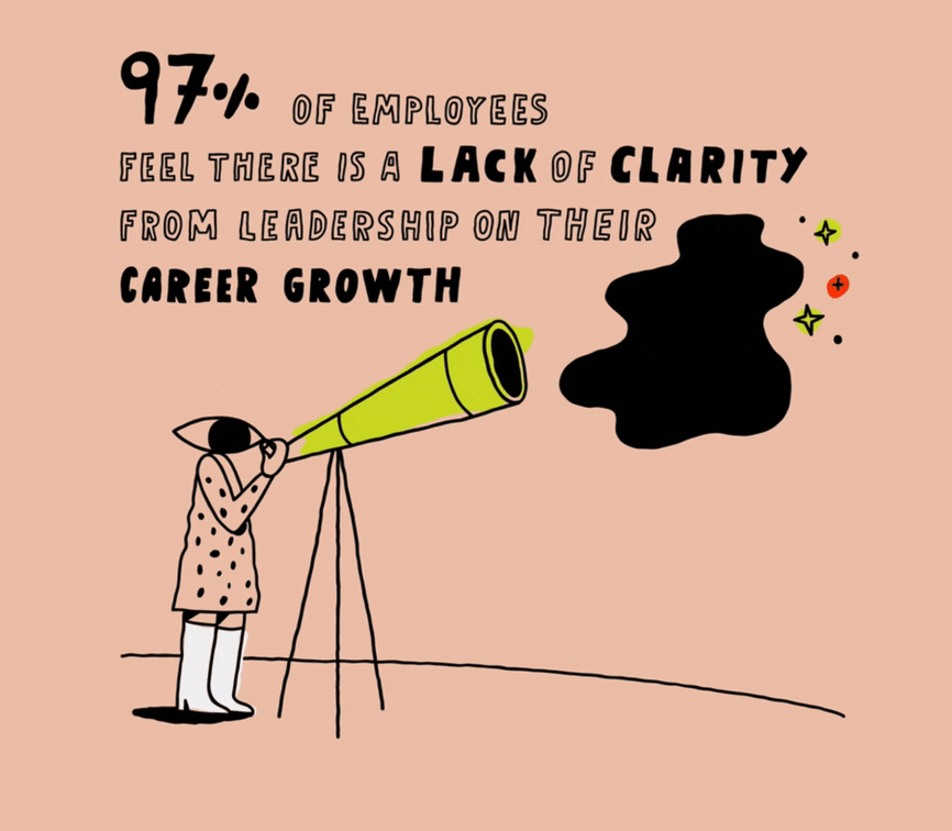

- Intro: Now that Covid restrictions are becoming a distant memory, a blip on the timelines of our lives, Working Not Working have picked up on the rising sentiment of employee dissatisfaction. Companies are beginning to shift back away from people, leaving them burnt out and less productive. WNW wanted to know how this was impacting on creatives, and this survey gets under the skin of the ‘why’. Why are people so unhappy, what’s driving that? This beautifully made set of animated illustrations empathetically gets the message across in a way that both tells a story, but also appeals to the eye.
- Why it matters: This piece matters for a number of reasons. First, the message itself is of vital importance. Employees who are unhappy in their roles are not going to stay in their roles, and they’re not going to be productive. Second, there are so many data points in this piece, really breaking down the reasons why employees might be unhappy, but at no point does it feel overwhelming. WNW have done a great job of balancing this. And finally, the overall message is pretty gloomy, but the visuals get the point across in a way that isn’t overly negative; they’ve got the balance right (again) between fun and serious. And there’s also the added bonus of some key organisational drivers that make employees want to stay in their roles, too.
The moments before Trump was almost assassinated by Der Spiegel


- Intro: What could have happened on 18th July had Trump been standing a few inches to the left? A detailed visual story [German] from the data storytelling team at Der Spiegel replays the second-by-second timeline of the vital moments before what could have been a fatal assassination.
- Why it matters: Led by Matthias Stahl, the visual storytelling team at Der Spiegel use some of the best technologies in data storytelling, including D3, Svelte and Blender, to create in-depth data storytelling experiences for audiences.
Everything you need to know about Olympic boxing to watch Ayoub Ghadfa make history by La Rioja


- Intro: Highlights the data around the boxing match of Ayoub Ghadfa in his round of 16 match, where he defeated Kazakh Konkabayev. The visual data story highlights the differences between Olympic boxing and professional boxing.
- Why it matters: This explainer piece by La Rioja has a mix of everything. It cleverly includes tables, diagrams, animated visuals, and scrolling interactivity to explain the principles of boxing to anybody and in a fun way. A highlight for me was the animated videos with drawing style animations: working with video and photos can be tricky, but the results here look great, a really unique way of showing rather than telling. Overall, this piece packs a lot of visualisations and styles into one explainer piece in a seamless way that makes boxing accessible to those, like me, with no prior interest or knowledge.
Data Land: The Data Visualization Board Game by Julie Peasley
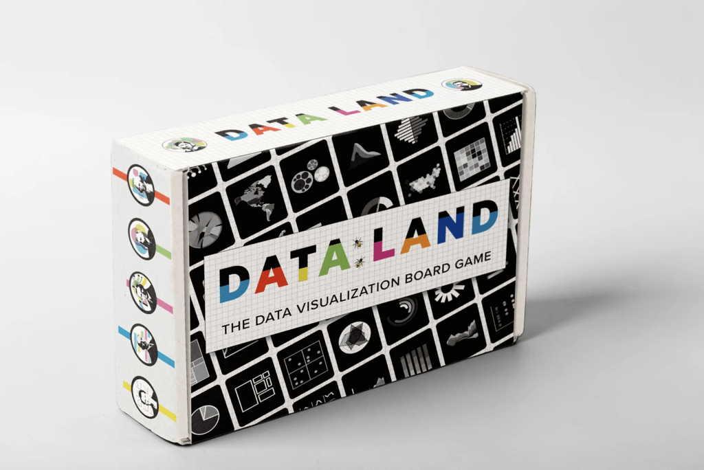

- Intro: Have you ever wanted a board game all about data? Of course you have! Inspired by Candy Land, Data Land is a game prototype to increase data and chart literacy while bringing some fun into the world!
- Why it matters: Having fun is the best way to stay inspired, creative, and to enjoy our work, and we know that dataviz people can be obsessed by data! When I was in Chicago, even after three days of Outlier, I found all my colleagues playing a dataviz card game in a pub. Whether you want to finally make your parents understand what your job is, or you want to show off your knowledge among friends, Data Land seems like the right game to have fun and brush up on the basics of charts. And if you‘d like to see the prototype become real, let the author know your feedback!
All roads lead to Rome by vividmaps
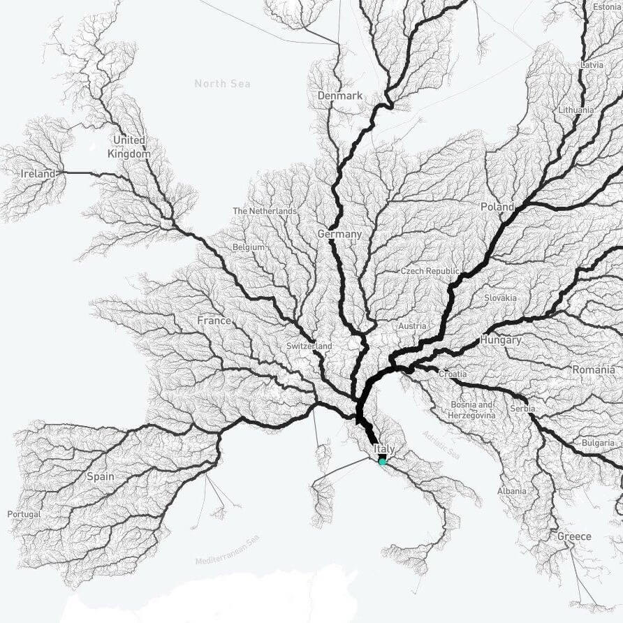

- Intro: The proverb “All roads lead to Rome” highlights the central importance of Rome during the peak of the Roman Empire. It reflects how the city was once the hub of a vast network of roads that connected the empire. This visualisation by vividmaps shows the extensive network of roads that led to Rome, illustrating the historical reality behind the proverb.
- Why it matters: We’ve all heard this saying and likely considered the extent of the roads that once spanned the empire. Over time, the proverb has taken on a metaphorical meaning, suggesting that different paths can lead to the same destination.
Breaking story by BBC Sport


- Intro: We’re big on the Olympics in our household. The chaos of the kayak cross has been a real highlight, and another new Olympic sport for Paris is breaking. This scroller from BBC Sport details the history and sporting pedigree of break-dancing, from its birth in the Bronx in the 1970s to its inclusion in this year’s Games.
- Why it matters: With their mixed media and playful feel, these scrollytelling stories are way more appealing than the typically dry explainer video or ‘long read’ formats we’re already so/too familiar with. Other entries in the Shorthand-powered series include A Visual Guide to the Olympics and a retrospective on the last time the City of Light hosted, exactly 100 years ago. It feels like the team at BBC Sport are only just starting to flex their data journalism muscles with this format, so I’m excited to see what they come up with next.