Best of Data for Everyone, August 2023: Putting the heat in heatmaps 🔥
11 mins
Reading time
Reading time
all
Category
Category
Each month we share some of the best dataviz the world has to offer.
On the menu this month:
- Atmospheric Carbon by Source by NASA
- Population Density of the World by Python Maps
- Tracking how the Hottest Year on Earth is Affecting US Heat Records by The Pudding
- The Enemy Made Visible by Nautilus
- Viz Heads by Odd Studio
- 1,500 Years of Loch Ness Monster Sightings by Emma Morrice
- The Shared Excitement of the Top Level of the Bus by Very British Problems
Atmospheric Carbon by Source by NASA


- Intro: This visualisation from NASA’s Scientific Visualization Studio shows CO2 being added to the Earth’s atmosphere cumulatively throughout 2021. It shows 4 major contributors as smoke: fossil fuels (brown), biomass (faint red), ecosystem (faint green) and ocean (faint blue). The major absorbers are shown as dots: land (green) and ocean (blue). By plotting them all on a globe, it’s easy to see where in the world those emissions are coming from.
- Why it matters: These visuals highlight that CO2 emissions are a truly global issue. Unsurprisingly, Latin America and sub-Saharan Africa are major absorbers of CO2, but over the course of the year, they become drowned out by emissions from the Northern Hemisphere in particular. The visuals make me wonder how successful carbon capture could ever be, given the sheer volume of emissions over the course of just one year. The main focus in ‘net zero’ should always be reduction, but at the same time, we need to protect those areas that naturally capture lots of carbon, and financially reward nations adequately for their efforts.
Population Density of the World by Python Maps


- Intro: This visualisation from Python Maps captures population density around the world using the ‘data science trilogy’ of Matplotlib, NumPy and Pandas, with notable hotspots shown through a fiery heat scale.
- Why it matters: On the one hand, the choice of colours makes the visual look like city lighting and gives the impression of a vibrant urban landscape. On the other hand, we get the sense of a world increasingly on fire. From a technical standpoint, it’s not an easy task to generate maps in such a style on the web. This complexity caught my eye this month, and I’m hoping to see more maps that are styled similarly while offering an interactive online experience soon.
Tracking how the Hottest Year on Earth is Affecting US Heat Records by The Pudding


- Intro: The Pudding have created an interactive map and clickable story showing the days since a given US city had a record-high temperature. It’s a timely and relevant topic for the work I do, and it showcases how creativity can turn large and typically scientific datasets into engaging and informative tools for everyone.
- Why it matters: This piece has 3 clear wins that make it a unique example of great data visualisation. Let’s start with the data itself. After all, how many ways are there to show temperature other than degrees? Well the team at The Pudding have found a novel approach by highlighting the numbers of days since a heat record occurred – this in itself makes it interesting and sparks curiosity. Then there’s the data visualisation. This is a lovely example of a simple interactive map with a great user experience, allowing users to slice and view the data differently. Finally, a little hidden gem is that you can view city trends in a clickable data story format in addition to the map. This shows complex data in a really simple way by taking the viewer through a clear journey, explaining what the data shows at each step, and effectively using different visualisations to best explain the trends.
The Enemy Made Visible by Nautilus


- Intro: In ‘The Sphere That Changed the World’, artist Angela Palmer has created the most scientifically accurate physical representation of the SARS-CoV-2 virus. While directly imaging the finer structural details of viruses is beyond our current capabilities, this 3D digital sculpture has been elucidated based purely on bioinformatics and data derived from extremely powerful computational analysis of the SARS-CoV-2 gene sequence. This is the exact same process that informed the shape of the spike proteins on the surface of the virus, which in turn would lead to the development of novel vaccines, in record-breaking times, saving potentially millions of lives globally.
- Why it matters: Angela Palmer’s work represents something more than symbolism; it is a physical testament to the complexity and ferocity of nature, the ingenuity of science and technology, and the power of beautifully crafted data visualisations (or data realisation in this case?) to engage, educate, provoke and inspire.
Viz Heads by Odd Studio
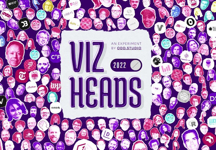

- Intro: Populated from the 2021 and 2022 industry survey organised by the Data Visualization Society, this interactive visualisation lists books, experts, websites, and groups leading the dataviz field. But Viz Heads is more than just a list; it represents the community pushing the industry forward. Most importantly, this visualisation neatly captures the essence of community: people.
- Why it matters: Many data visualisations suffer from the same boring type of charts, meaning we miss out on humanising data. Don’t get me wrong, there is a place for boring charts—they’re reliable, predictable, and functional. But, it doesn’t mean we shouldn’t explore novel visualisations! My start in dataviz was through Twitter, where the community was most active. Everyone shared their work, celebrated the work of others, and challenged unethical visualisation practices. For anyone new to the field, this viz lowers the barrier of entry and makes it easier to discover thought leaders and resources. I look at this visualisation with awe and gratitude; I see many familiar faces, and I’m proud of everyone’s efforts to advance and advocate for the craft.
1,500 Years of Loch Ness Monster Sightings by Emma Morrice


- Intro: Whimsical scrollytelling from Scotland this month, charting the data on Nessie sightings as far back as 532 AD. The data comes courtesy of a man with the enviable job title of the Keeper of the Register of Sightings. And it’s visualised through a mix of scrollytelling, animated visuals and word-clouds to boost the fun factor.
- Why it matters: Data drives better decision-making, and now even Nessie-spotters can use data to give themselves the best chance to catch a glimpse of the world’s favourite stranded plesiosaur. Such uses for data have practical applications, too: Tourism-wise, you could picture tour operators visualising something similar for the Northern Lights (or any other natural-and-so-unpredictable phenomena) so that their customers are likelier to go home happy.
And Finally… The Shared Excitement of the Top Level of the Bus by Very British Problems
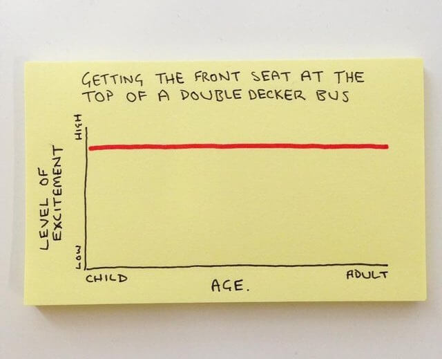

- Intro: Something lighter for the summer months. This one from Very British Problems made me chuckle in its simplicity while highlighting the power of data in bringing about shared memories that we can all relate to, which isn’t something we often attribute to data-led content.
- Why it matters: At infogr8, our subject matter expertise helps solve real-world challenges with data across EdTech, Sustainability and Healthcare. These challenges are real, like the climate change made so stark in the other visuals above. So in amongst all this crushing reality, here’s an example of how even the simplest of data visualisations can conjure real, positive human emotion.