Best of Data for Everyone, April 2024: What if we could hear data? 🎧
11 mins
Reading time
Reading time
all
Category
Category
Each month we share some of the best dataviz the world has to offer.
On the menu this month:
- Hold the Line by Loud Numbers Studio by Miriam Quick and Duncan Geere
- How to spot a solar eclipse by AirDNA
- What will we cook from? By Tanya Lomskaya
- Can I Eat It Yet? by Diana MacDonald
- The last undisputed heavyweight champion of the world by Arjen Groeneveld
- AFRICA – Big Change / Big Chance – by Valerio Pellegrini
- History-making profits. World-ending emissions. by Energy Profits
Hold the Line by Loud Numbers Studio by Miriam Quick and Duncan Geere


- Intro: This month I’ve opted for something a little more unconventional, heading into the world of data sonification as opposed to visualisation. In their Loud Numbers Studio, regular infogr8 collaborators Miriam Quick and Duncan Geere look to transform data into soundscapes as a means to resonate more – and create more impact – with audiences as they engage with data. This specific track dives into Canadian wildfires: the soundscape is impacted by volume, intensity and cause. In short, it blew me away. One question that pops out at me: if I’d have seen the number of fires started by humans on a map, would it have landed the same impact as hearing them, in the form of a zippo click? There are a lot of zippo clicks to be heard, and it feels shocking.
- Why it matters: Hold The Line is a unique and inventive new way of looking at (or listening to) data. The underlying data itself could very easily have been visualised on a map that changes over time, but as we become more and more accustomed to wildfires (and data visualisation generally), is there the risk that we become desensitised, and that these graphics land less impact? Possibly, but sonification of data is unique, novel, and allows the audience to experience the data in a different way.
How to spot a solar eclipse by AirDNA


- Intro: How can you spot a solar eclipse before it takes place? Look at the Airbnb bookings. According to data from @airdna, with the eclipse less than a week away on 7th April, over half of US cities along the eclipse’s path were fully booked for the night. This outstanding visualisation was even picked up by The Economist as part of its reporting on the rush to view the eclipse.
- Why it matters: The beauty of visualising data in this way helps us spot cultural phenomena and trends and understand why things pan out the way they do. From a business standpoint, these (literally) high-level insights help drive more considered strategy and decision-making.
What will we cook from? by Tanya Lomskaya
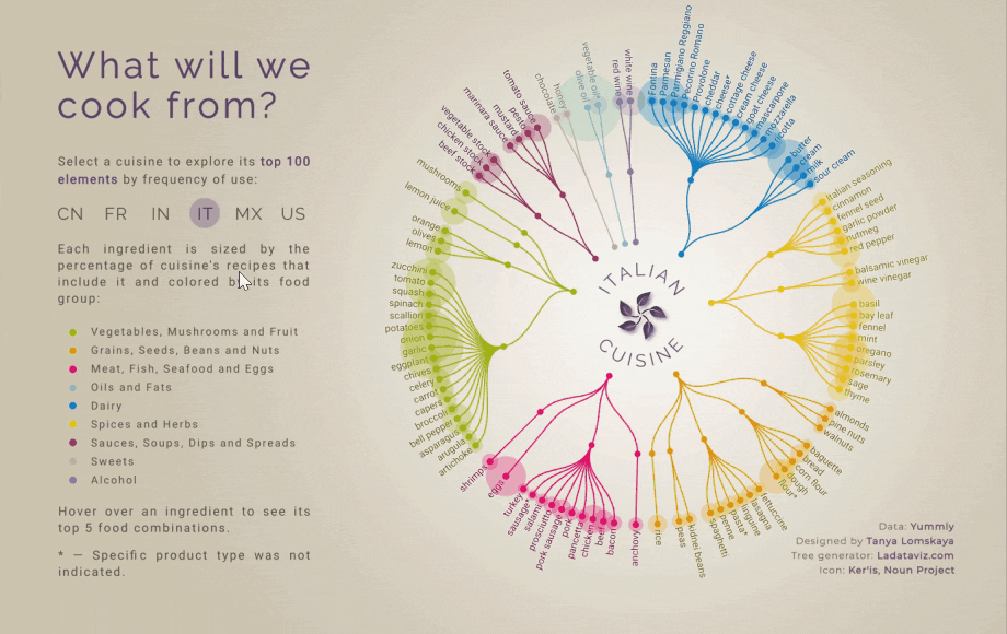

- Intro: With the rise of meal kits, at-home delivery boxes and takeaway apps, the foods of the world are being brought to our doorsteps like never before. This Tableau visualisation lets you explore the top 100 ingredients frequently used across Chinese, French, Indian, Italian, Mexican, and South American cuisines. So simple yet so effective, I love how this visualisation cleverly elevates a static dendrogram into a practical tool that looks great and offers effortless and easy interactivity.
- Why it matters: My curiosity was instantly ‘fed’ from the way the data is grouped, the ability to compare countries, the sized bubbles to show the % of each ingredient used in recipes, and the additional layer to see top 5 food combinations. I wanted to click on everything, and I was curious to see how UK cuisine compares (I love garlic so clearly I’m a fan of Italian food!).
Can I Eat It Yet? by Diana MacDonald
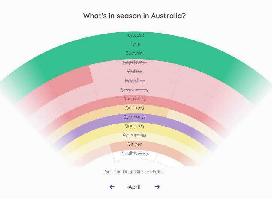

- Intro: This visualisation tracks which 20 fruits and vegetables are in season right now in Australia. The project stemmed from a very simple question that many of us think about as we grocery shop: “When can I buy this piece of produce that’s fresh and at a good price?” I’ve certainly asked this question during the cold winter months in Toronto and look forward to the various fruits that will soon grow in abundance on local farms, such as cherries and watermelon.
- Why it matters: Part of why I love this visualisation is that it’s practical and something everyone could reference regularly. The colourful vibe invites you to explore fresh local produce and helps you plan your grocery list on a budget. I think a lot about the lifetime value of a visualisation – many are created to solve short-term goals and are seen for only a short period by a small group of users before they’re left to collect dust. What other questions could information designers consider that could benefit so many people in their everyday lives?
The last undisputed heavyweight champion of the world by Arjen Groeneveld


- Intro: The visualisation condenses boxing’s golden era in the 1990s into a single view, including all the fighters, the champions and the fights that made the period so epic. With the postponed Fury vs Usyk heavyweight bout now set for 18th May, will we have another undisputed champ to rival Lennox Lewis way back in 1999?
- Why it matters: As an information designer, I always seek to find the right balance between complexity, accessibility and creativity. This piece of work visualises a complex storyline without overwhelming the audience by adding a level of interactivity. In this way, users can interact and decide for themselves what information to further explore and on what level they want to read the article. And from a graphic design perspective, I particularly enjoy the detail of the legends and the symbols found within them.
AFRICA – Big Change / Big Chance by Valerio Pellegrini


- Intro: This piece of visualisation by Valerio Pelligrini was produced as part of an exhibition at Triennale di Milano highlighting the socioeconomic changes that are taking place across Africa. The themes covered range from oil production and the diffusion of contraceptives on the continent to the African diaspora in Italy. These large-scale data stories serve as an introduction to and in-depth analysis of the other media (documents, photographs, 3D models) that make up the remaining exhibits.
- Why it matters: Understanding oil production in Africa is important amid its expanding population. Insight into production patterns improves energy planning and makes policy more efficient. It also helps with safeguarding natural resources for future generations and steady economic development. And, from a cultural perspective, this series signals the potential of information design to bring an extra dimension to our museums and exhibition spaces.
History-making profits. World-ending emissions. by Energy Profits
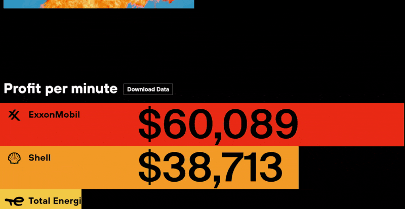

- Intro: A parent at my son’s school works for Shell. It’s awkward. I listen to his patter about how much they’re investing in R&D and cleaner fuels and yadda yadda yadda, but I regularly want to scream something about shareholders into his face. I understand that I’m not blameless in this: one of the two cars we run takes petrol, so we’re part of the demand-supply equation. But I needed something to signpost to that shows the extent of the shameless profiteering, not just from the planet in general but also from social crises like the war in Ukraine. This data story – blunt and sharp in equal measure – does exactly that.
- Why it matters: Like our own American Opportunity Index, this piece of data storytelling has won a Webby Award (think the Oscars but for online design) for its excellence in dataviz. In 2022 alone, oil’s big five made $200 billion in profits, in the same year that CO2 emissions hit a record high. For all their green-spinning and posturing about the future, these firms need to be held to account, and the cut-through that data provides is the place to start from.