Best of Data for Everyone, April 2023: Because even ship tracking can be beautiful
11 mins
Reading time
Reading time
all
Category
Category
Each month we share some of the best dataviz the world has to offer.
On the menu this month:
- Movement: Tracking Ships In and Out of Poole Harbour, UK
- Queering the Map
- The Forgotten Kingdom
- Based on Implemented Policies, We’re Going to Change the Planet Irreversibly
- No One Stays On Top Forever
- Mapping Inequality Can Drive Social Impact
- How Forest Loss can Unleash the Next Pandemic
Movement: Tracking Ships In and Out of Poole Harbour, UK
Finally Day 23 – Movement was a project I'd been working on in the back background for much of this year… #raspberrypi availability was a challenge but I really enjoyed animating local AIS ship movements#30DayMapChallenge #python #Blender pic.twitter.com/8AYdfIlCGT
— beyondwatts (@beyondwattsuk) November 30, 2022

- Intro: Movement is a data-driven project by Beyondwatts that combines Blender and Python to show ship movement in and out of Poole harbour in the UK. It’s part of a series of geospatial animations based on real-world data – this time pulling data from the AIS (automatic identification system) that passes tracking information between transceivers on shipping and on shore. I love the way the camera smoothly changes perspective as we watch the ships move.
- Why it matters: When it comes to these monthly dataviz picks, I noticed that I tend to mostly focus on technology and the techniques we can learn from them, rather than the actual message they convey. This case is no different. I believe there is a hidden gem here, one which we (dataviz specialists) haven’t fully unlocked yet.By leveraging Python as a data-processing tool, Blender as a 3D assets / video creation tool, and finally existing web technologies, I believe we can create powerful and unusual data-driven stories that will have a lasting effect on their users.
Queering the Map


- Intro: How can data play a role in preserving LGBTQ2IA+ identity? For those in the queer community who feel invalidated, contested or erased by their experience, Queering the Map functions as a living, community-generated archive of queer life, brought together in an interactive world map.
- Why it matters: As the description reads, if it counts to you, then it counts for Queering the Map. I’m always amazed at the role that data can play in our lives as a tool to connect with each other and to counteract the narratives forwarded by the majority or those in power. This example gives a whole other meaning to visual data storytelling, giving a voice to communities that have too often been cast aside.
The Forgotten Kingdom
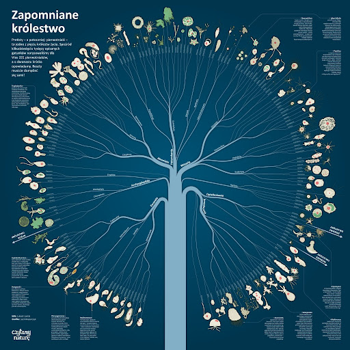

- Intro: I came across this visualisation via LinkedIn. Lech Mazurczyk is a Polish infographics designer, and this family tree of protozoa (single cell organisms) he created looks very intriguing. The neat and minimal use of colours. The combination of scheme and illustrations. The layout. It just makes me want to look closer.The world of protozoa is not very visible to us humans, although most information designers are probably familiar with the drawings of Ernst Haeckel. With these 191 protozoa, Lech Mazurczyk only draws on a tiny part of this forgotten kingdom (over 50,000 species in total).
- Why it matters: Research has been constantly changing hierarchies in this domain, so it is important to present these sorts of insights clearly. This is a great example of making the ‘invisible’ visible through information design, and even the tiniest details (and organisms) deserve close attention. Creating a balance between overview and detail is a challenging part of designing data visualisations – this example makes the audience curious about all the levels of information contained within it.
Based on Implemented Policies, We’re Going to Change the Planet Irreversibly
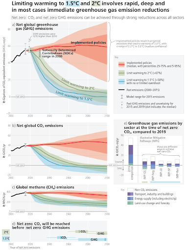

- Intro: The Intergovernmental Panel on Climate Change (IPCC) released its Sixth Assessment report at the end of March, detailing how it’s still possible for humanity to secure a liveable future for all. That’s the good news.
- Why it matters: The bad news is that we still have a big gap between policies that have actually been implemented and what we need to minimise global temperature reductions. This figure from the IPCC report shows us, in very clear terms, the trajectory we need to see, and the trajectory we’re likely to see. It gives us hope, in that emissions look likely to plateau, but it also serves as a call to action for governments of the world to act now.
No One Stays On Top Forever
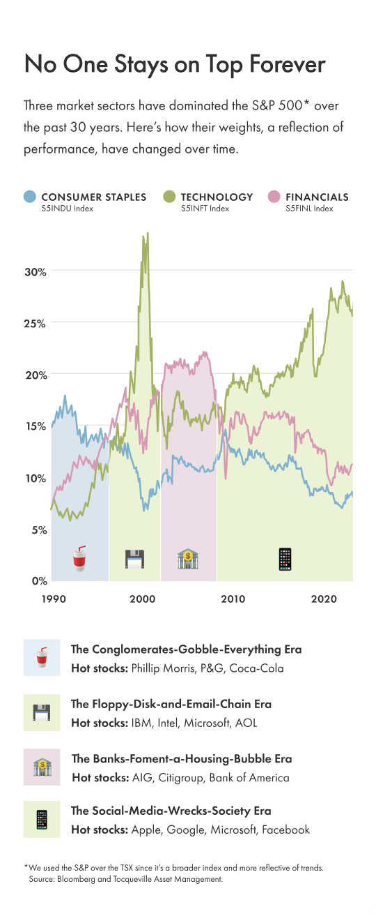

- Intro: Wealthsimple is a Canadian investment tool aimed at a younger demographic. They recently launched a newsletter called
TLDR, which they describe as ‘Canada’s best and most entertaining way to get smarter about markets, business, culture, and whatever Elon Musk says.’ In their Q1 issue, they included a visualisation that shows the performance of three leading sectors over three decades. - Why it matters: I look forward to reading Wealthsimple’s newsletter because they’ve managed to turn what could be a very boring topic into something that is fun to learn about. Their overall tone is quirky, energetic and playful – a stark contrast to how financial investing is generally portrayed. This tone trickles into the visualisation in a very interesting way.The chart is broken down into four sections that are double encoded with light colours and fun emojis. There is a clear narrative being presented here, making the overall insight more accessible. As an added bonus, this visualisation was designed for mobile and email, a combination that I don’t come across often. Most of the time, visualisations are created for the web or apps, and users have to click a link to see the visualisation. Keeping the dataviz within the email means there’s less friction to get to the insights, and more likelihood for the reader to stay engaged.
Mapping Inequality Can Drive Social Impact
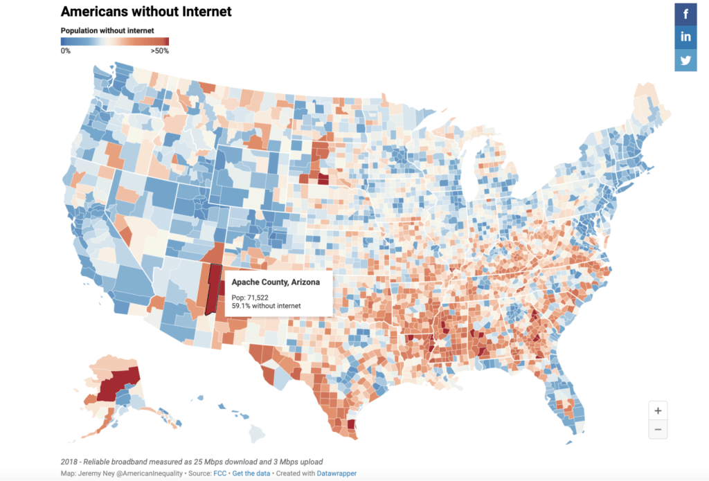

- Intro: While looking into the importance of climate action and the role data visualisation plays, I came across this great article that provides poignant examples of why dataviz is necessary and how the combination of good data and visualisation can provide insights that drive meaningful change.
- Why it matters: In the various different roles/places I have worked and the wider conversations I’ve engaged in with my peers, time and time again I’ve come across a misperceived perception around the importance of both data and visualisation. This article highlights the importance that both play in society, from the wealth of accurate data needed to inform decision-making, through to the visualisation of this data to help everyone understand the value of the stories and trends within the data itself. It’s our job to make sure that the purpose of dataviz extends far beyond being just a pretty picture.
How Forest Loss can Unleash the Next Pandemic


- Intro: While working on our Sustainability pod’s latest newsletter, I stumbled down a rabbit-hole around one of the less obvious problems associated with deforestation: the eroding of the boundaries between humans and wild animals and the dangerous ‘mixing zones’ that result.I never realised that the Ebola outbreak in West Africa in 2013 emanated from one little boy playing too close to a (man-made) treeline. This scrollable story by nonprofit newsroom ProPublica succinctly captures the heart of the problem of ‘spillover’ and conveys its influence on human/animal safety in compelling terms.
- Why it matters: This harrowing scrollable story uses clean visuals, slider interactivity and a clever animated spin on the traditional Venn diagram to highlight the very real, very human impact of deforestation.