What we can learn from The Legend of Zelda – a talk at Datamat.es
Reading time
Category
Facebook HQ in London recently played host to the capital’s best data journalists, analysts and data-driven designers. The third Datamat.es event had promised both beer and pizza; attendees were not disappointed. But they had really come for the discussions from the evening’s three speakers on how they are using data to solve real-life problems.
I kicked off the evening, showing some of my own work before discussing my approach to visualisation, detailing how to help clients present their data in a more engaging way. The difference between infographics and data visualisations is an issue that still causes confusion but I think we can draw on an unusual analogy to help us understand it – video games.
Infographics often boil datasets down to their simplest forms so that only the core message remains, allowing the information to be presented to readers in digestible chunks. The video game equivalent of an infographic is something like Temple Run, an “on rails” app which scrolls automatically and deliberately limits the degree of interactivity the player has, providing an incredibly accessible experience that is fun in small doses.
Data visualisations, on the other hand, allow users to explore and identify patterns and anomalies within a large sea of data, inviting them to form their own conclusions. They can often appear overwhelming at first but can be immensely enjoyable to read and highly insightful. In the gaming world, these can be compared to titles such as World of Warcraft. These games can be intimidating for inexperienced players due to their scope and complexity, yet are incredibly rewarding for many who are willing to invest more time and effort.
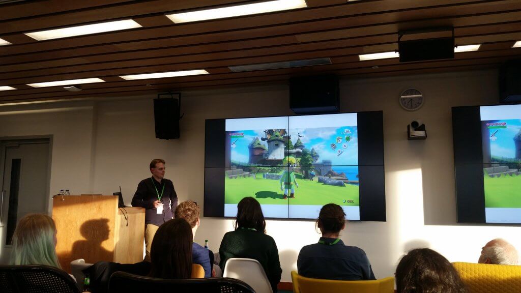
Other games combine these two play styles, and these hybrids can be compared to the types of visualisations that I enjoy reading and creating. The Legend of Zelda video game series – which I’m a particular fan of – manages to present a tightly crafted game structure within a world that feels like it can be explored from any angle. The player is encouraged to deviate along the journey and the most attentive players are rewarded for their efforts. My aim is to create visual displays of data that provide the user with a similar sense of discovery and achievement as they explore the visualisation’s many layers.

I then revealed a series of wireframes from Infogr8’s “End of the Road” visualisation of Formula One data to show how an idea evolves from sketch to final piece. Structuring the data in the very early stages of the project is crucial so that primary and secondary stories can be established and their visual prominence considered accordingly. This is to make the most interesting information noticeable at a glance, while those willing to look a little deeper can gain further insights.
To close my talk, I presented an interactive I worked on called The Startup Universe, which visualises the founders, investors and money invested in over 40,000 startup companies over the last 26 years. As Facebook had kindly hosted us for the evening, it seemed only fitting to trace how its founders and venture capitalists were linked to other up and coming ventures and how this once tiny company grew into what is is today.
Afterwards, Yodit Stanton of OpenSensors.io opened our eyes to the possibilities offered by open data and the evening was rounded off by a talk from statistician David Spiegelhalter on the challenges of collecting reliable stats on the nation’s sexual activity.